Urban photography
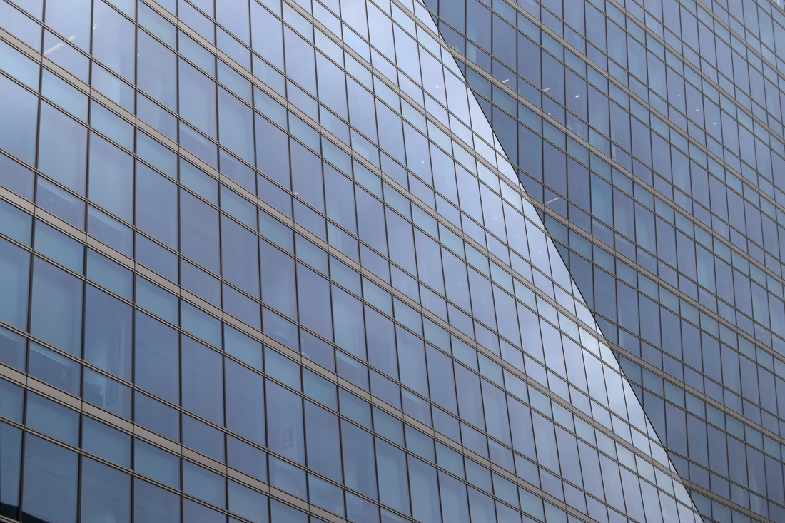
Michael Wolf Michael Wolf uses the urban landscape of many cities to get inspiration as he does his work.
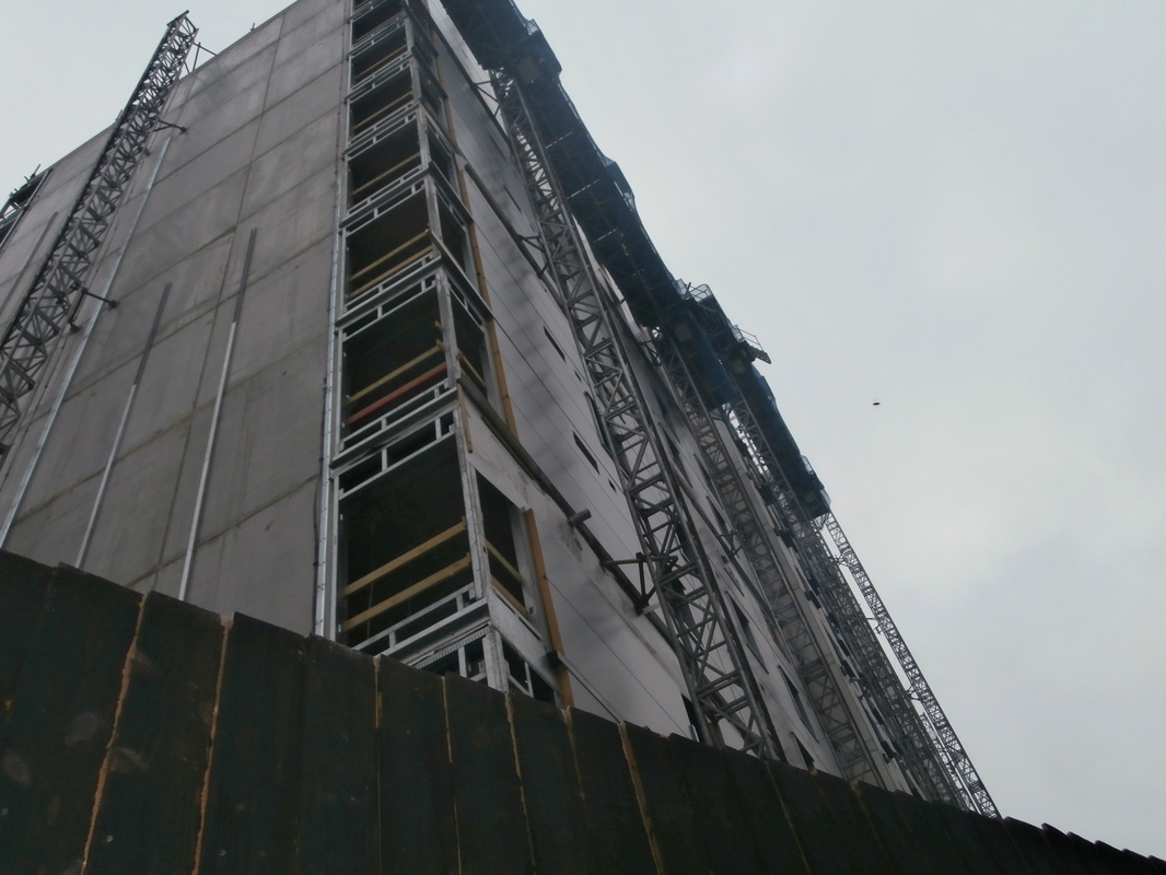
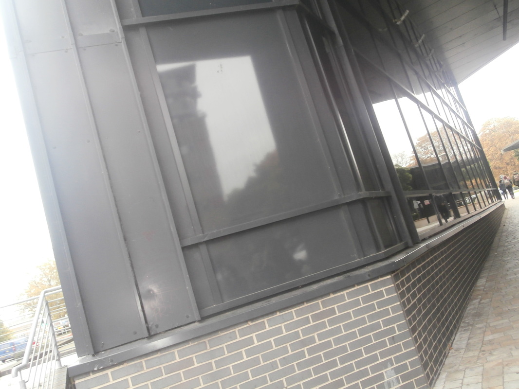
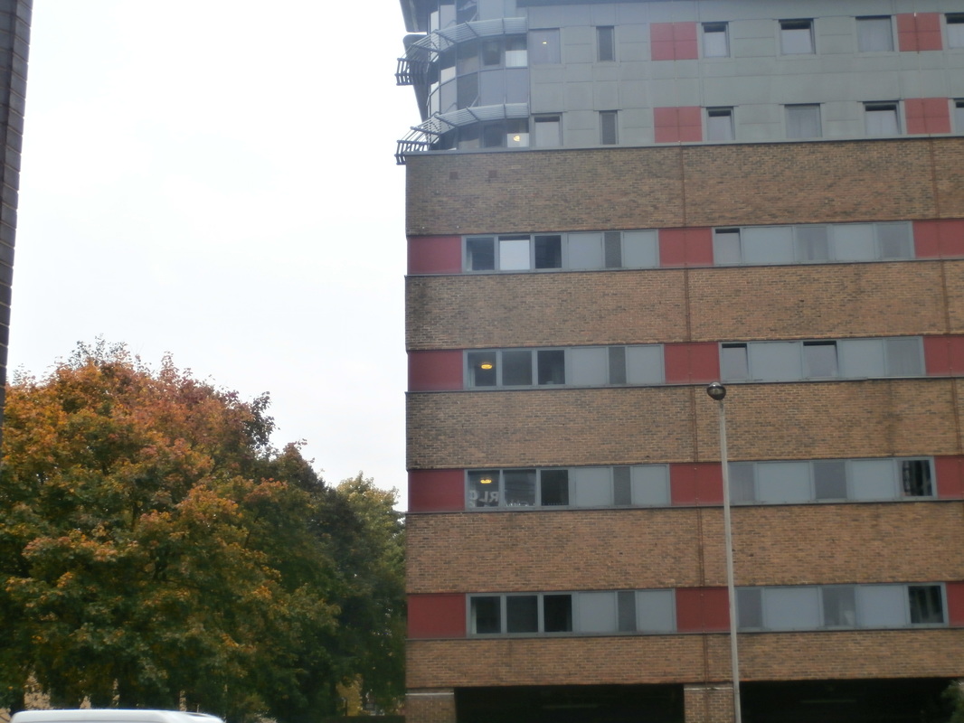
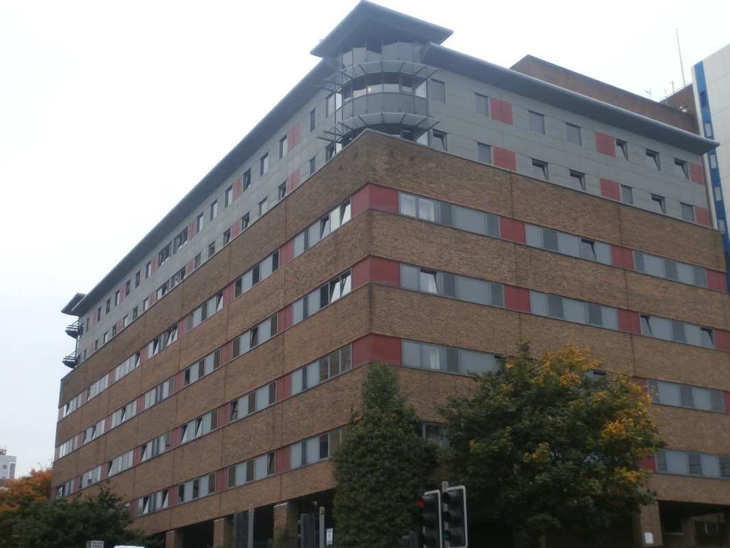
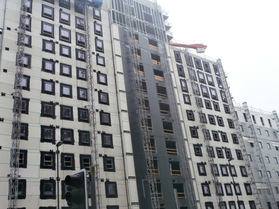
Most of Michael's photos are in dark and grey colours, but he also has some photos in pretty pastel colours that aren't shinny, but gives a different air to the picture. His photos also have loads of patterns. To get a better view, he positions himself at the same height of the buildings he want's to photograph. I think Michael's work inspired me, because from now on, I am going to look at buildings and structures in a different way. |
|
My response to Michael Wolf:
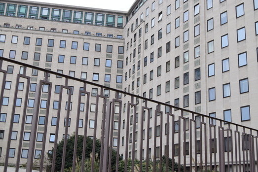
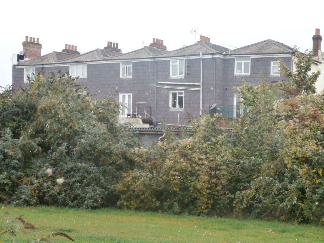
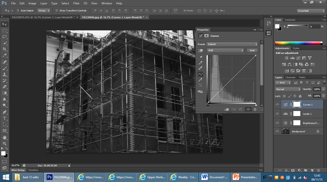
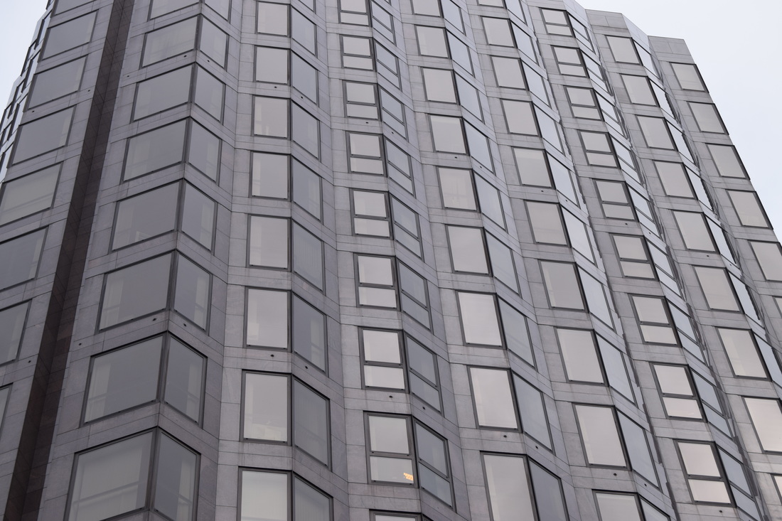
This is the original photo I used for this edit.
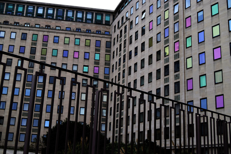
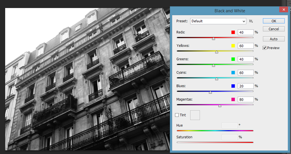
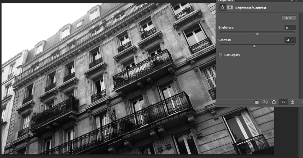
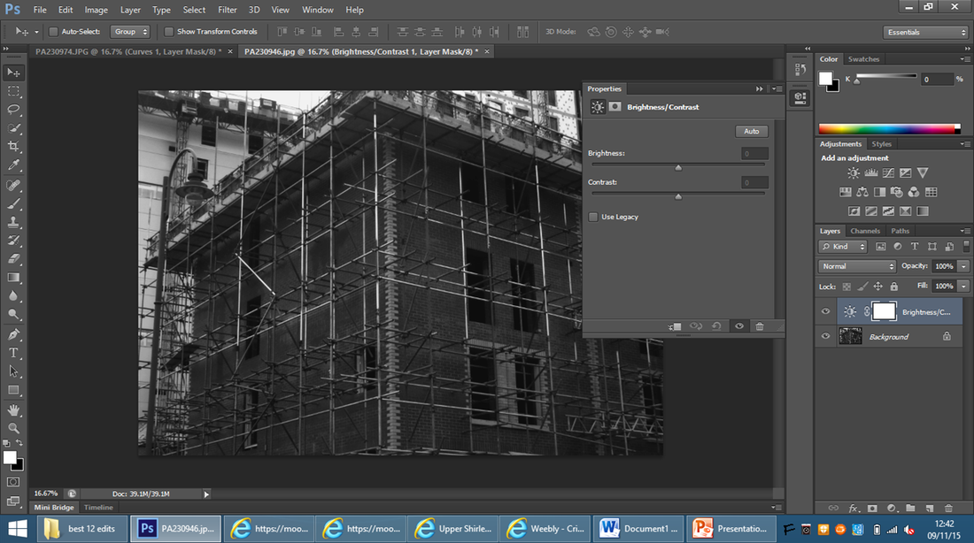
This is the second step to Michael Wolf's response, which I only changed the contrast and brightness and use the polygonal lasso tool and the paint bucket tool to change the colour of some of the windows into pastel colours.
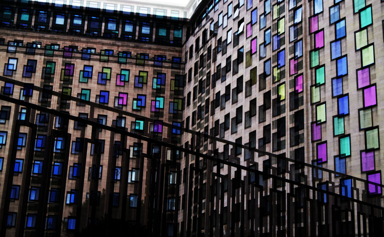
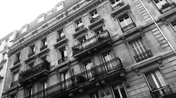
This is my final response to Michael Wolf's work. I used pastel colours and repetition to create this edit.
Abstract
|
|
|
|

|
|

|
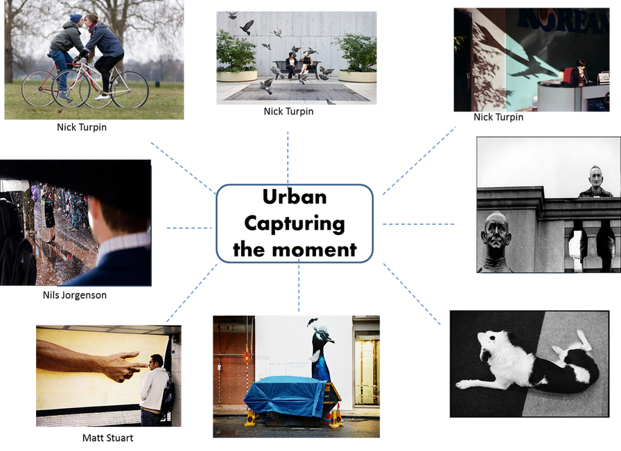
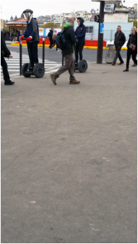
Capturing the moment
My response to capturing a moment
|
|
|
|
|
|
|
|
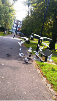
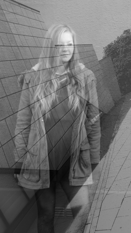
I don't have good photos for this response, but these are my best far this project.
Repetition
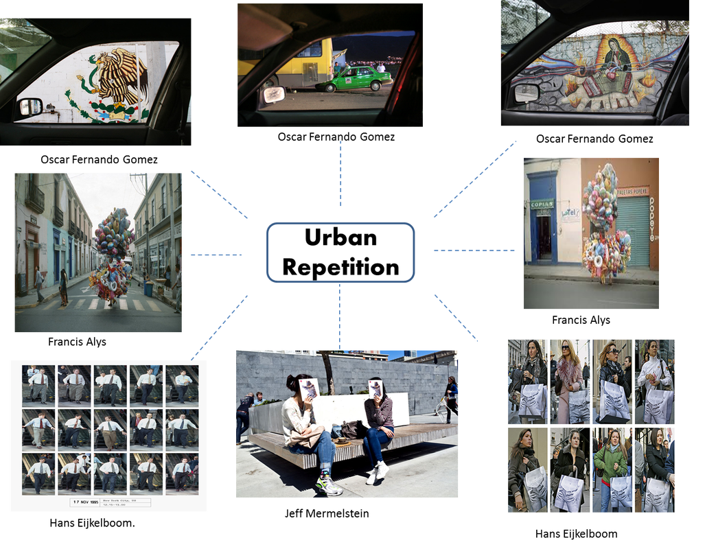
My response to urban repetition
|
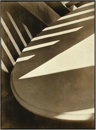
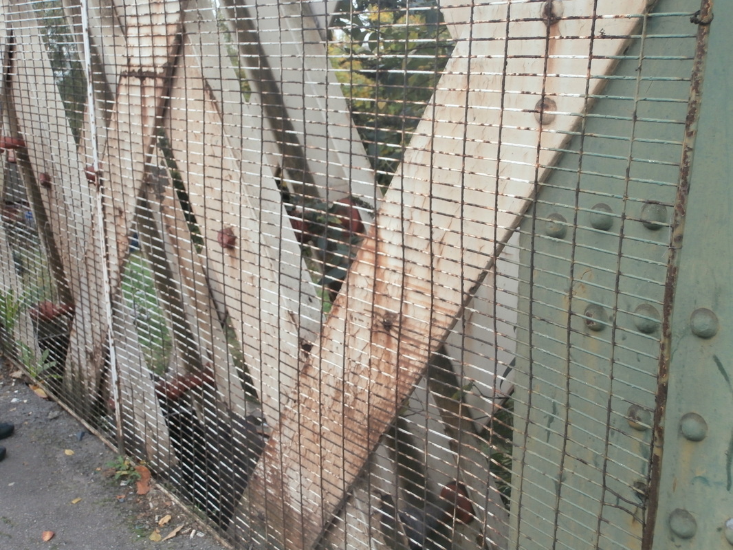
This image is by Paul Strand. It is entitled 'Abstraction, Twin Lakes, Connecticut' and was made in 1916.
Focus: The whole image is in focus. But there are some parts that are slightly soft. Light: There are some geometric figures that are brighter, like the big triangle in the middle of the table, that gives enough light to brighten the whole image. On the side you can see some strips of light as well that looks like a fence. Line&Shape: As you can see in the photo, you can see loads of lines and different shapes, like a big, straight triangle on top of a round , curve table. All the shapes you can see are made by man. Repetition: There is a repetition of the geometric figures that I think it's made by a fence and we can see those figures because of the sunlight going across it. Space: The space in the image appears quite shallow. We don't see the whole of any of the objects and the photographer appears to have been quite close to the subject. Texture: This picture has quite smooth texture. Value/Tone: The image contains different tones from very dark to very light. There are deep shadows but also mid tones. |
My response to repetition
|
|
|
|
|
|
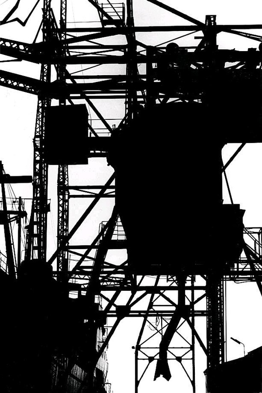
Keld Helmer Peterson
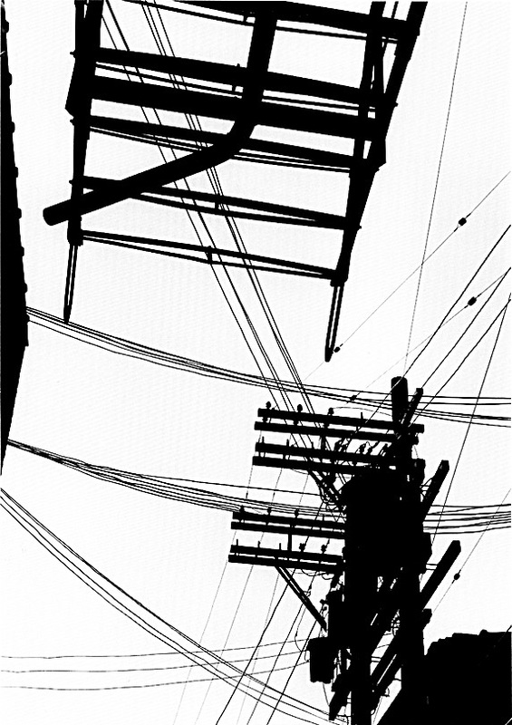
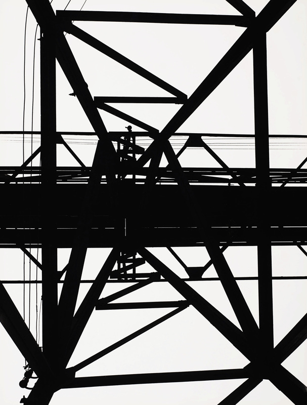
These photos are highly contrasted, which make the photo be in a strong black and whites and makes us able to see the strong lines that are in the photo.
I am inspired by these photos and I am definitely going to use this effect in my own photos.
Keld Helmer Peterson uses this technique to emphasise the strong lines in his photos, and by having strong lines he can play around with the contrasting tool to make the lines even more stronger and visible for the person that is observing his work.
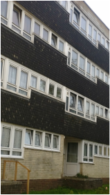
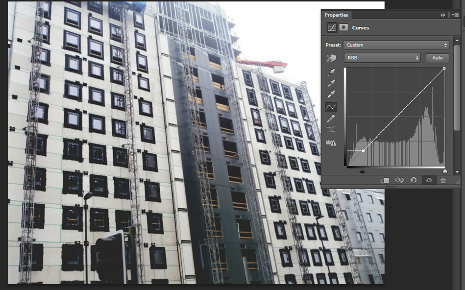
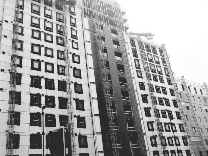
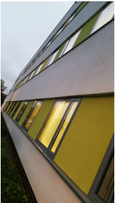
I chose this photo because of the strong lines you can see, and because it would be easier to edit like a Keld Helmer Peterson
|
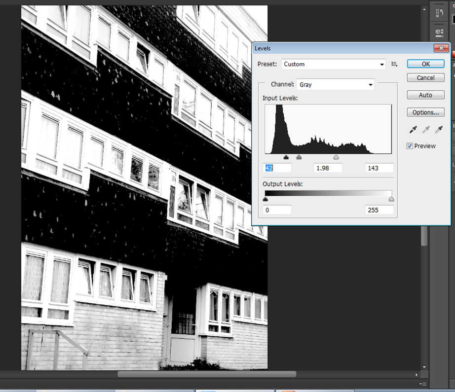
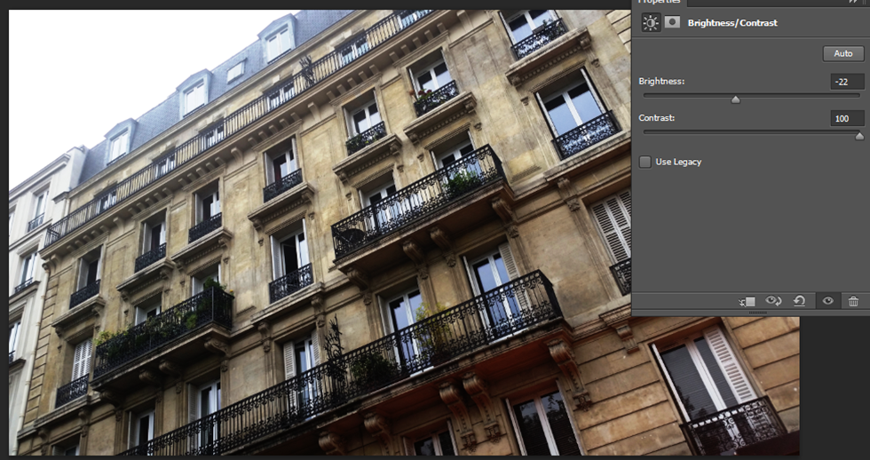
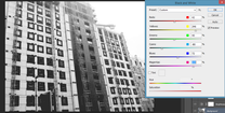
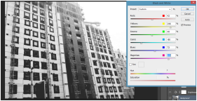
This was my first stage of editing my photo, I used a tool to change the contrasts levels of my picture and do a similar edit as Keld Helmer Peterson.
|
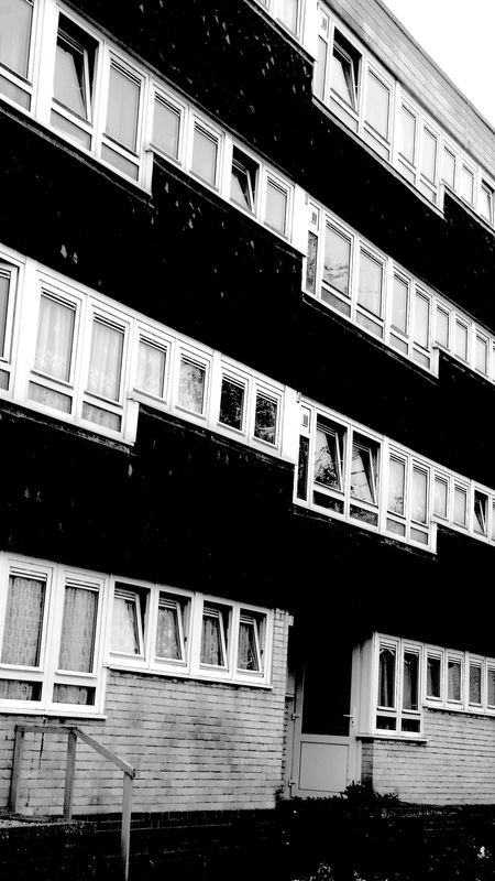
I'm pleased with my final edit and happy I could do something like his photos and explore this type of tools in photoshop and do more edits like Keld Helmer Peterson.
|
Moholy Nagy
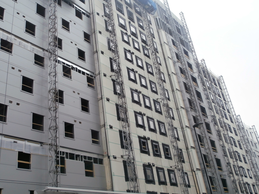
Moholoy, uses this technique of looking up to catch the strong lines of the building to then edit with it with the high contrast tool to emphasise the straight lines.
|
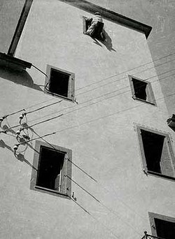
In this picture he is also looking up and also capturing the moment, a moment that you obviously will not see often, a man going through the probably 5th floor.
|
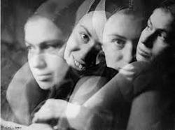
To create this image he had to take photos of different face expressions of the girl, and then make un overlay of her changing facial expressions and turn it black and white to define her facial lines.
My response to Moholy Nagy:
|
|
|
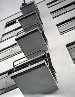
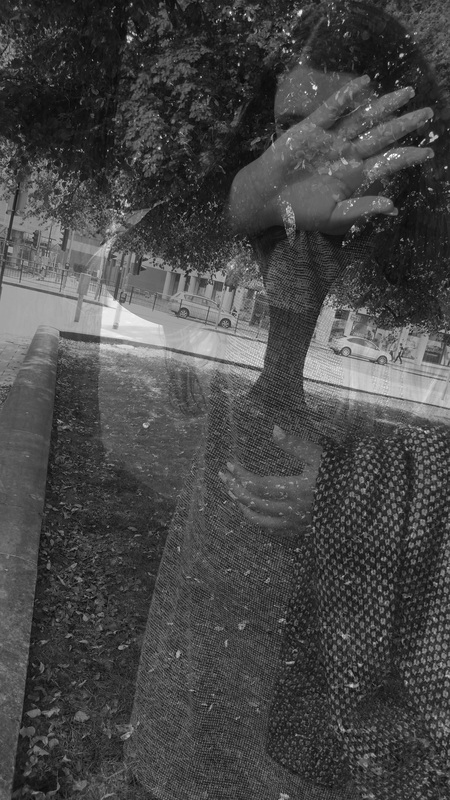
This is my response to Mohloy Nagy's work, I played a bit with the contrasting and brightness tool to emphasise the strong lines that the balcony has and then changed the filter to a black and white and put the contrast even higher so that the lines and shapes show off.
|
|
|
|
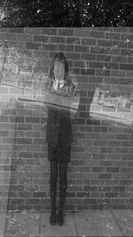
Using Moholy Nagy's ghosting technique
|
|
|
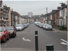
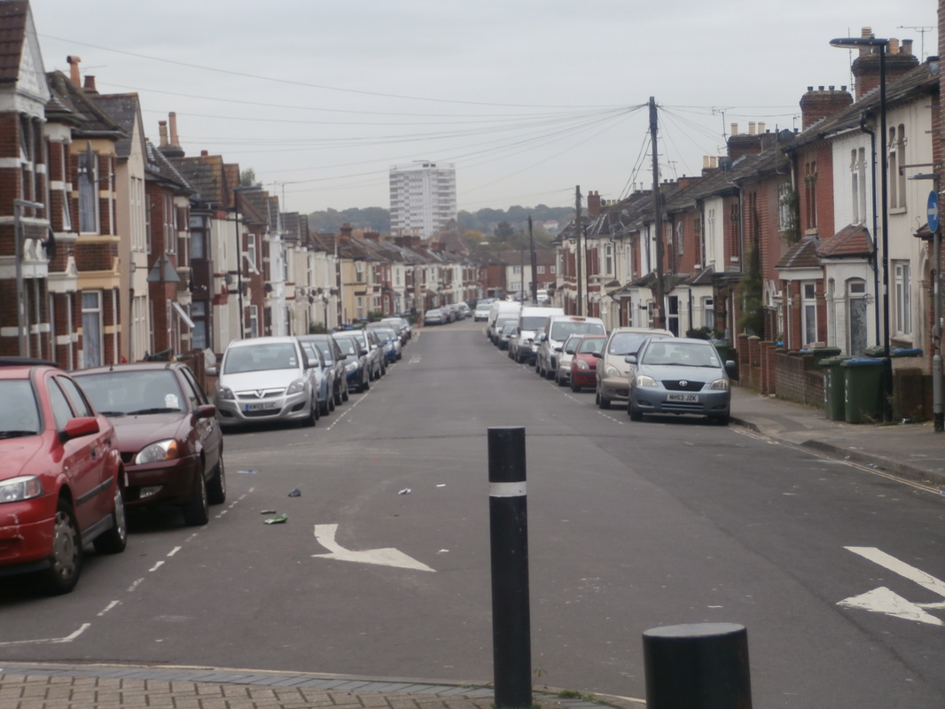
Photoshoot -Shape, patterns, texture.

|

|

|


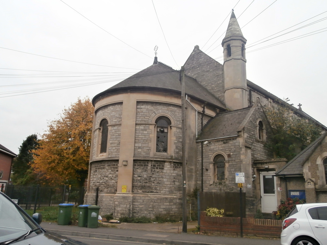
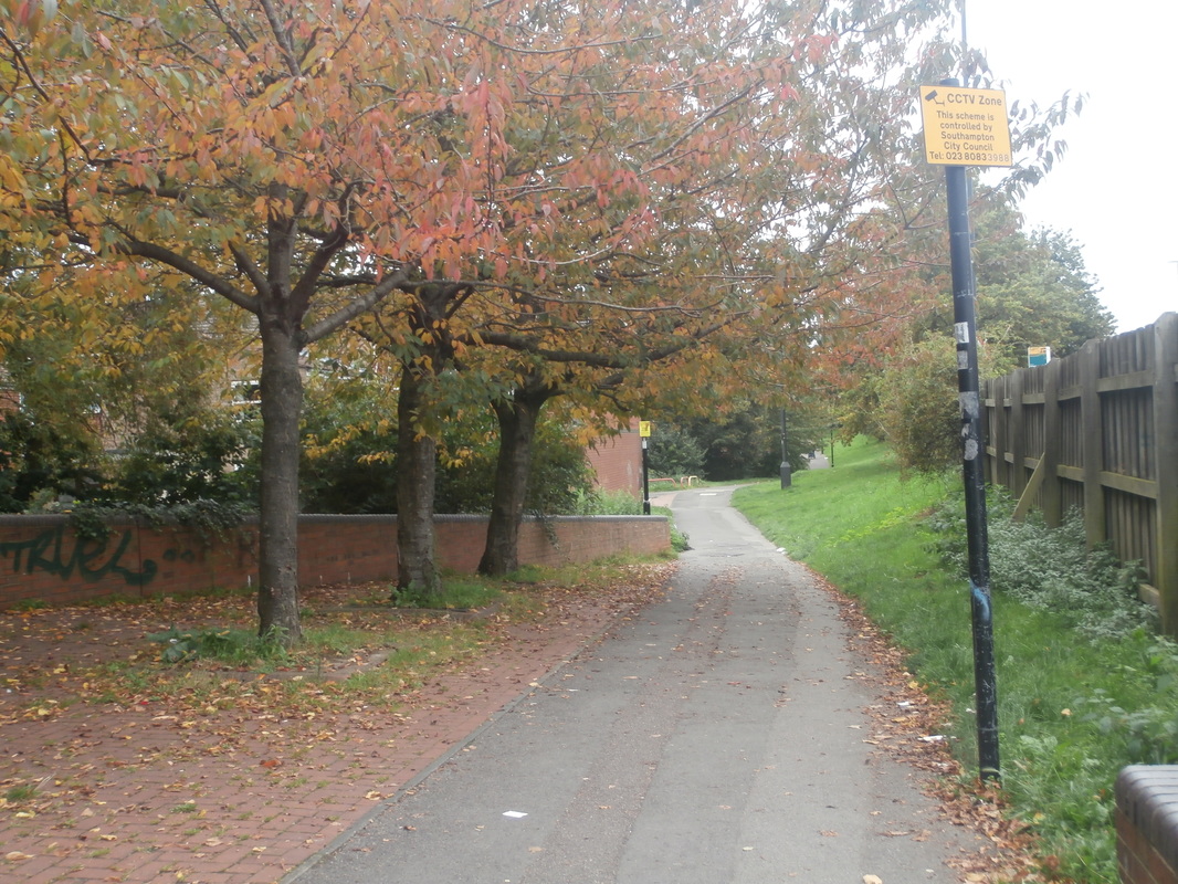
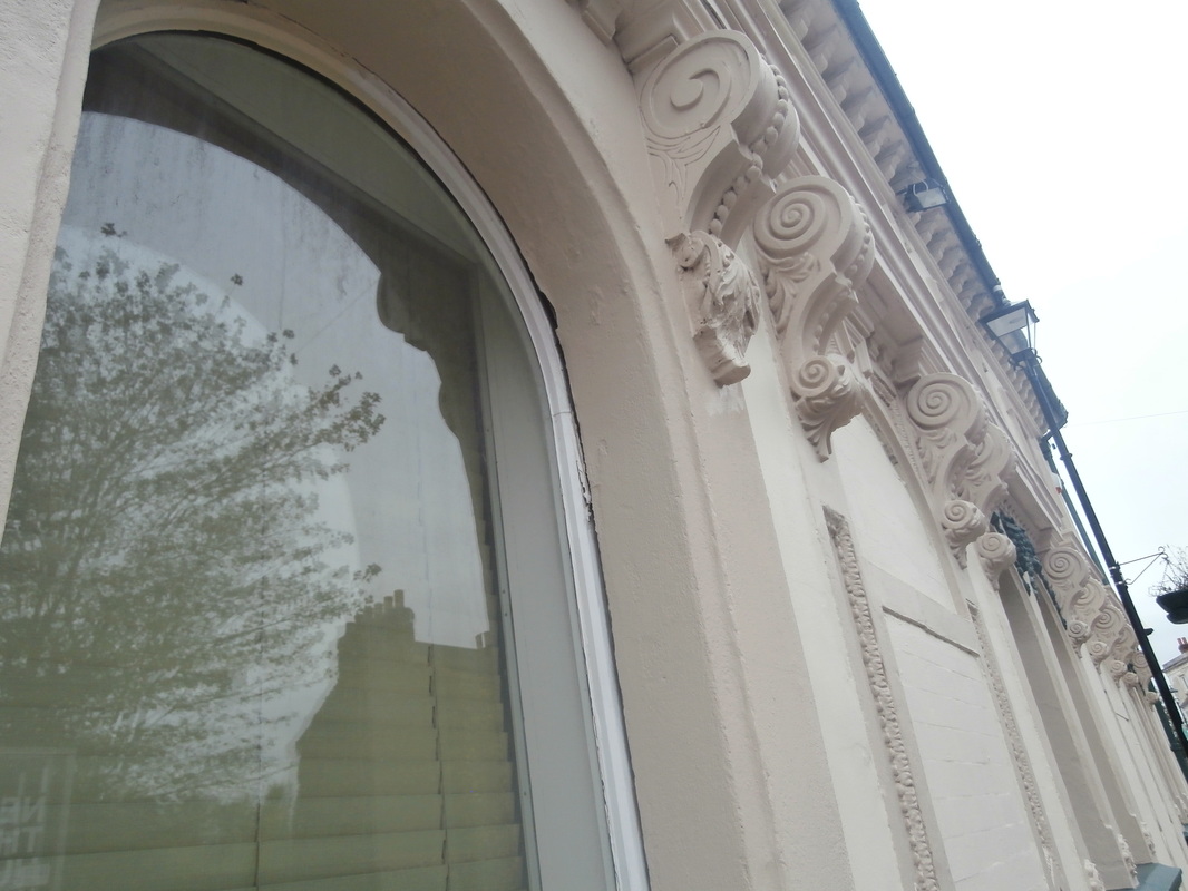
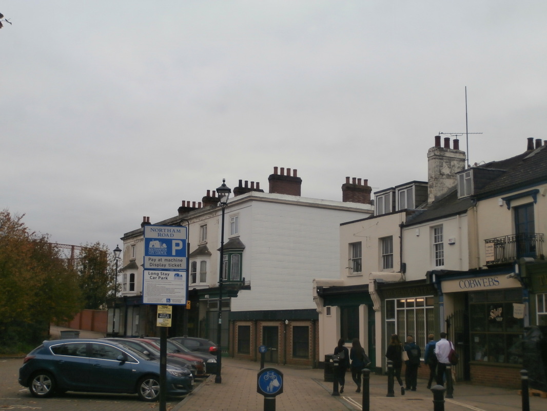
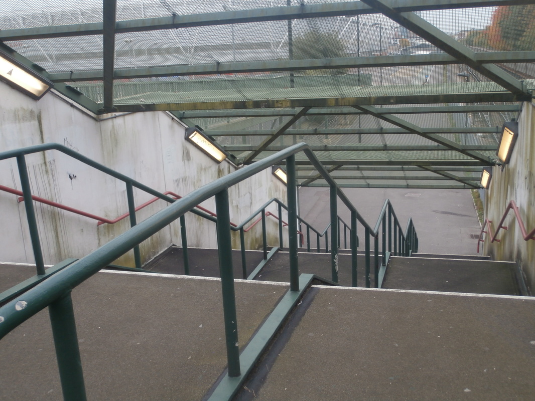
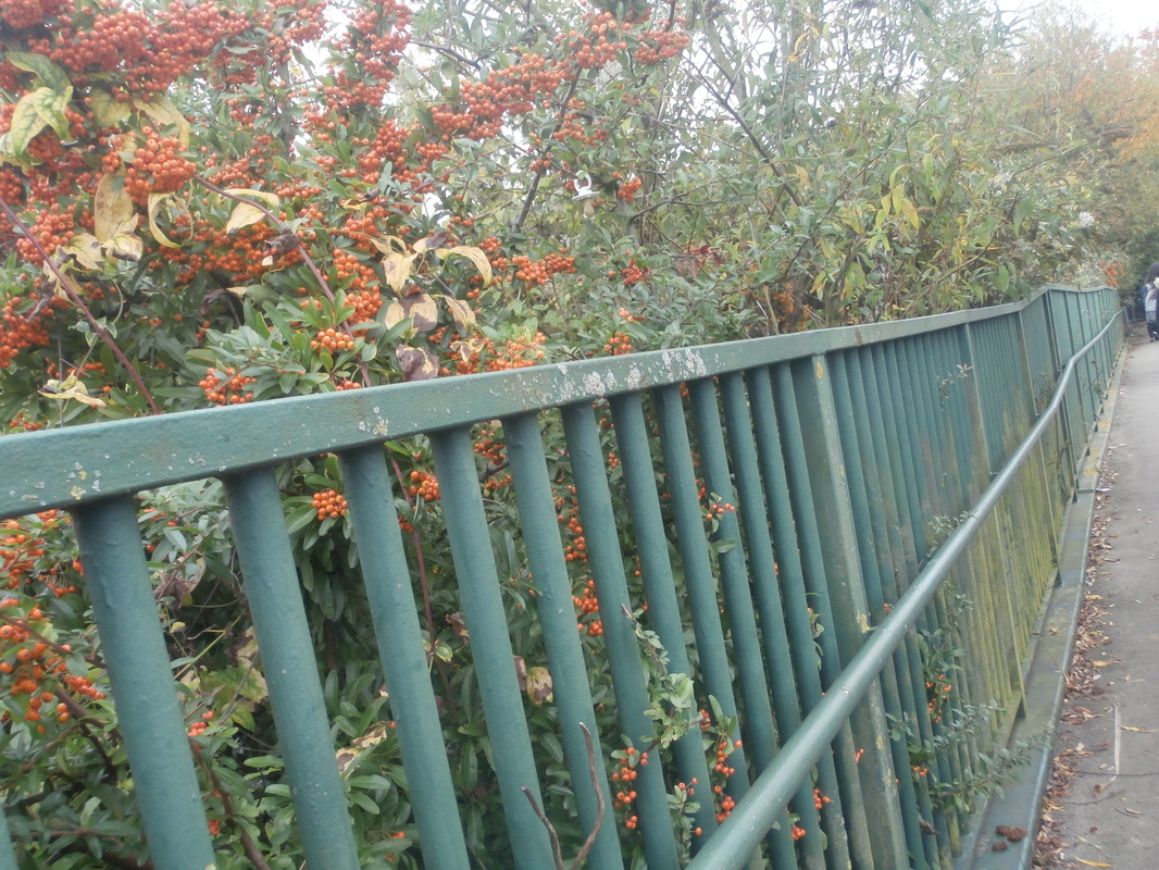
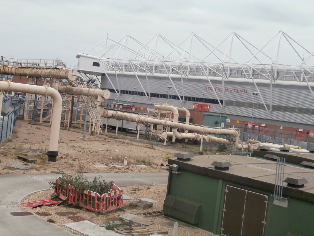
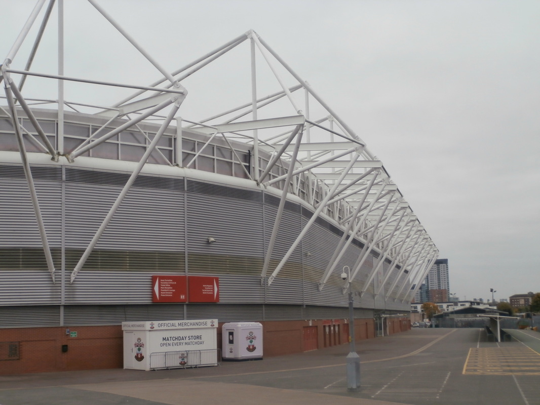


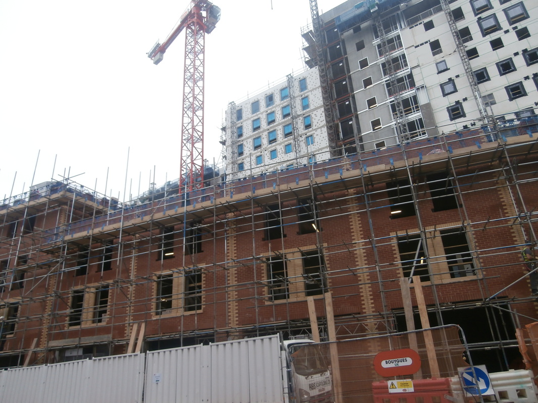
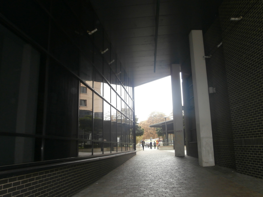
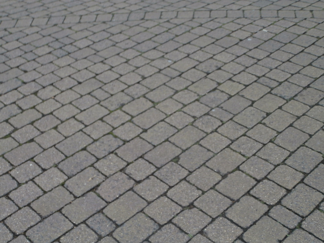
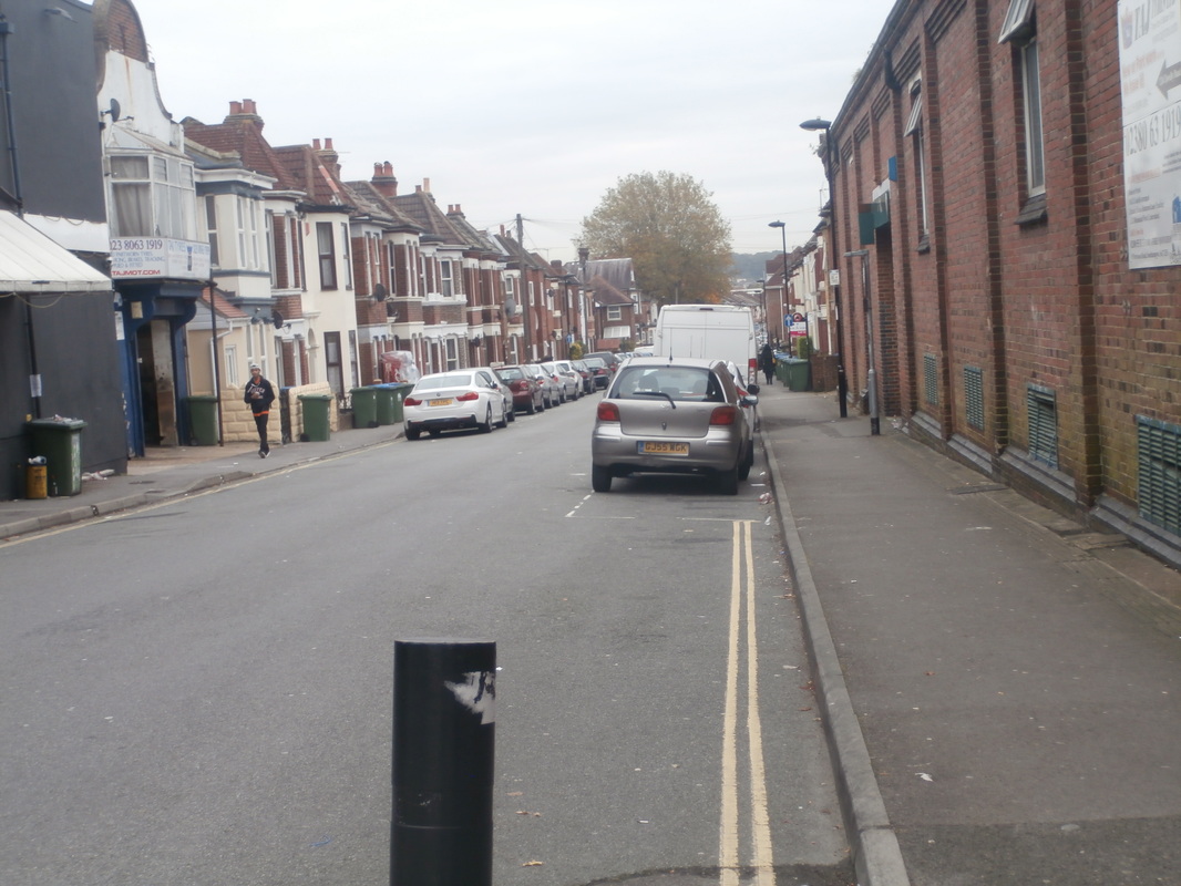
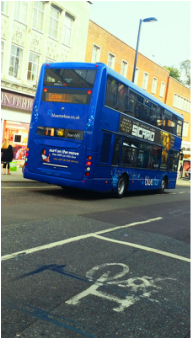
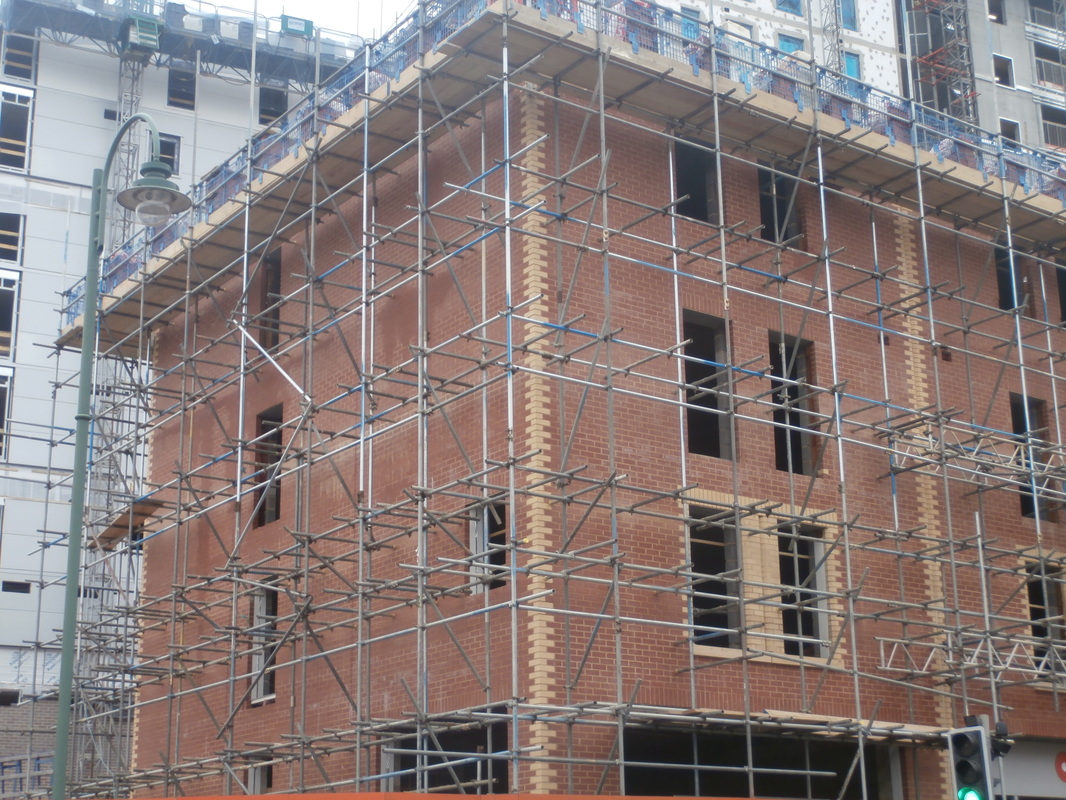
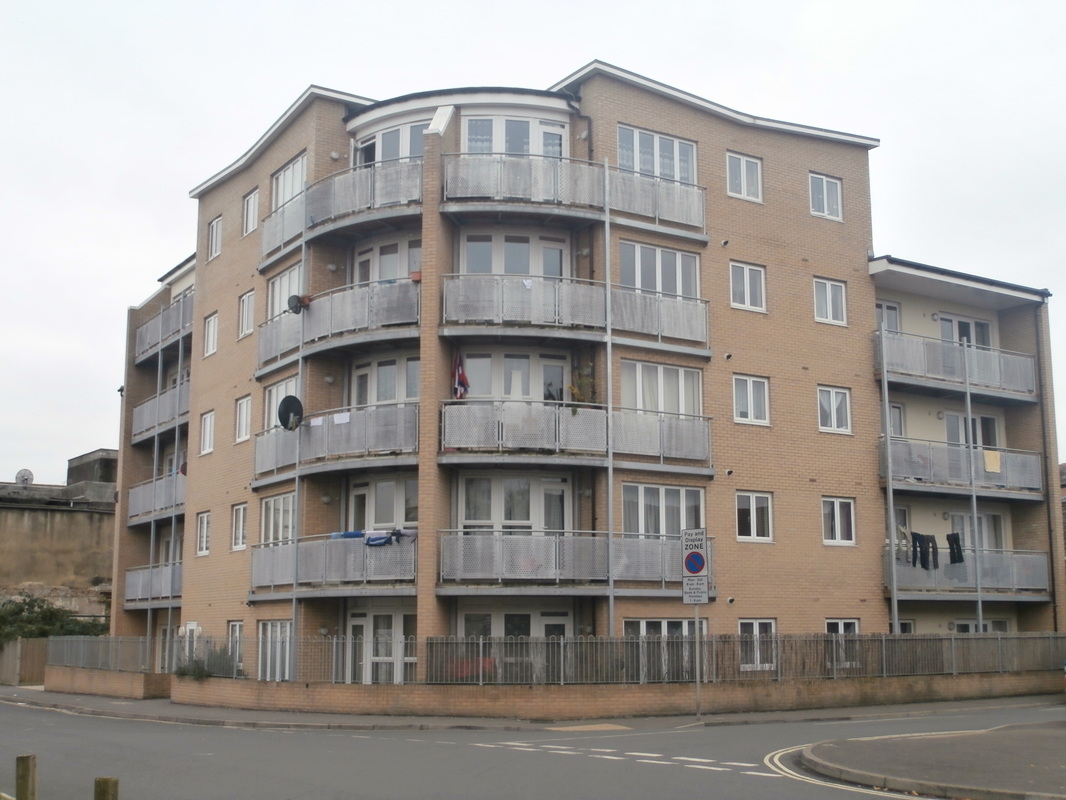
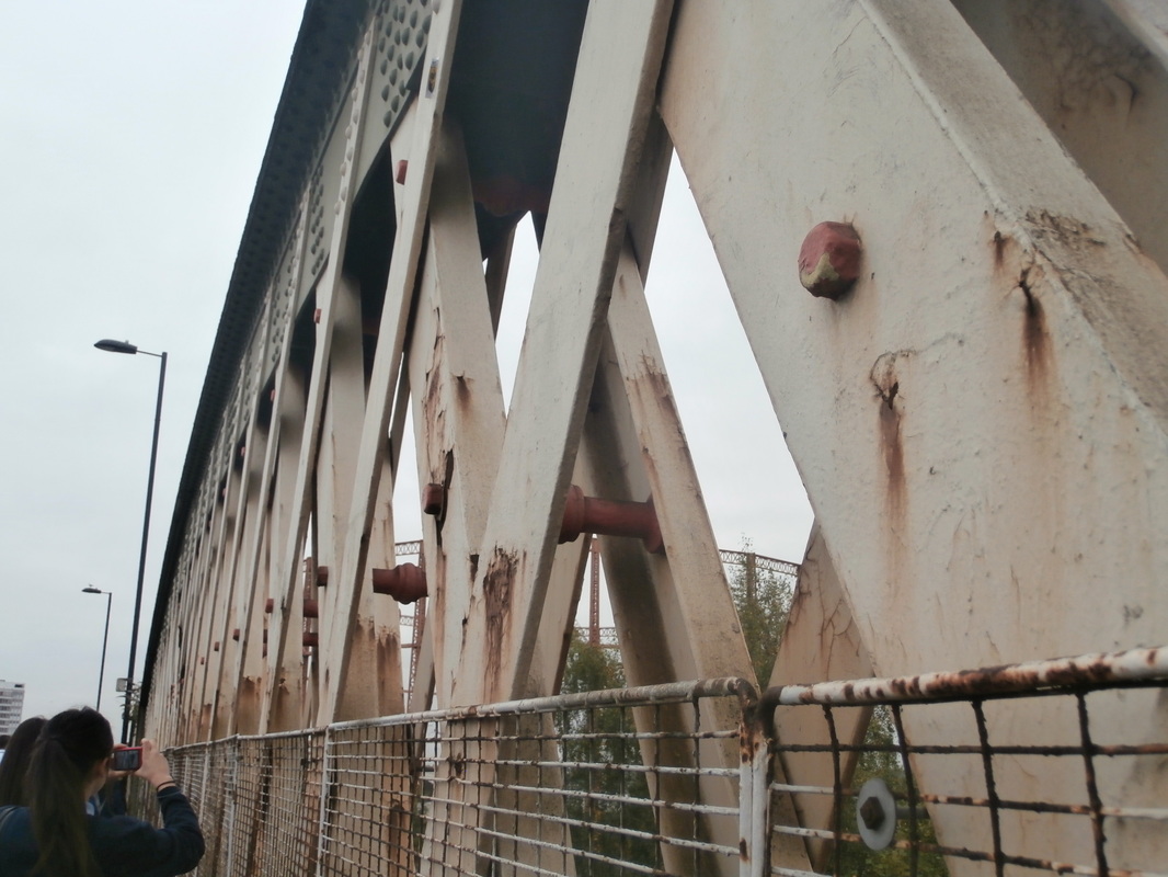
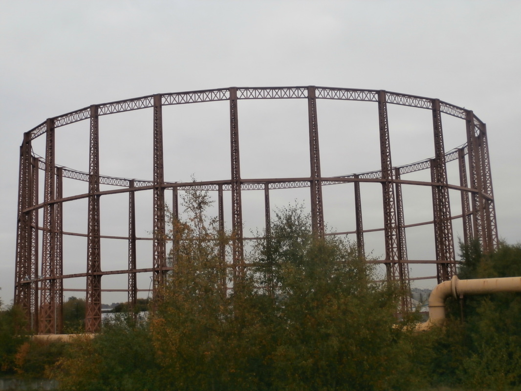
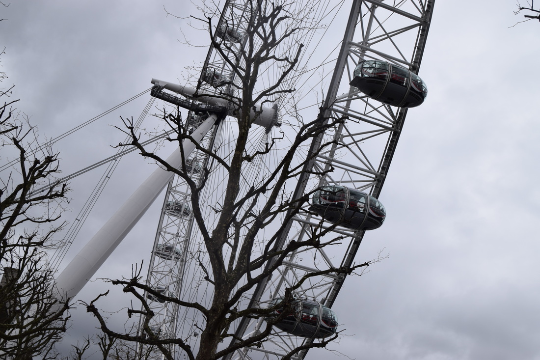
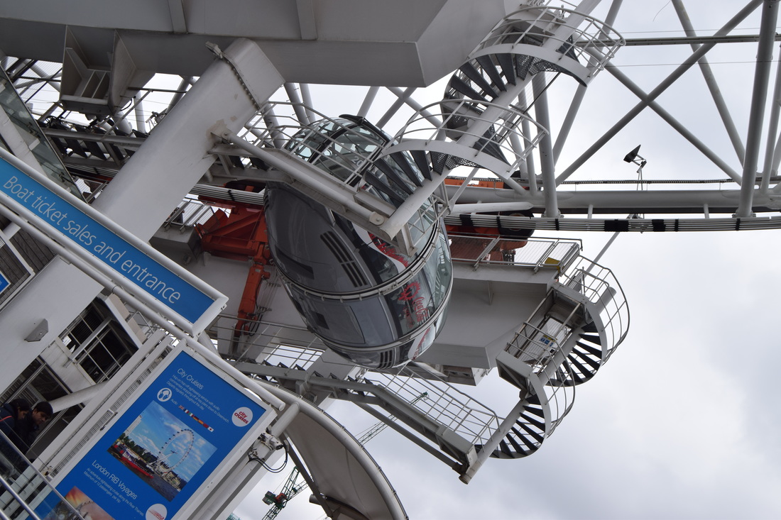
In these photographs I looked at some city streets looking for patterns, shapes and repetition and in stuff that I could use in my Urban project.
Selected photos from the photoshoot

|
|
|


|
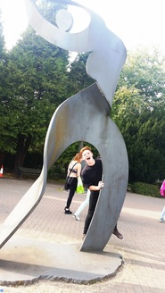
We had to select 12 of our best photos that we took when we went to St.Mary's and then edit and relate them with some famous photographers that we have been studying in lessons.
Edited selected photos
|
|
|
|
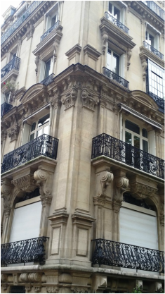
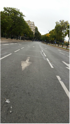
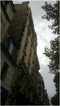
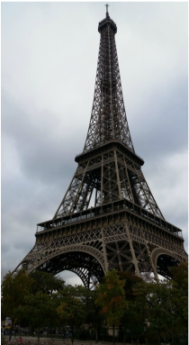
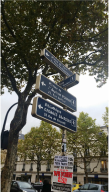
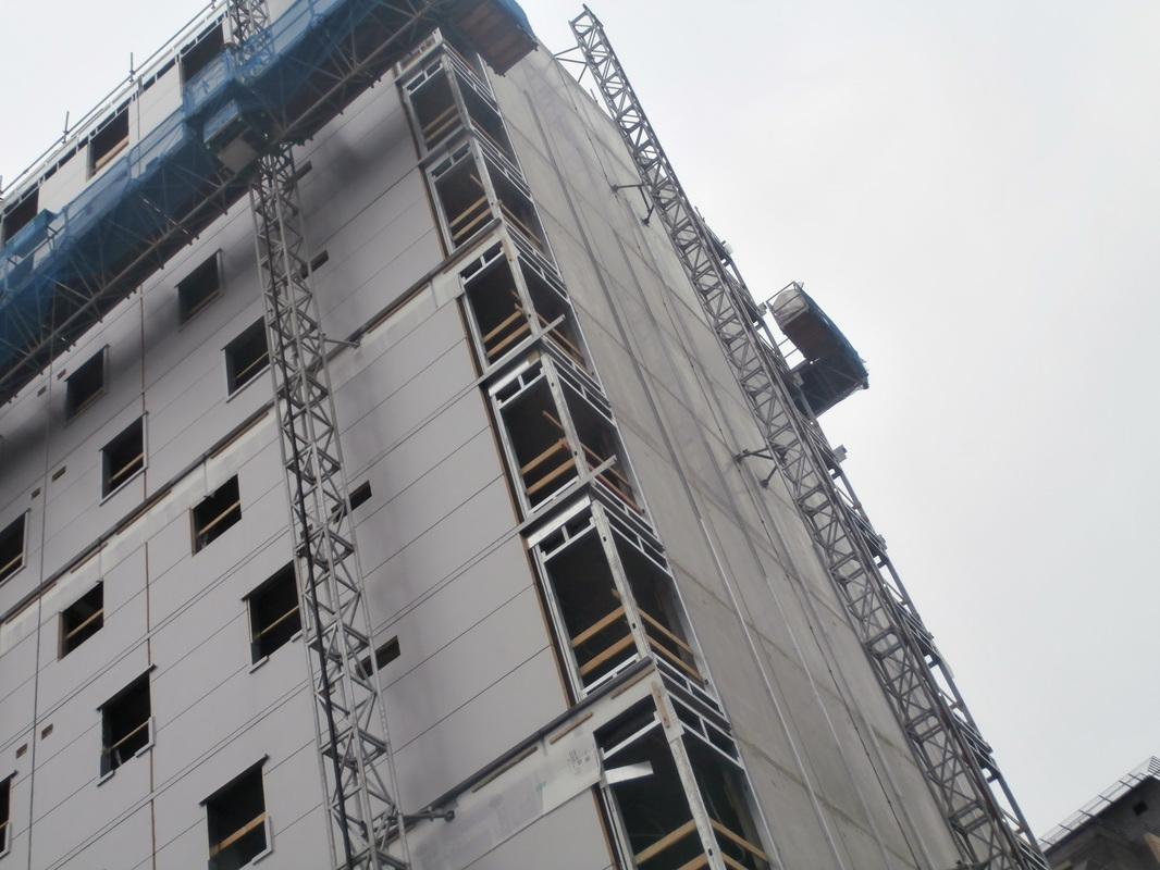
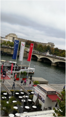
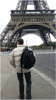
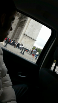
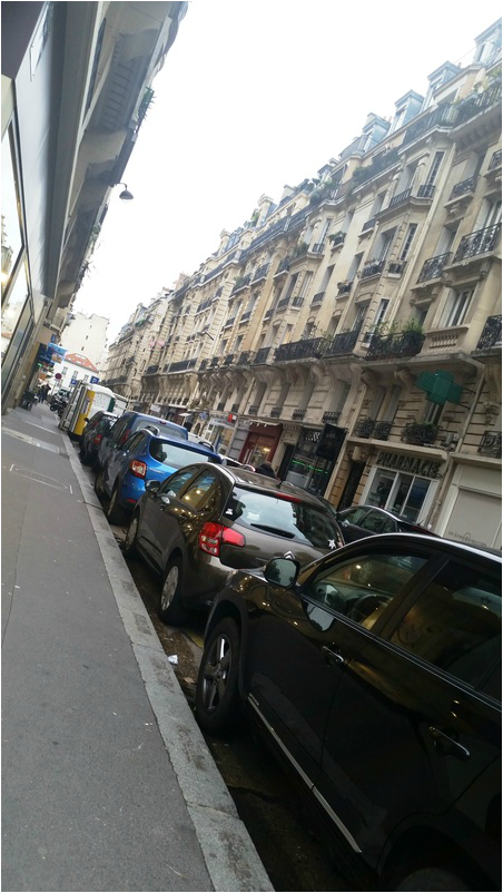
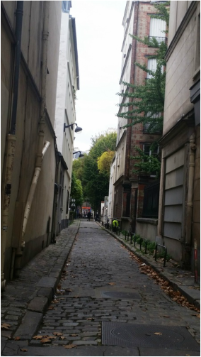
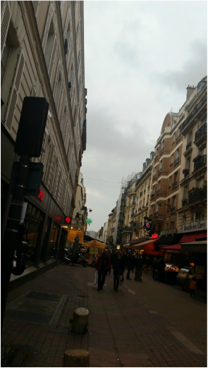
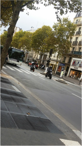
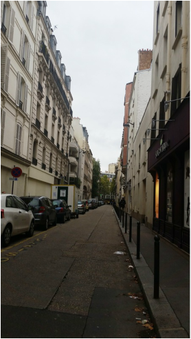
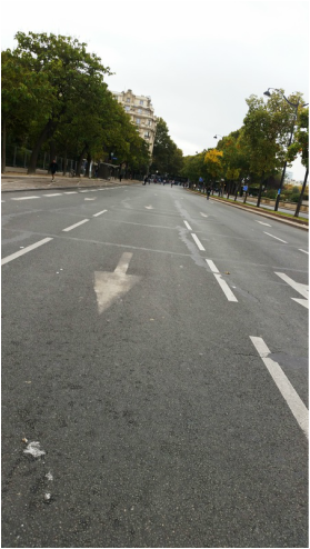
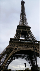
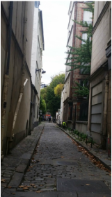
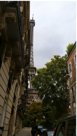
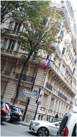
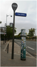
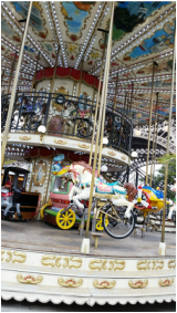
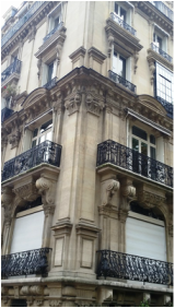
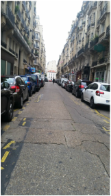
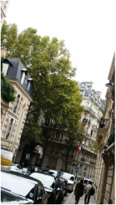
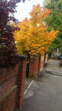
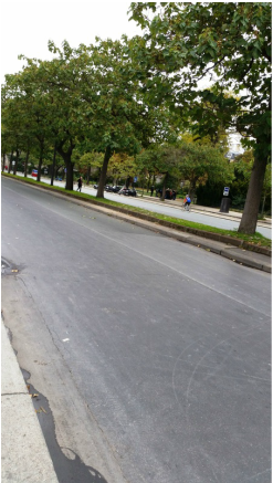
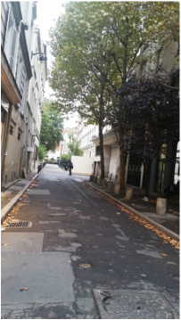
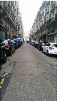
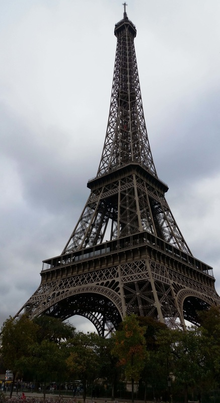
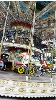
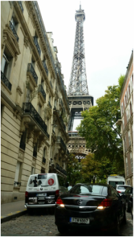
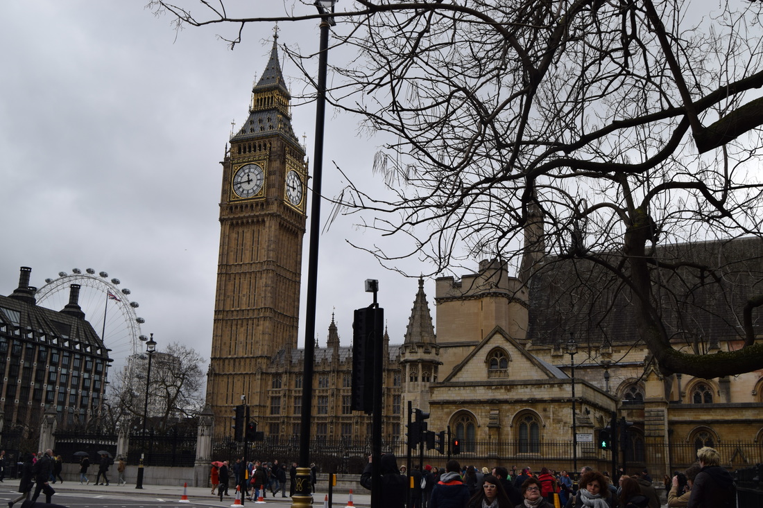
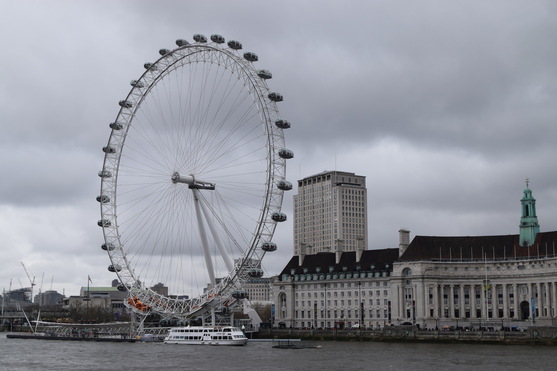
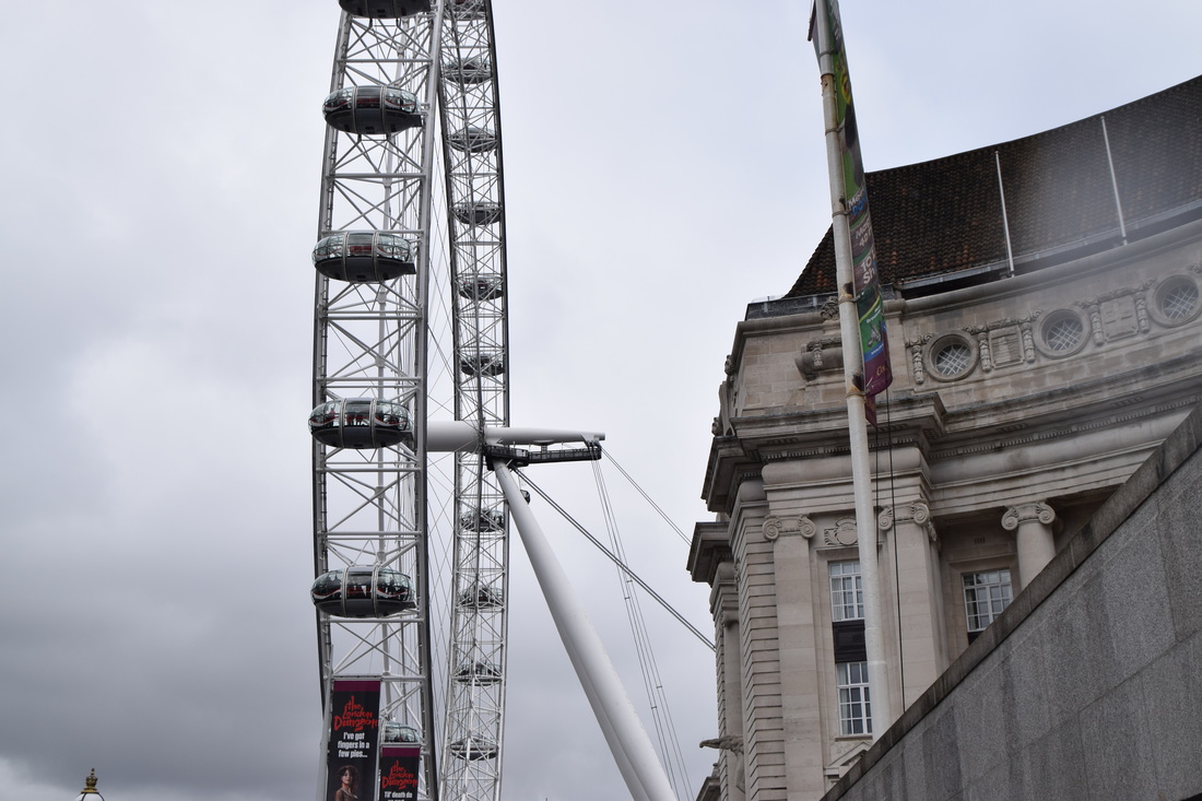
My trip to Paris
I took these photos when I went on a weekend to France with my dad.
France, especially in Paris has loads of beautiful looking buildings and houses and has loads of great view points.
When I was taking photos of the buildings and tall view points it made me remember the photographer Michael Wolf.
I hope you enjoy my photos as much as I enjoyed being in Paris!
France, especially in Paris has loads of beautiful looking buildings and houses and has loads of great view points.
When I was taking photos of the buildings and tall view points it made me remember the photographer Michael Wolf.
I hope you enjoy my photos as much as I enjoyed being in Paris!
|
|
|
|
|
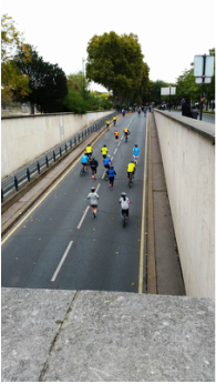
Refining my ideas
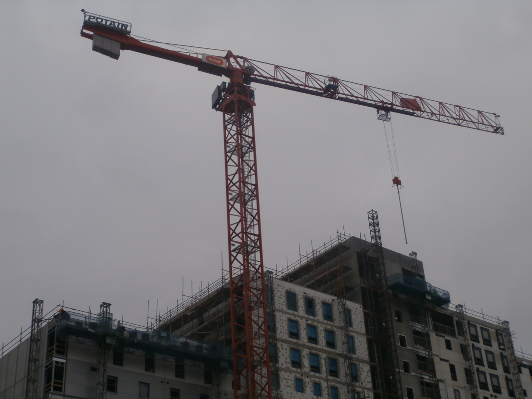
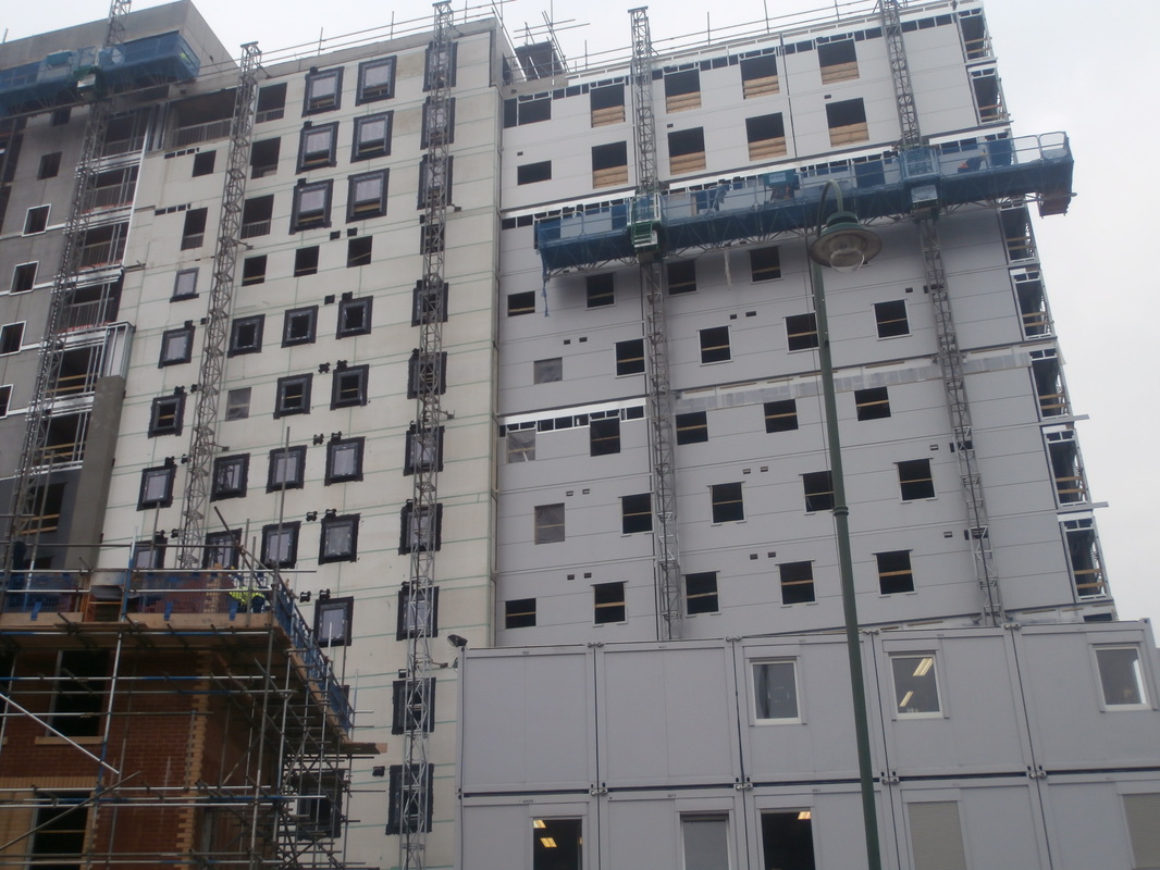
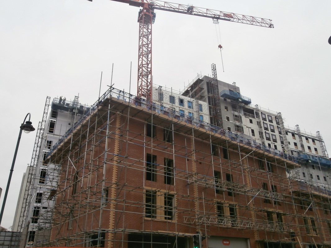
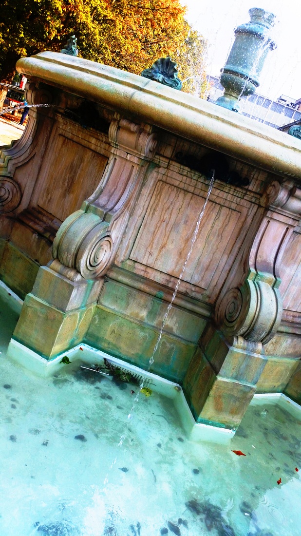
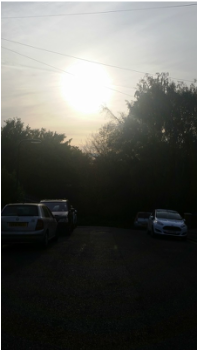
These are some of my best pictures that I took though this urban project.
|
|
|
|
Refining my ideas 2:
|
|
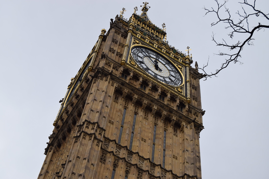
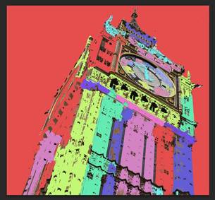
For this edit I only cropped it once to take out the tree that was in my way and I didn't need it for this edit.
The second thing that I did, was make the background red and I started to select random bits of the big ben and used the paint bucket tools to fill in bits.
The second thing that I did, was make the background red and I started to select random bits of the big ben and used the paint bucket tools to fill in bits.
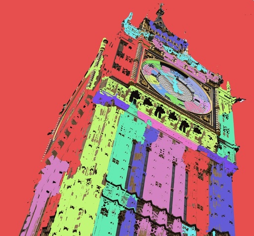
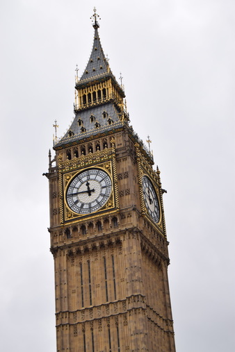
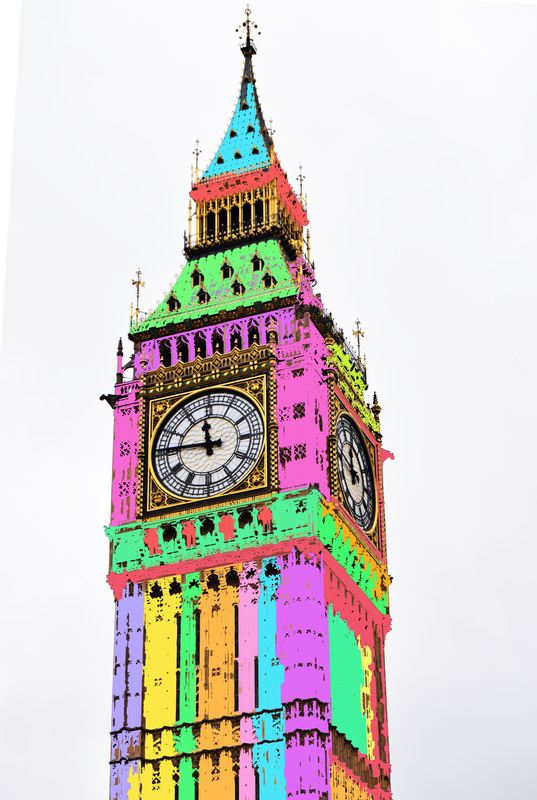
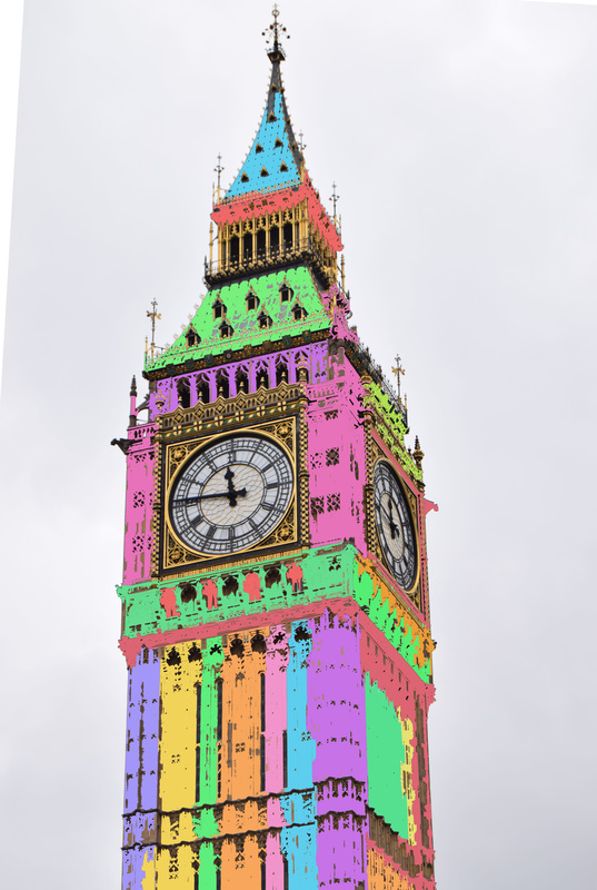
To create this edit I only selected the areas I thought ere better to colour in and to play around with the bright colours.
I have two examples of this photo, the first one is the high contrasted one, and the second is the normal one that I only edited the colours and not the contrast or saturation.
Out of the two of the edits, the one I like the best is my first one, because as I increased the contrast, the colours got brighter and prettier.
Developing a final piece
|
|
|
|
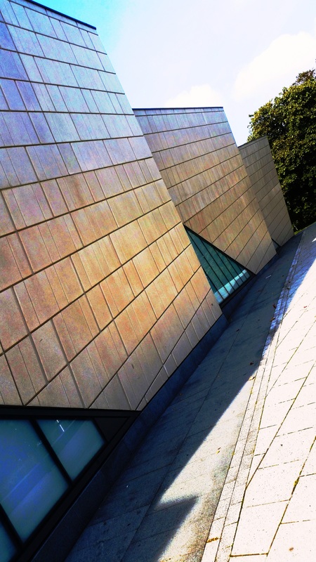
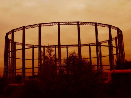
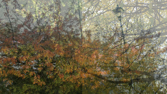
I used this picture because of the structure and because of the dark colour coming from the bottom, so I used what the image already had and just used a warm filter.
|
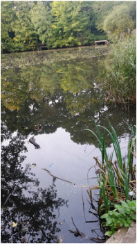
I didn't change almost anything in this stage, I just changed the contrast of it so the trees could be seen better and to give it a gradually colour change.
|
I'm really pleased with this edit, even though it didn't take as much work as my other edits.
And I'm glad that I could make this mixture of warm and intense redish colours.
And I'm glad that I could make this mixture of warm and intense redish colours.
I picked two of my street photos and overlapped them and duplicated the layer, and changed the opacity of it so the lines in each picture could connect together and create a type of a pattern.
|
I just used the opacity tool in this stage so I could see the lines connecting and to see if the looked good overlapped.
|
I changed the colour of each photo, the first one I changed to violet to make a different edit and changed the density of it so it wouldn't look to purple, instead of always changing the contrast and brightness. |
In this step I did the same that I did in the third step, use a colour filter but instead of using the violet one, I used a magenta one and also changed the density of it. |
|
To create this piece I inspired myself in the photos in the leaflet that were in our book to support us while we were creating these type of edits.
I enjoyed mixing up the shapes and colours in these photos and to create something like this in such a small time and something as good as what our teacher taught us. |
I connected this two pictures so it could create an illusion that it as the same picture.
|
In this stage I duplicated the layer so I could add another picture, with the same theme and then do another overlaying so my project could have 3 seasons.
|
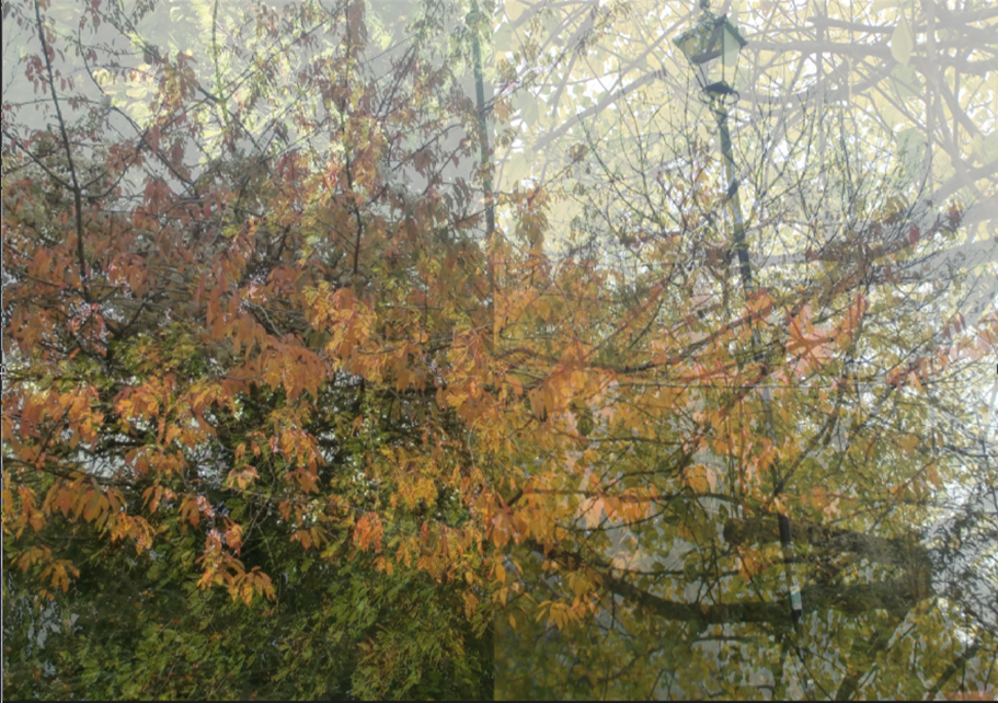
In this final step of this edit I changed the opacity of the third picture so it could fade in the other ones.
|
|
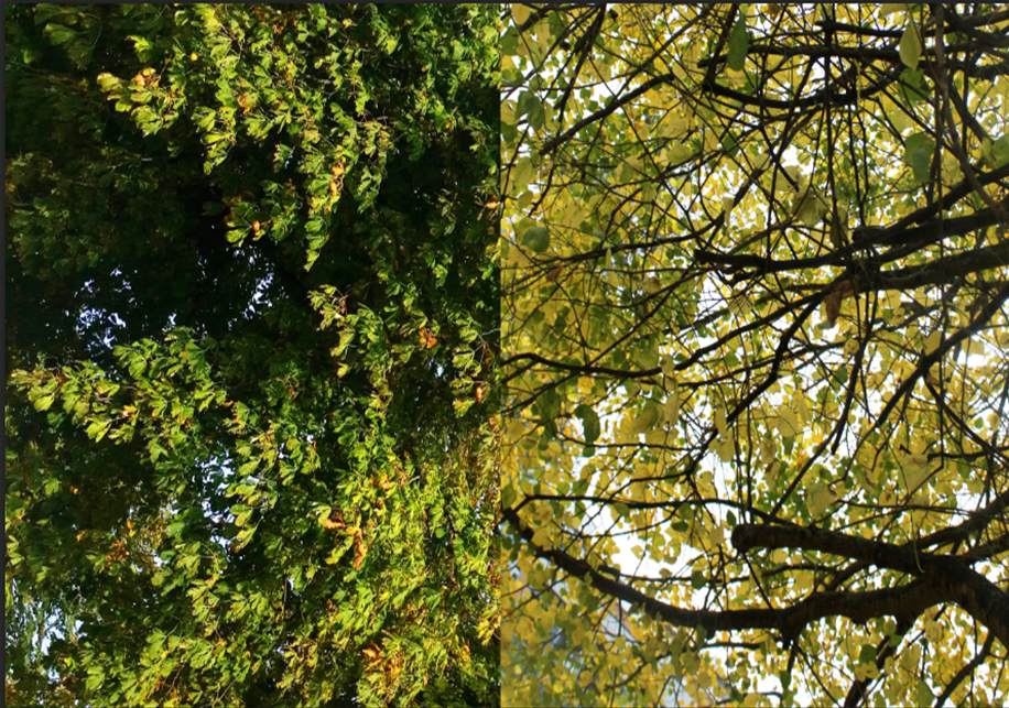
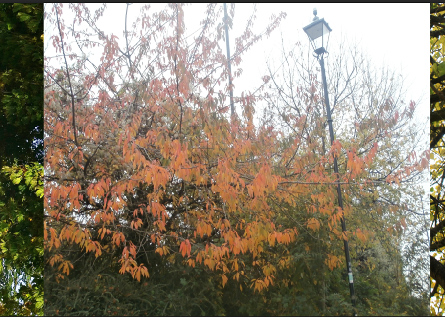
I thought about making this edit because I had loads of trees and leaves pictures so I decided to make a overlay of some of them with the theme, The four seasons.
|
Patterns
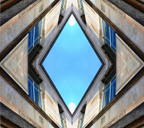
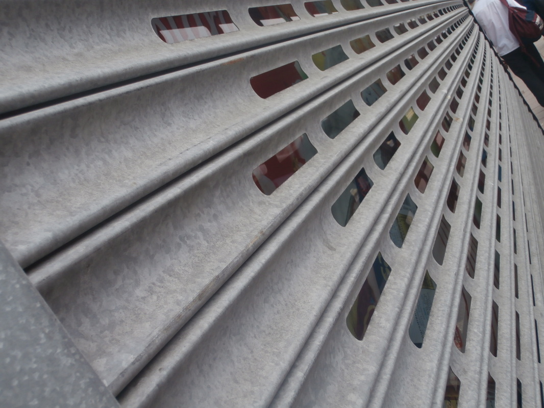
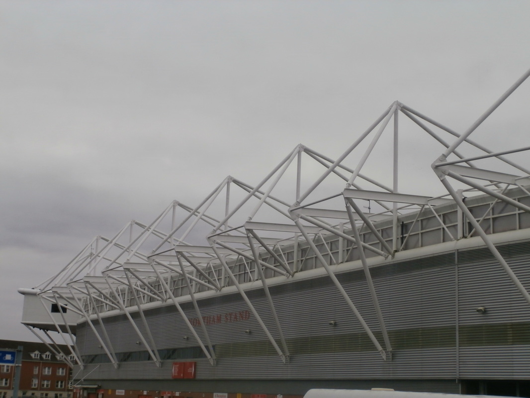
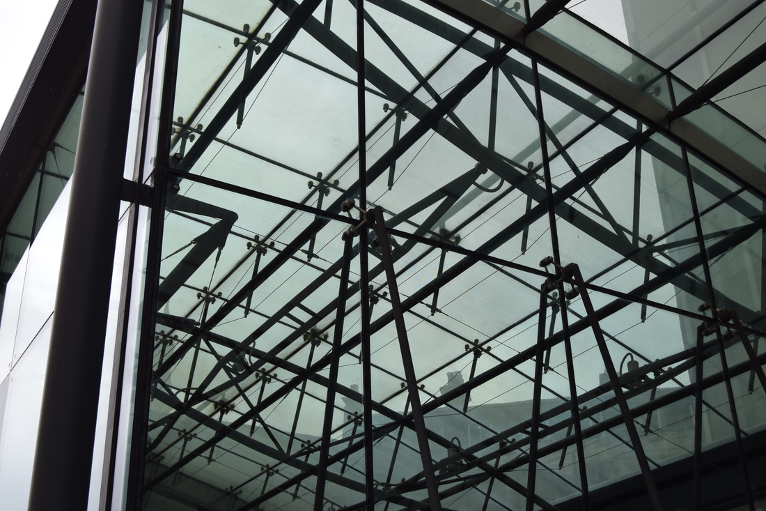
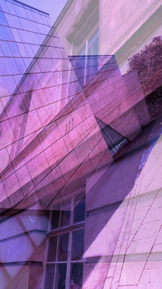
This edit shows loads of vertical lines all together to form only one image and create a diamond shape.
The texture of this edit is quite smooth in the middle because of the sky blue and in the sides the texture is also quite soft because of the lines on the walls joined together that form other diamond shapes and creates a optical illusion of the diamond getting wider.
I think that the white figures in the start of each end creates some light because my eyes go straight to it because it makes me remember a light bulb and if my eyes go straight to the white figures, probably the viewer eyes will also go straight to the same place as mine go every time I look at this image.
I am really pleased with this edit, I didn't think I could make something attractive as this edit, but I made it and I'm glad that I was capable to do it and I hope my work gets even better, as further I go on this project for my GCSE.
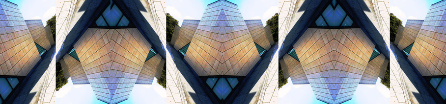
In this edit I did almost the same steps as I did in my other edit related with Moholy Nagy.
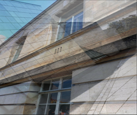
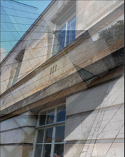
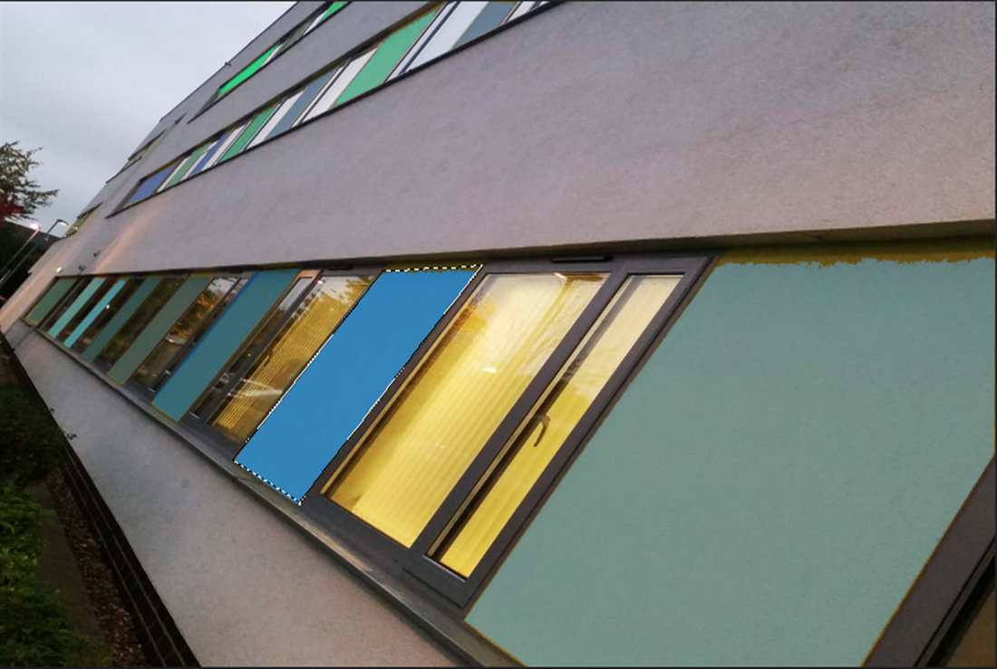
This was the first picture that I used for my edit and I duplicated the layer of this one so I could be able de overlay the same picture but edited.
|
To change the windows colours I used the polygonal lasso tool to select some figures and then use the colour bucket tool to change their colours into blue tones.
|
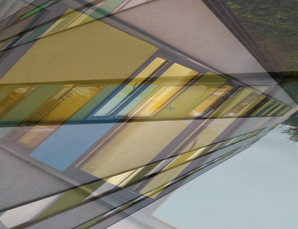
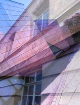
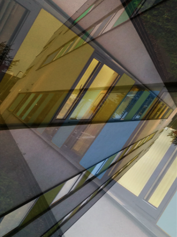
When I finished editing the other photo I overlayed it with the same photo but not edited and used the opacity tool to link in all together because of all the shapes and lines that it has.
|
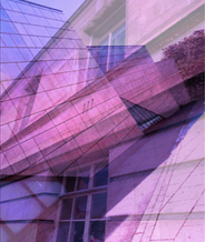
In this step I played around with the contrast tool and the density of it to make the colours in the photo brighter and more colourful.
|
In my opinion, this was the edit that took me a bit more time to create , because of all the tools I had to use and the techniques I used and to link the shapes and lines all in one image and to achieve this final piece.
I really like this edit because of all the colours used in the pictures and the high and low contrasts and in the way the link together perfectly even though they are the same photo but with just some edits and differences.
I really like this edit because of all the colours used in the pictures and the high and low contrasts and in the way the link together perfectly even though they are the same photo but with just some edits and differences.
