My initial response to repetition:
|
|
|
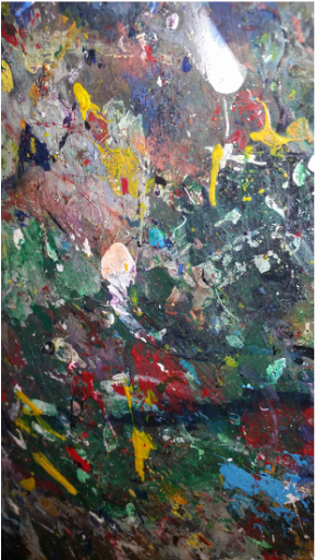
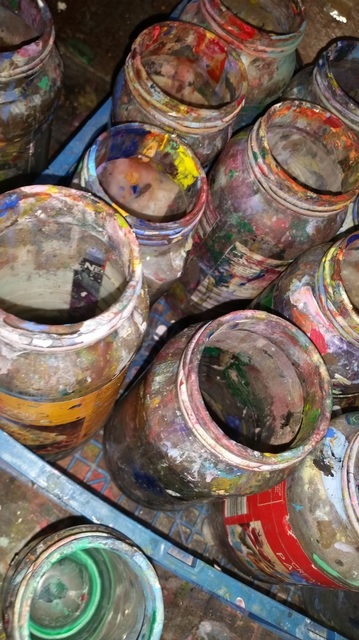
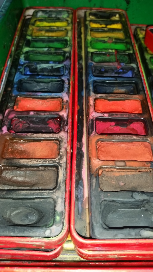
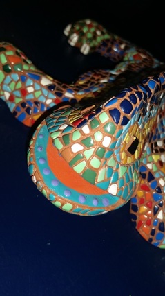
I took these pictures at some objects I found in the art room in school.
I photographed these objects because they are extremely colourful and they are all repeted in colour patterns because of all the mixtures of paint around.
I am going t use these photos for sure in one of my edits because I like the fact of the pictures being really colourful, and try and blend them together.
Using editing for repetition: Photoshoot
I took these pictures for my repetition project, even though they are single images I am going to be editing them and repeating them to relate them with my chosen photographers.
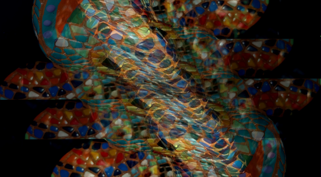
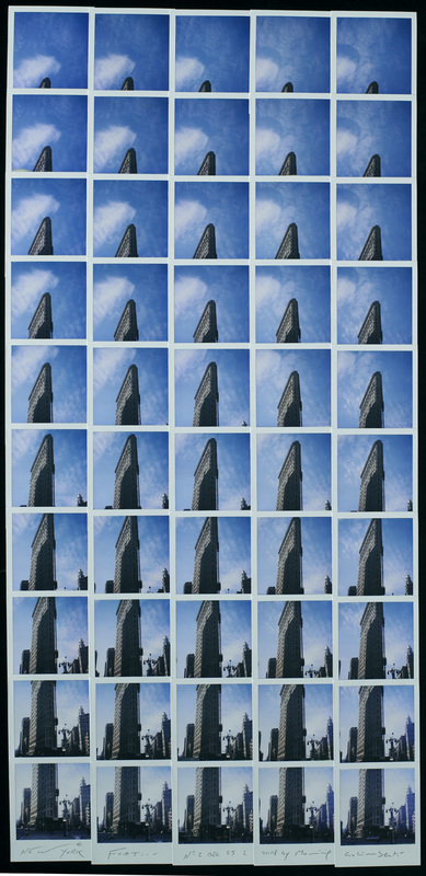
I used this mini landmark from Barcelona to edit it using the repetition theme, I duplicated the layer several times and rotated, and I also used the opacity tool a lot. The picture down below is the result of my editing.
|
|
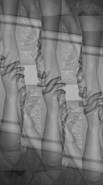
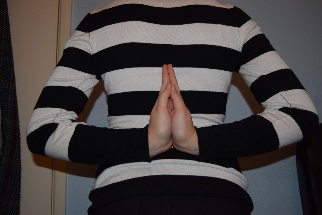
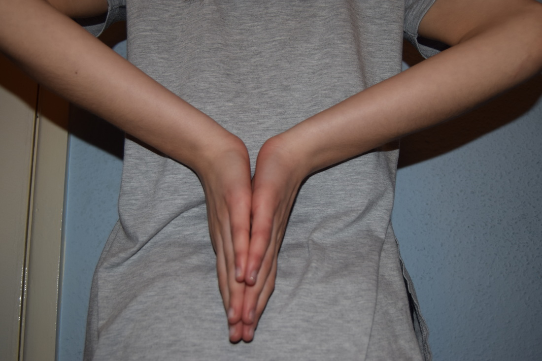
This photo is an edit that I did from the picture above and changed it to black and white, and then just duplicated the layers some times and rotated it, so it could create the effect as there was 3 people holding hands in the same way.
I like the way all the hands and arms link together as just one picture. |
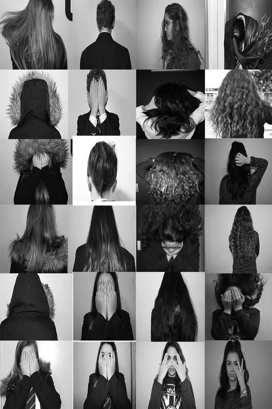
My response to repetition:
|
|
|
|
|
|
|
|
|
|
|
|
|
|
|
|
|

|

|
|
|
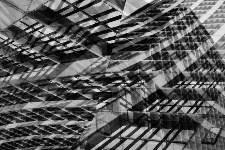
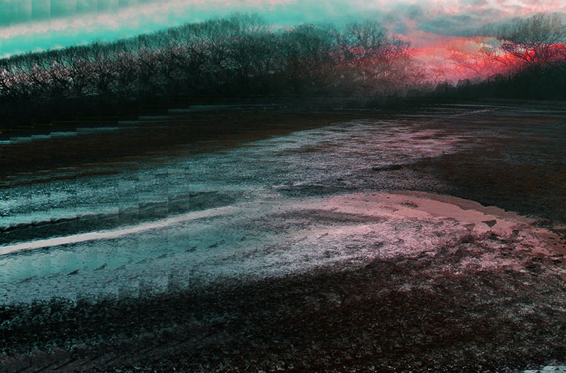
This edit, I used only one picture for this edit. I turned it into black and white and increased the contrast and just over layed them and leaved the line in the middle, as you can see, on purpose. This edit consists in a bunch of patterns and geometric angles.
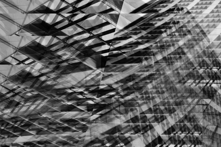
This is the edit you can see above this one, but I blended it just to experiment, I just blended it on one side.
Maurizio Galimberti:
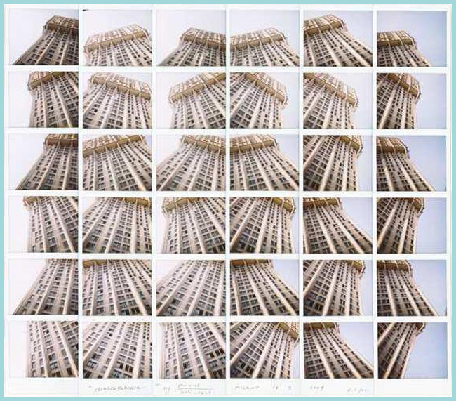
Maurizio Galimberti Italian photographe, born in Como in 1956 and grew up in Meda. He was trained as a survejor and in the building sites he developed his rigorous view with which he will impress the world of art. Since he was a young man, he won many photography competitions even under his mother or his wife name.
My response to Maurizio Galimberti:
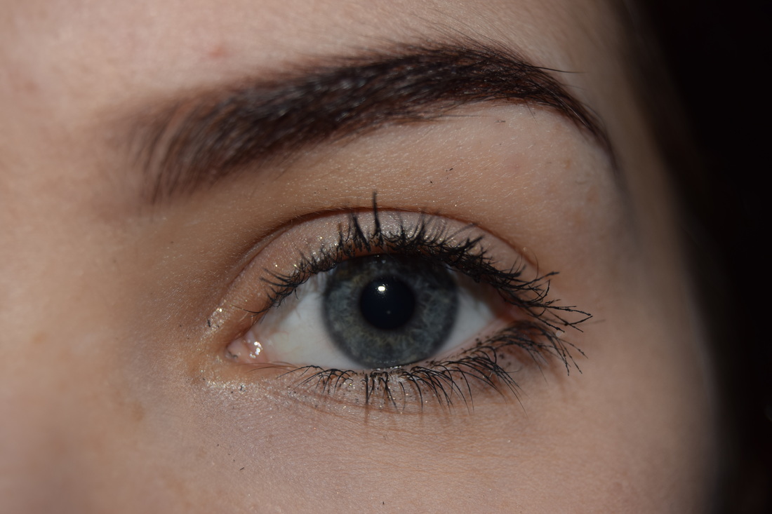
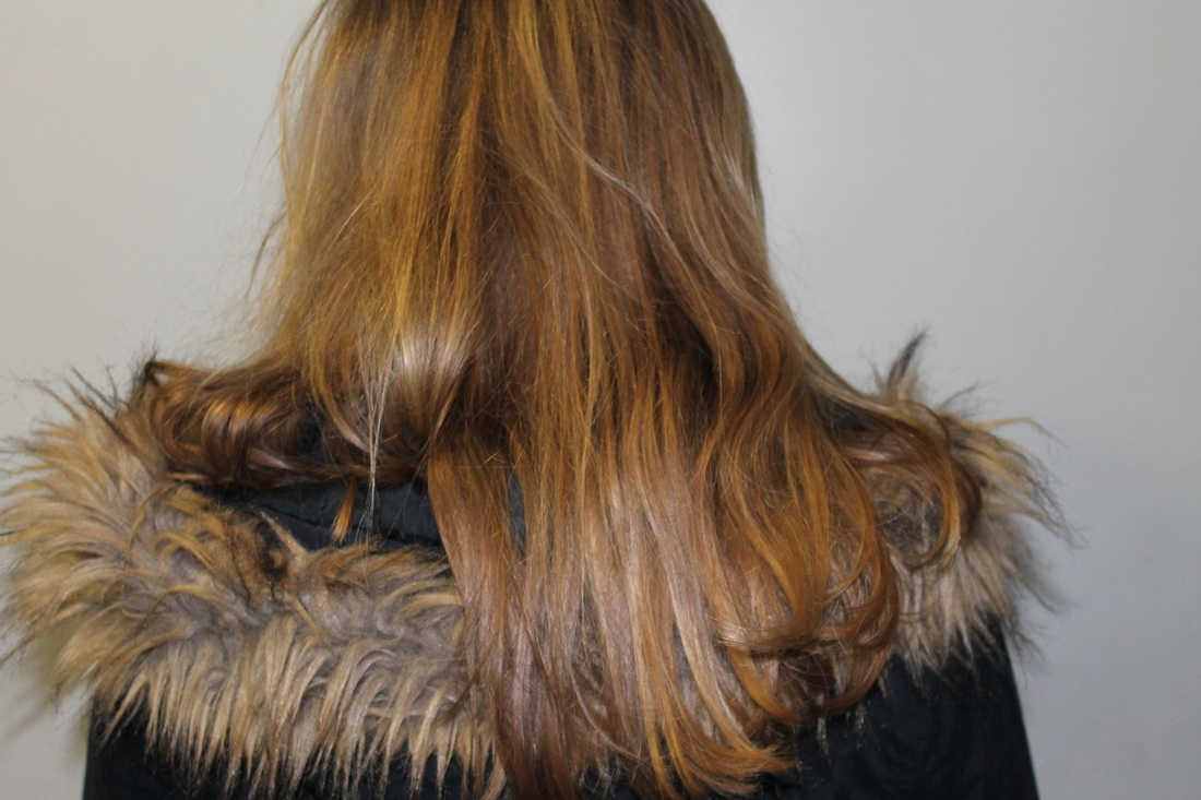
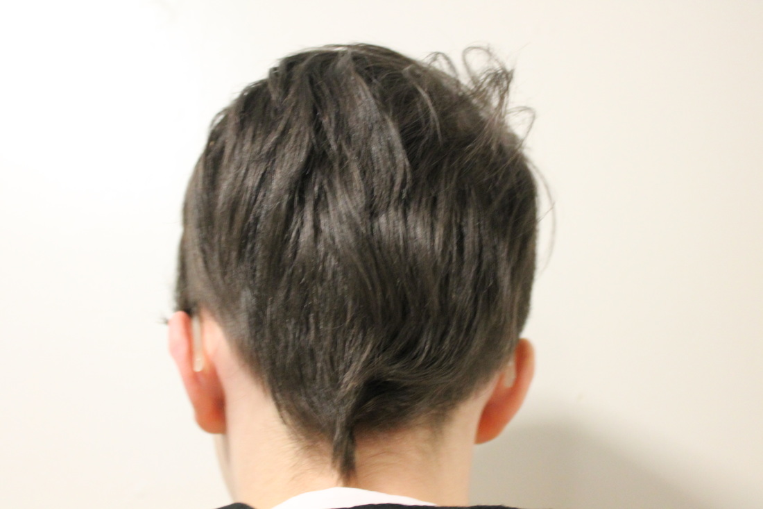
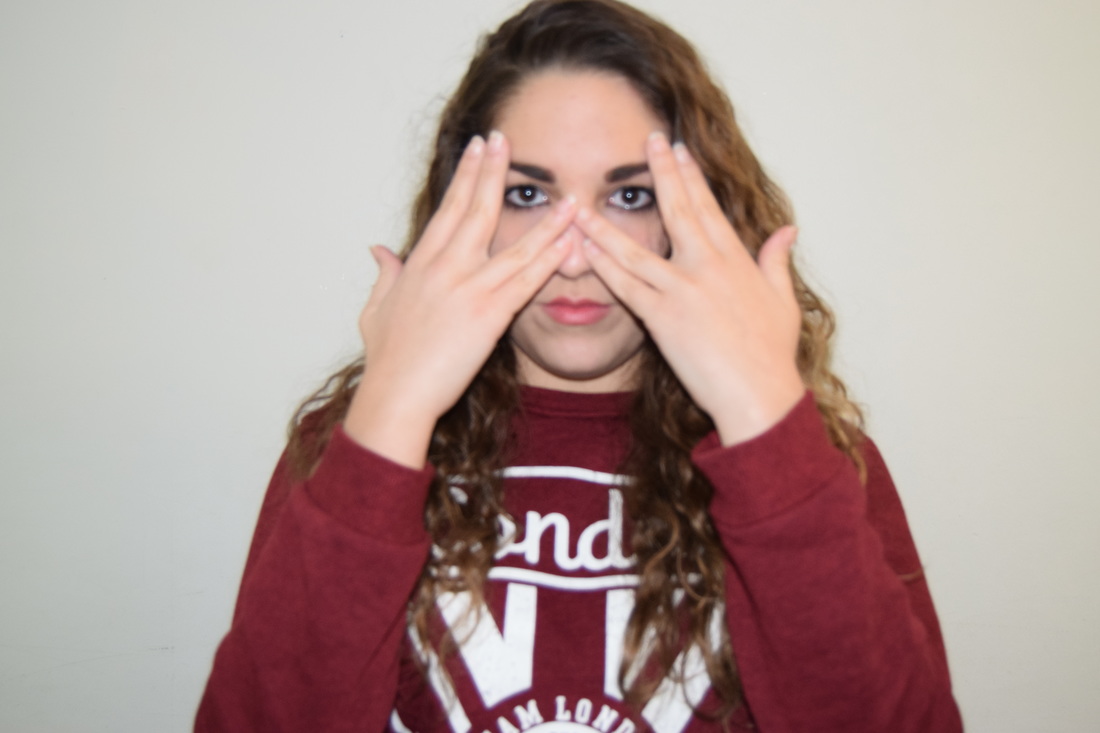
This is the original photo that I used to create the edit down below.
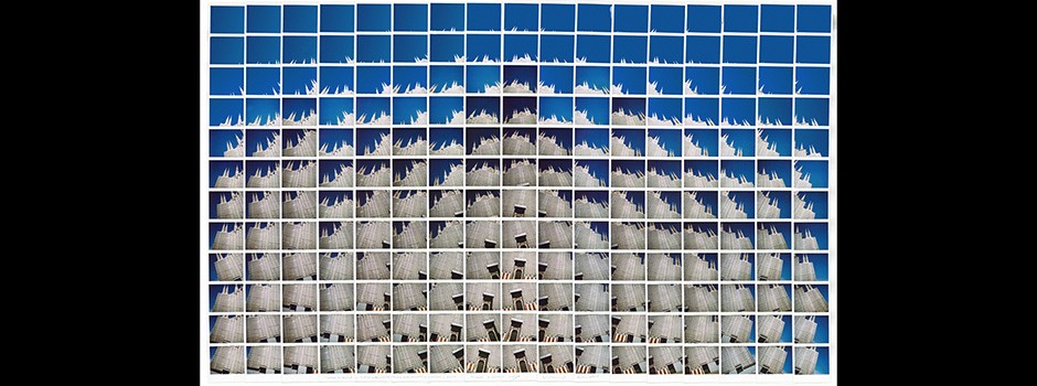
Using collage:
To do this edit, to respond to Maurizio Galamberti I did this edit that took me a bit more time than usual, because I had to cut all the stripes with the same measurements and lay them where the made sense.
I used two photos for this edits, the same picture, but one normal and the other one flipped sided.
I used two photos for this edits, the same picture, but one normal and the other one flipped sided.
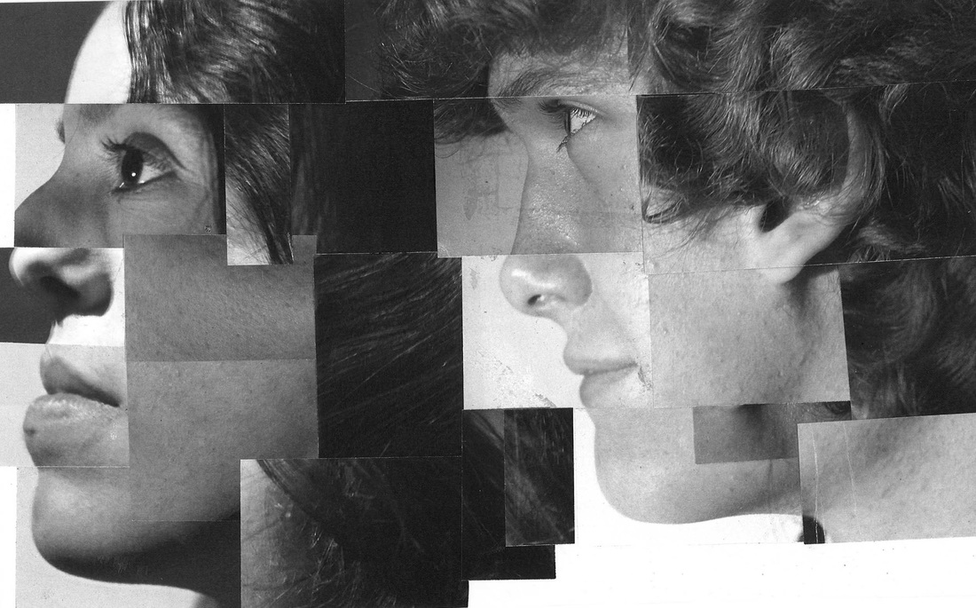
For this edit I used Maurizio Galimberti's work as an inspiration to create this, I used his collage method, but instead of having all the same measurement, I chopped them up in uneven bits and just combined them together.
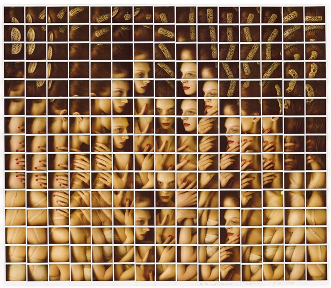
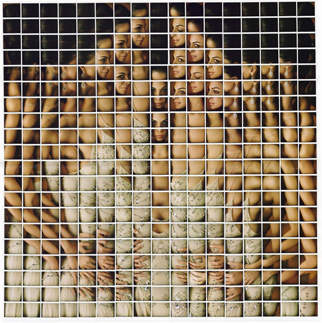
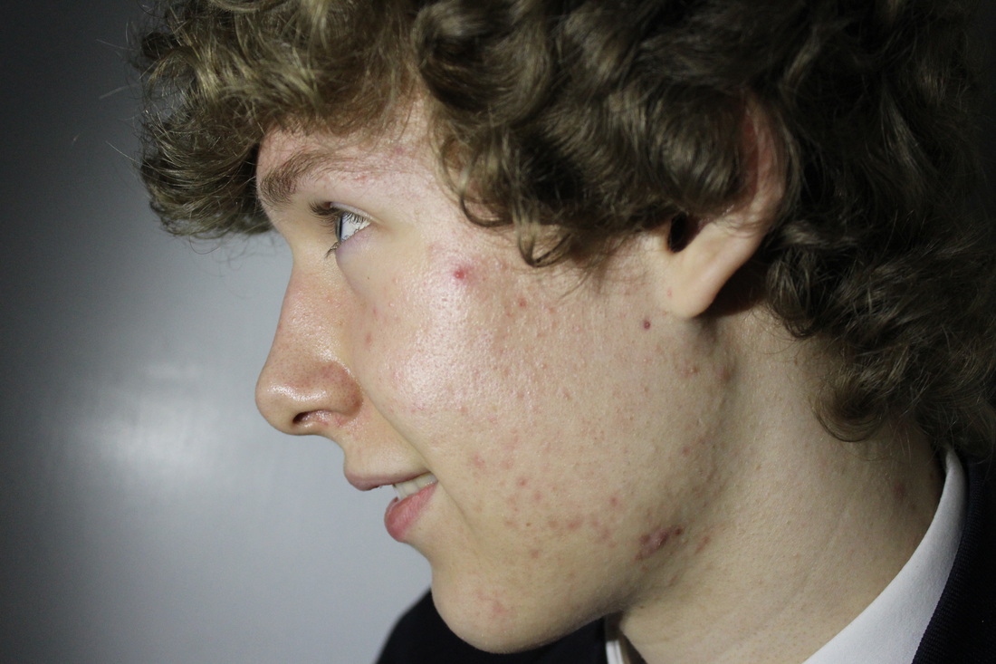
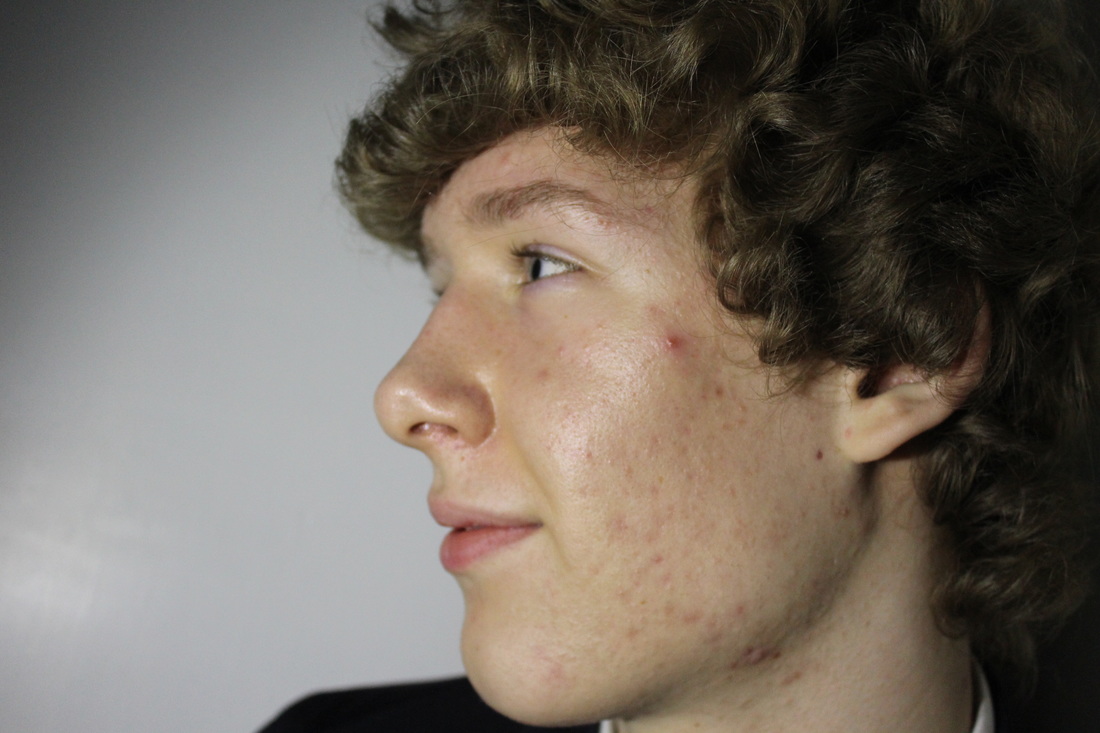
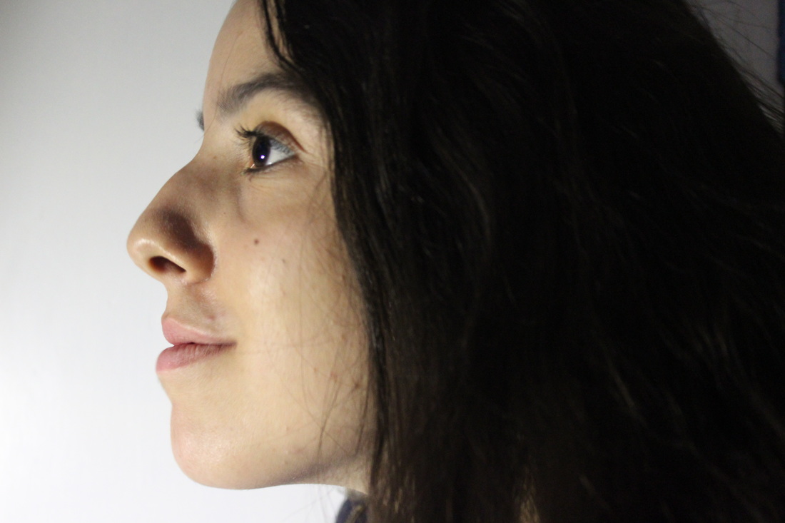
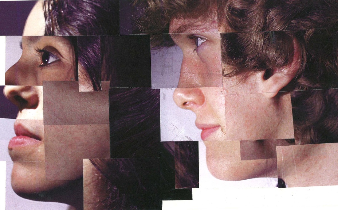
I used different facial bits from different photos, and mixed them together.
To start I edited the boys photos, reduced the amount of spots and took a bit of brightness, and mad the skin not look as red as in the original.
Then I printed them all out and chopped them into uneven bits and mixed them together and mixed the girl's and boy's, I used different face bits on the two sides.
Étienne-Jules Marey:
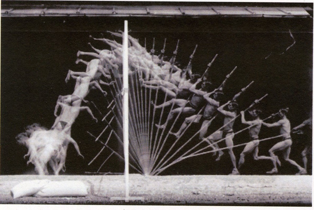
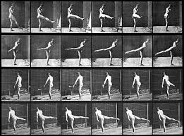
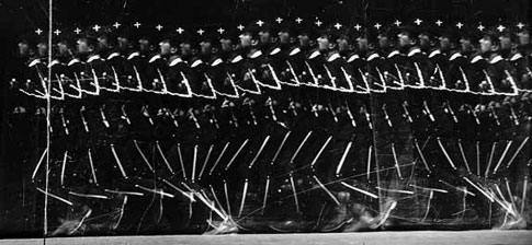
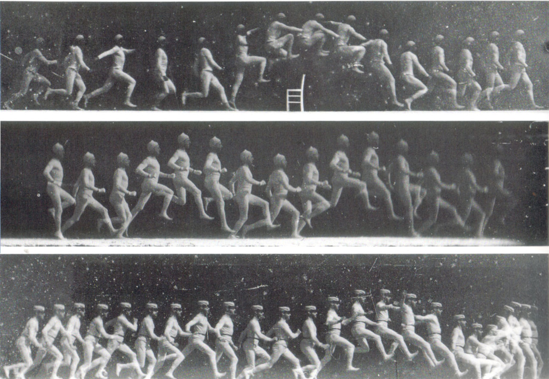
A French physiologist and chronophotographer born at Beaune, France in 1830, Marey went to Paris in 1849 to enrol at the faculty of medicine and to study surgery and physiology.
Marey used dry photographic plates, faster than the wet plates Muybridge used, and an ordinary camera with its lens left open.
Marey used dry photographic plates, faster than the wet plates Muybridge used, and an ordinary camera with its lens left open.
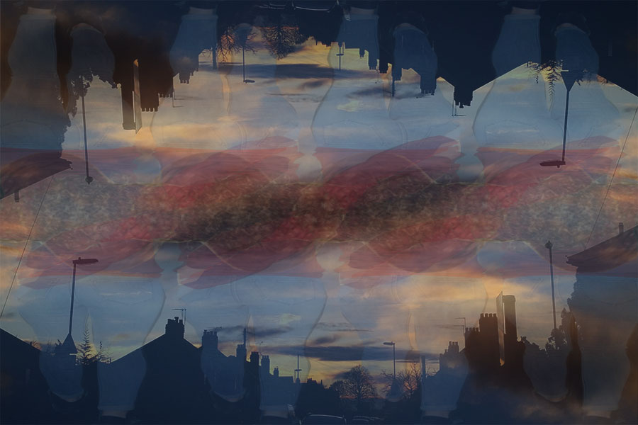
My response to Marey
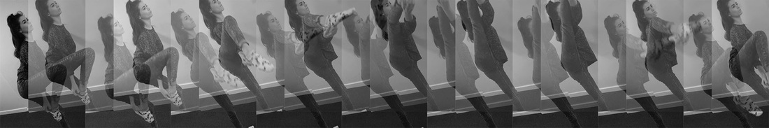
I tried my best t recreate this difficult type of edit, but anyways I managed to re create it the best I could, putting all the pictures in order first and over lap the layers over each other, and changed the opacity.
A further response to Étienne-Jules Marey:
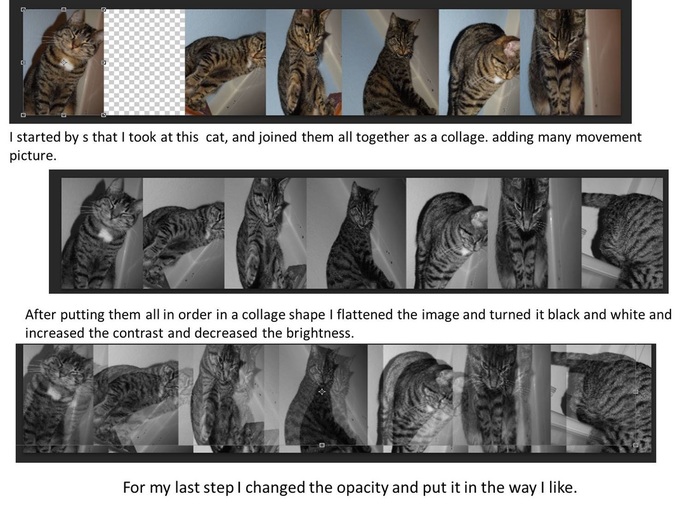
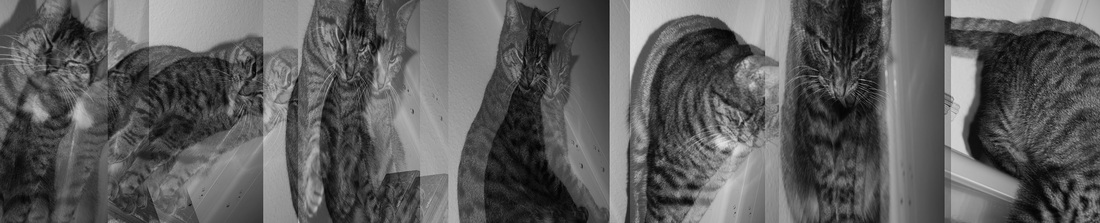
This is my final result of my response to Étienne-Jules Marey work.
Santiago Sierra:
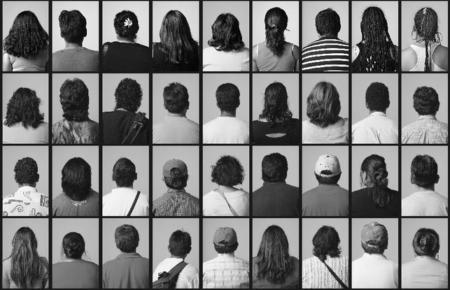
Santiago Sierra born 1966 is a Spanish artist. He lives in Madrid. Santiago Sierra’s understanding of the relationship between work and freedom in contemporary society, by focusing on a series of works where the artist hired someone to perform a specific activity. This is my favourite creation from Santiago Sierra, and it's the one I am going to get some inspiration for my next repetition creation.
My response to Santiago Sierra:
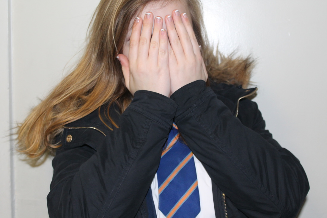

These are my original pictures that I used to create the collage down below. as my response to Santiago Sierra.
I tried to recreate Santiago's piece of work, but instead of just taking pictures of the back if their head, tired other poses and different ways of expression. I wasn't able to have a black thick line between each picture because I forgot.
Developing my response to repetition
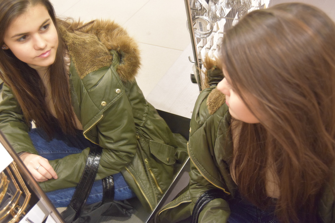
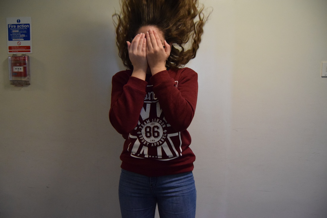
This is my original picture that I used to create this piece down below.

To this edit I called Brain Blur, because when I look at it, it makes my eyes go weird.
For this edit, I only used 2 layers of this picture and over layed them and made the contrast higher and changed the opacity, so it created the blur effect.
I got the high contrast idea from the photographer, Keld Helmer Peterson, and the rest of the edit I just made up and edited as it went when then the blur idea came to my mind, as is you were looking at the picture while drunk.
Repetition in architecture:


Albert Renger-Patzsch:
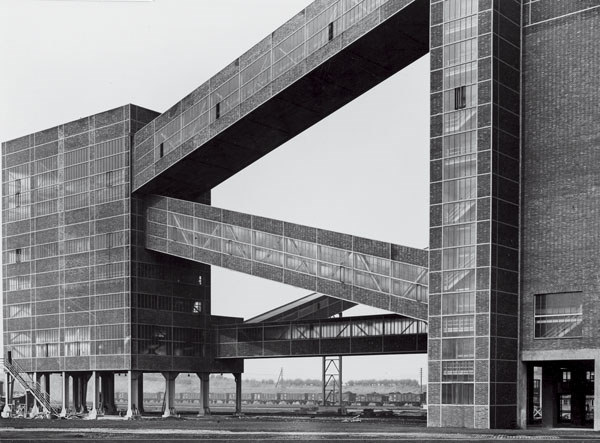
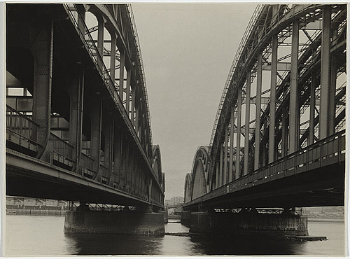
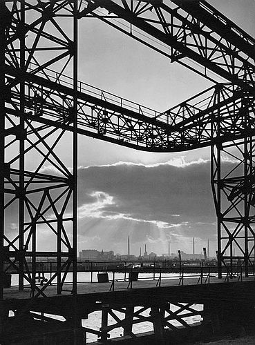
Albert Renger-Patzsch, born in June 22, 1897 and death in September 27, 1966, was a German photographer associated with the New Objectivity. Albert Renger-Patzsch's work in my opinion, is all about black and white and emphasising the strong lines that they have. I am going to get some inspiration from his work and use it in my exam, because my exam theme is about repetition and I can see that in some of his work he uses it a lot.
Harmish khambhaita:
Even though this photographer is not famous and does not have many photos, I got inspired by this piece of Harmish, because its my photography style and has a lot of lines and repeated patterns and it has a high contrast.
My piece down below is one of my edits I had done before I found this photographer and I think they relate, because both are in grey scale and both have two halves that are different.
My piece down below is one of my edits I had done before I found this photographer and I think they relate, because both are in grey scale and both have two halves that are different.
|

|
These are my two responses to Harmish. I think they are related to him, specially the first one because of the horizontal line separating two different sides of the building. I'm not sure if he mixed two different pictures to create this edit but I tried my best in my response.
My second response, is an edited that I had created before I found this photographer but I think it relates to him in some way because of the horizontal line in the middle and in the fact both images are black and white.
My second response, is an edited that I had created before I found this photographer but I think it relates to him in some way because of the horizontal line in the middle and in the fact both images are black and white.
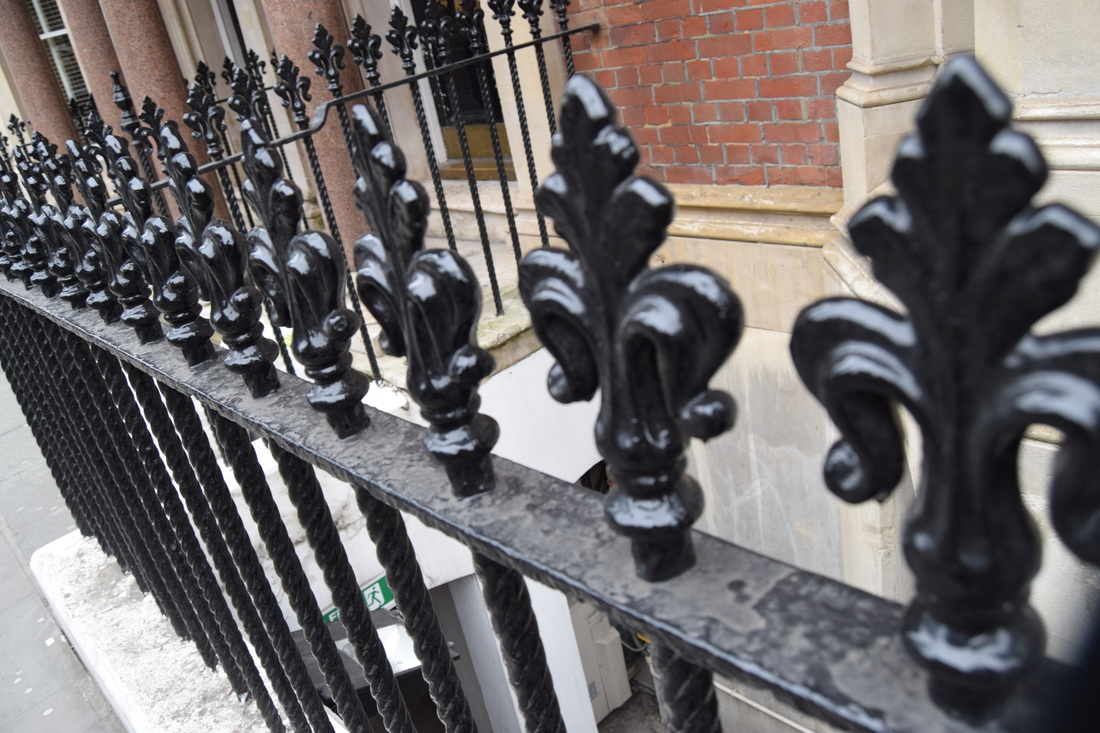
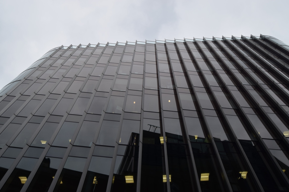
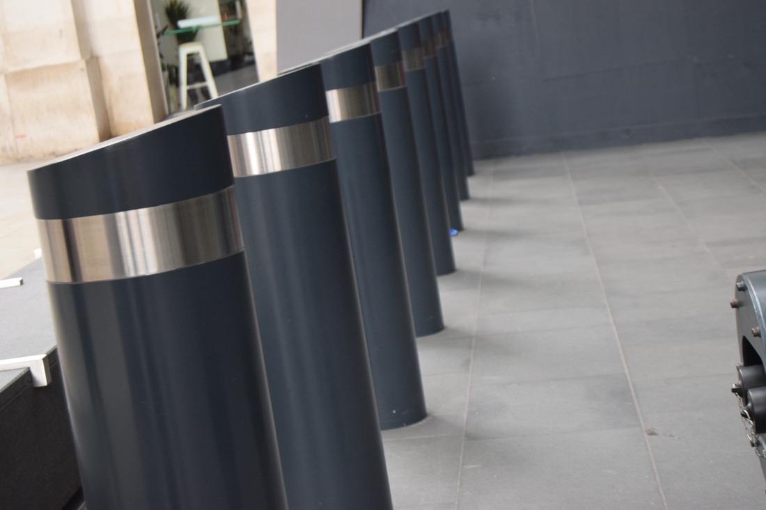
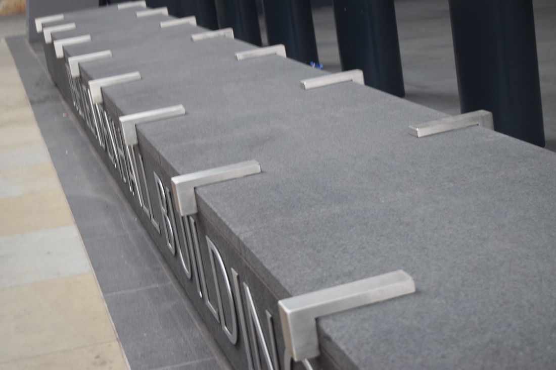
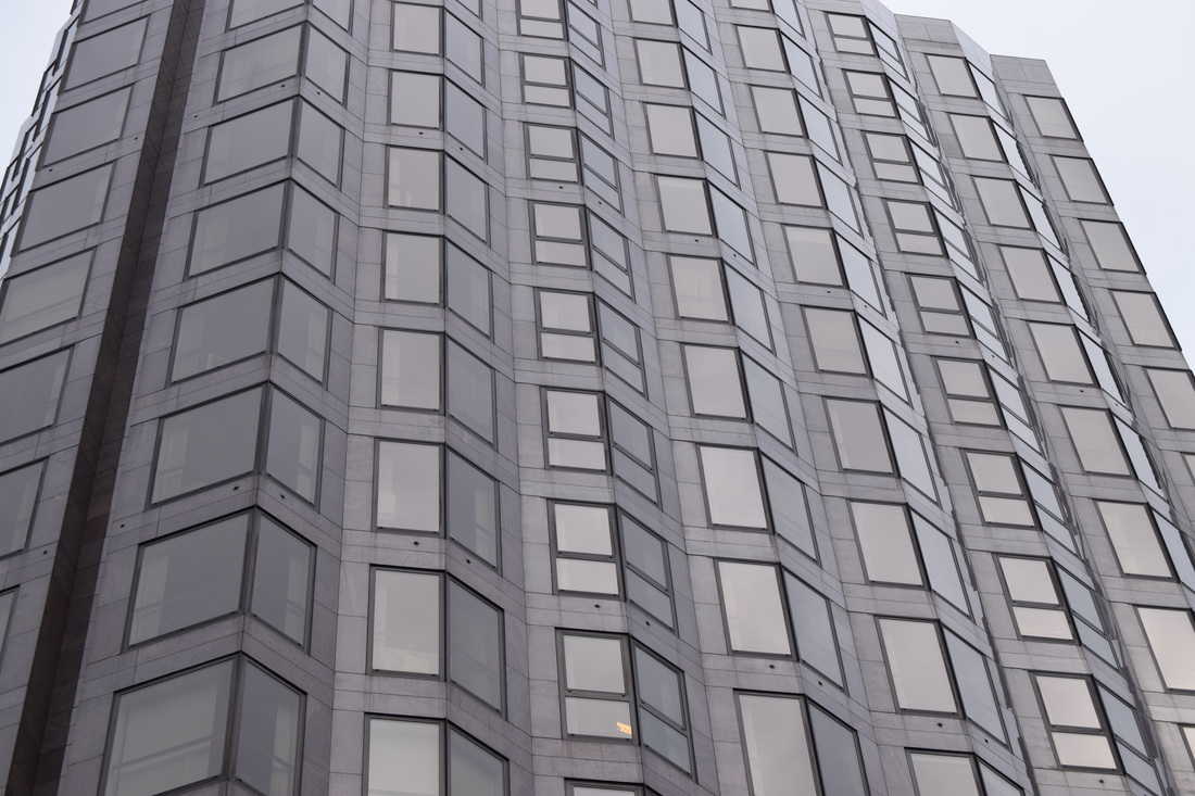
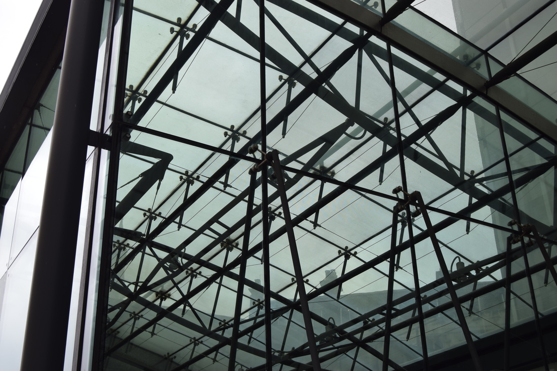
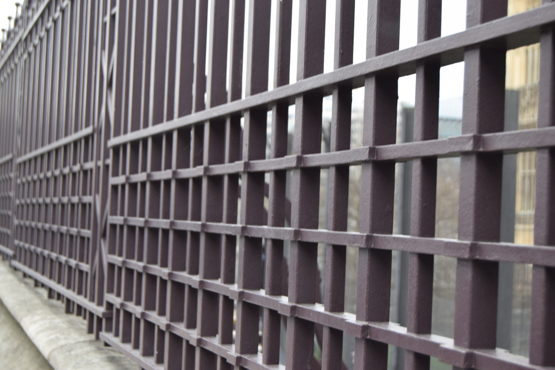
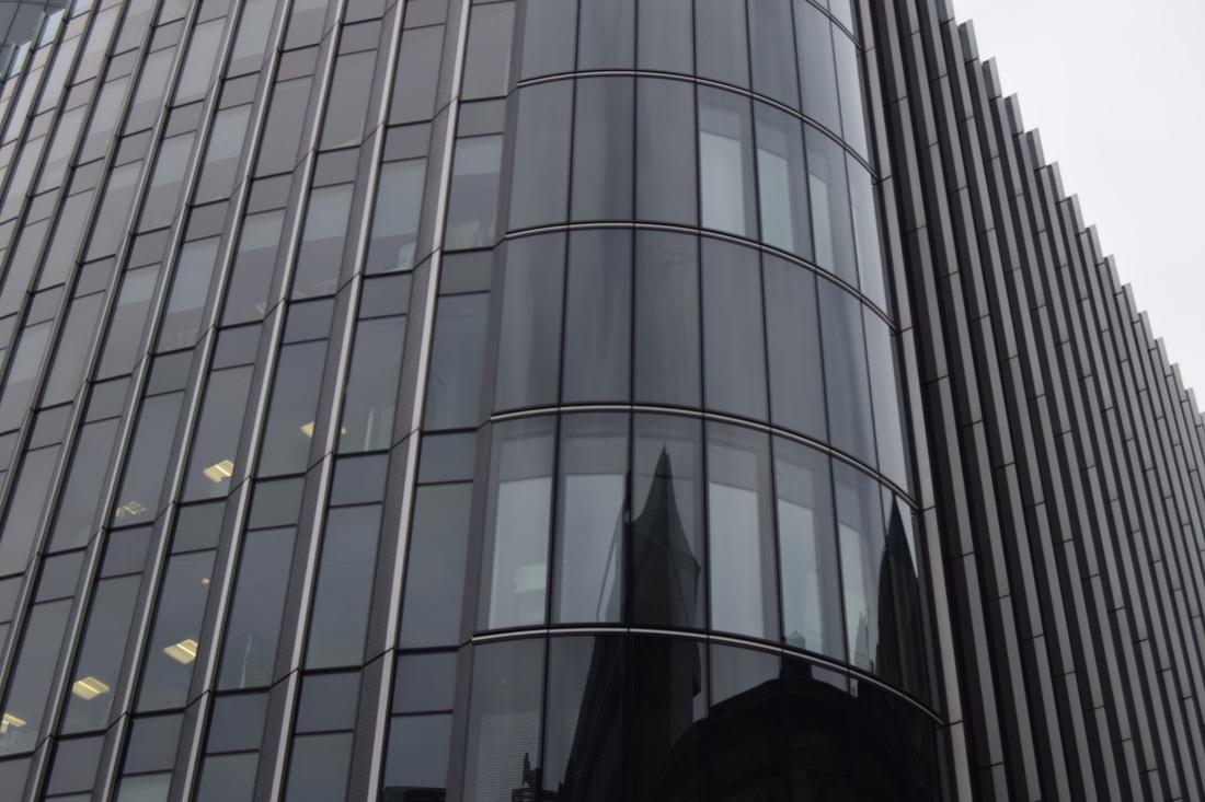
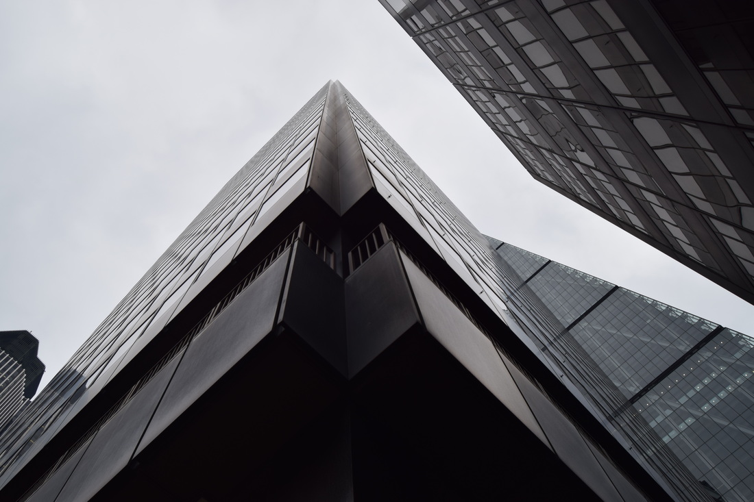
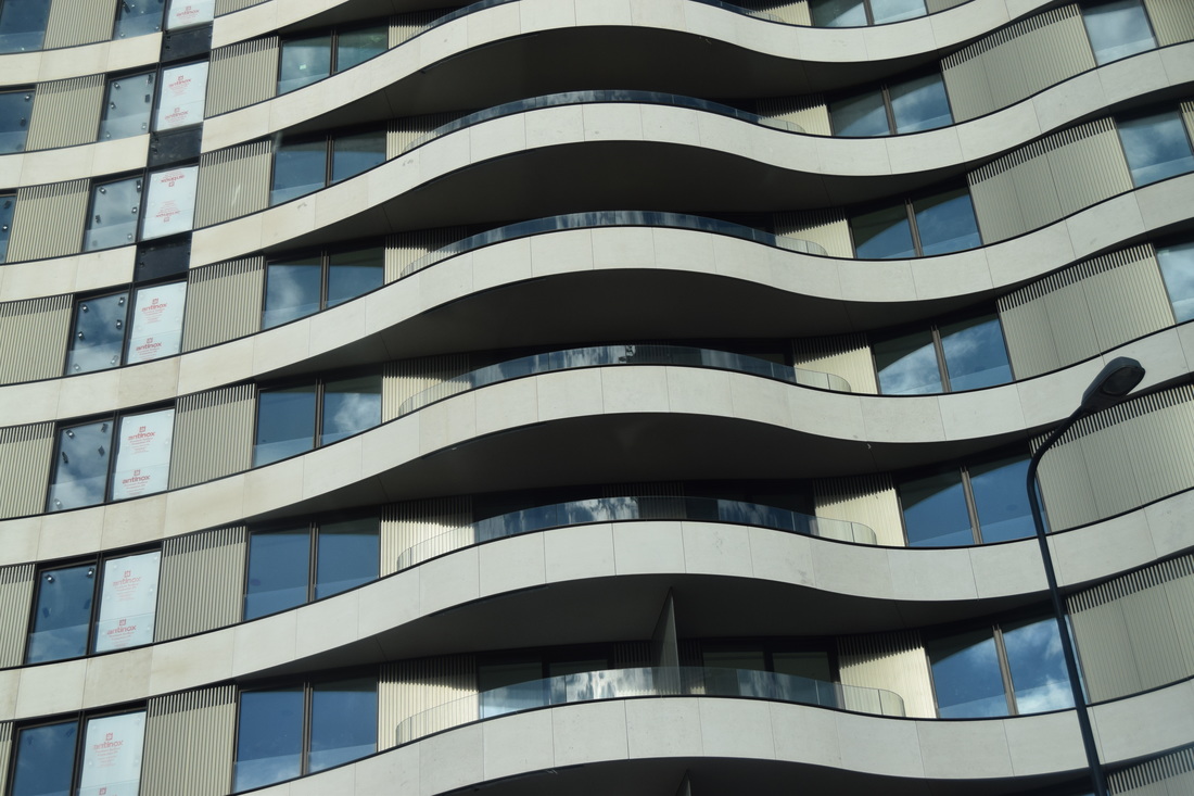
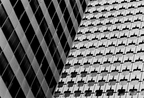
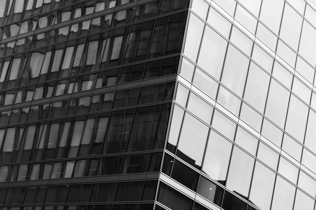
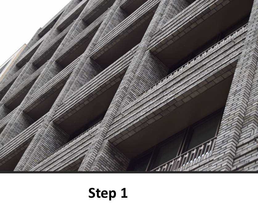
Best pictures for this project:
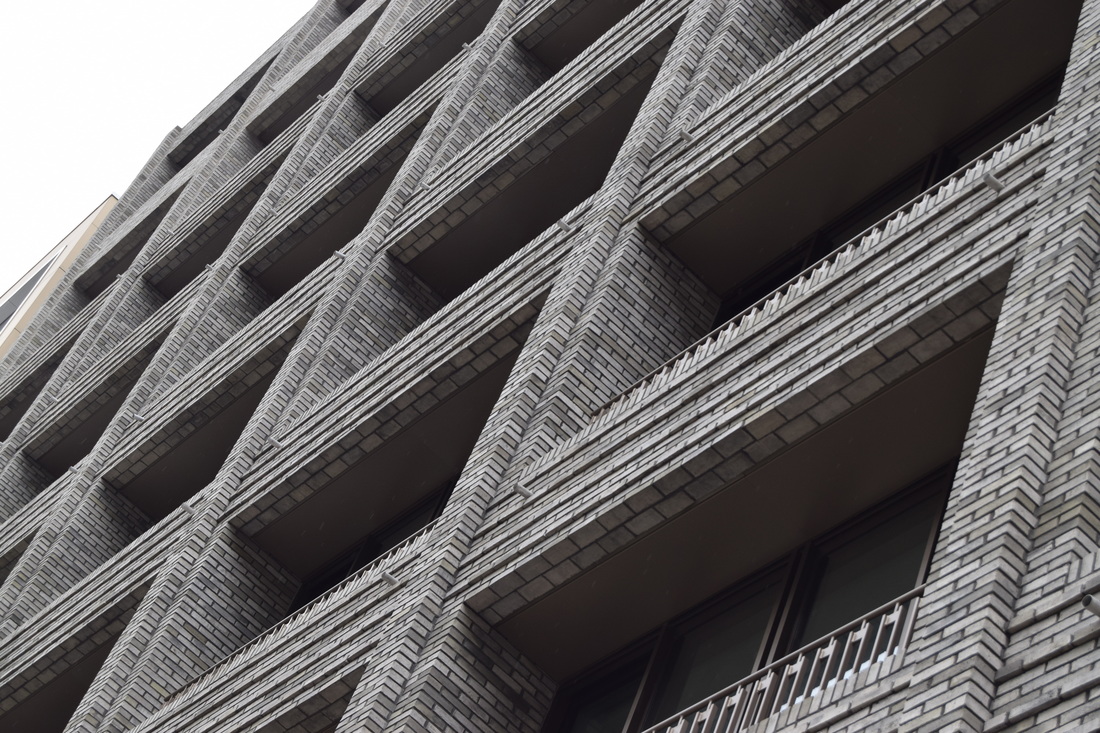

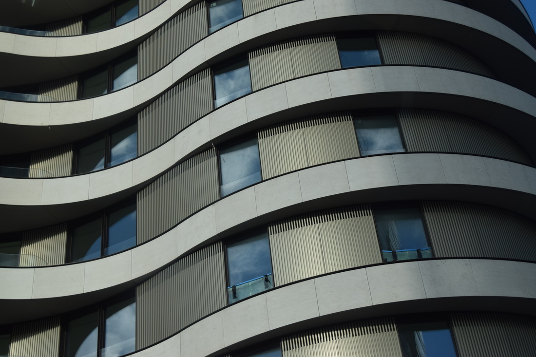
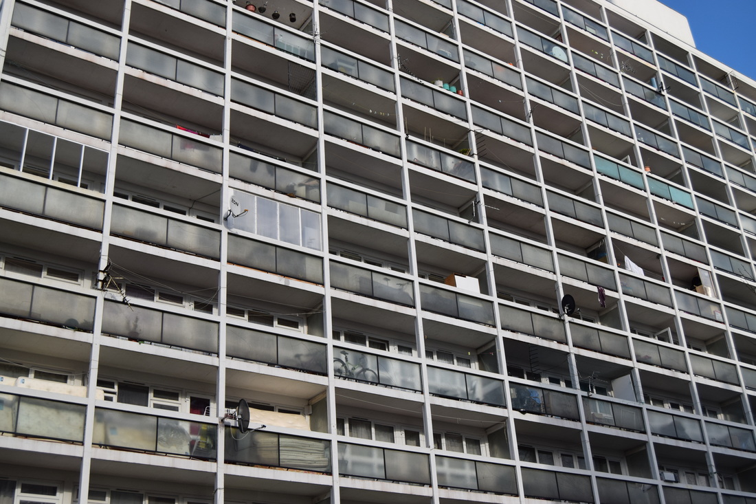
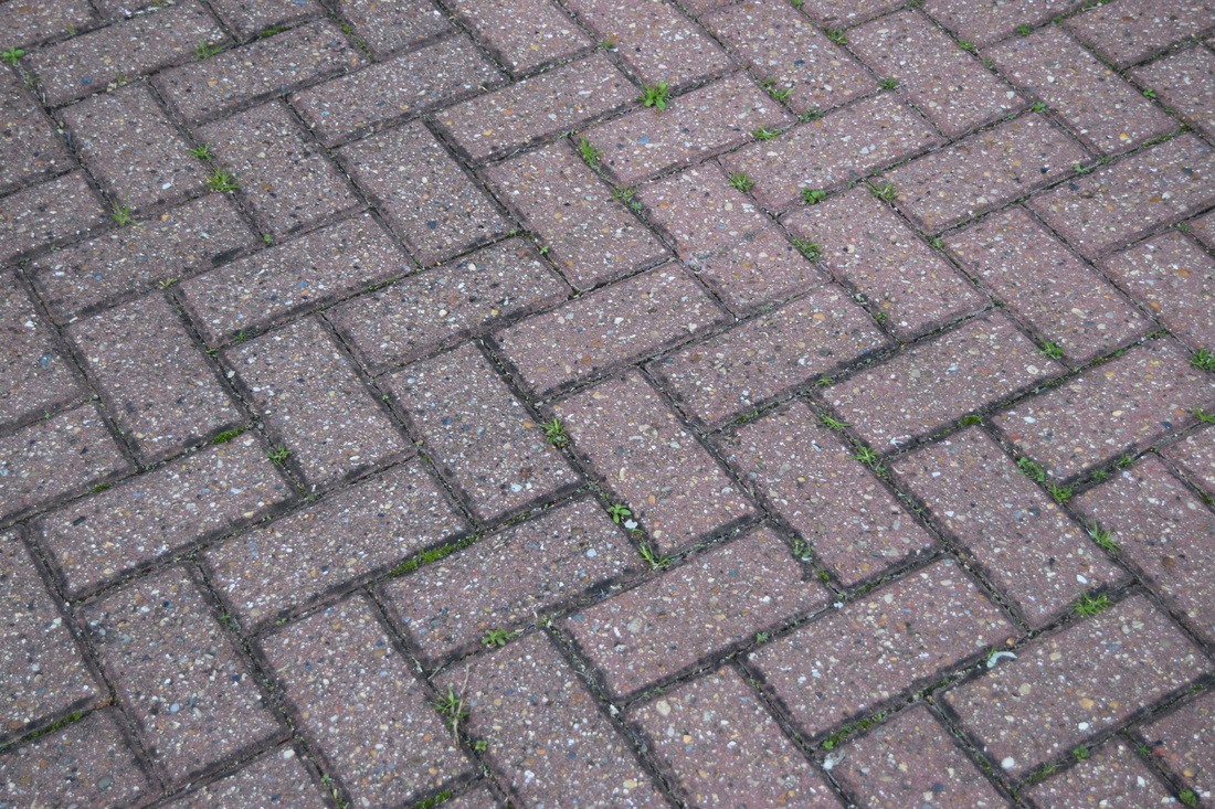
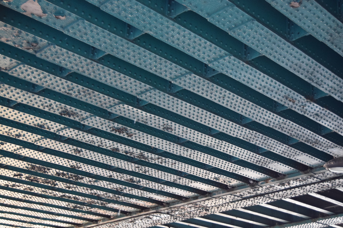


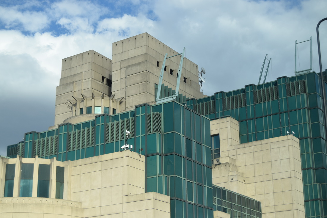
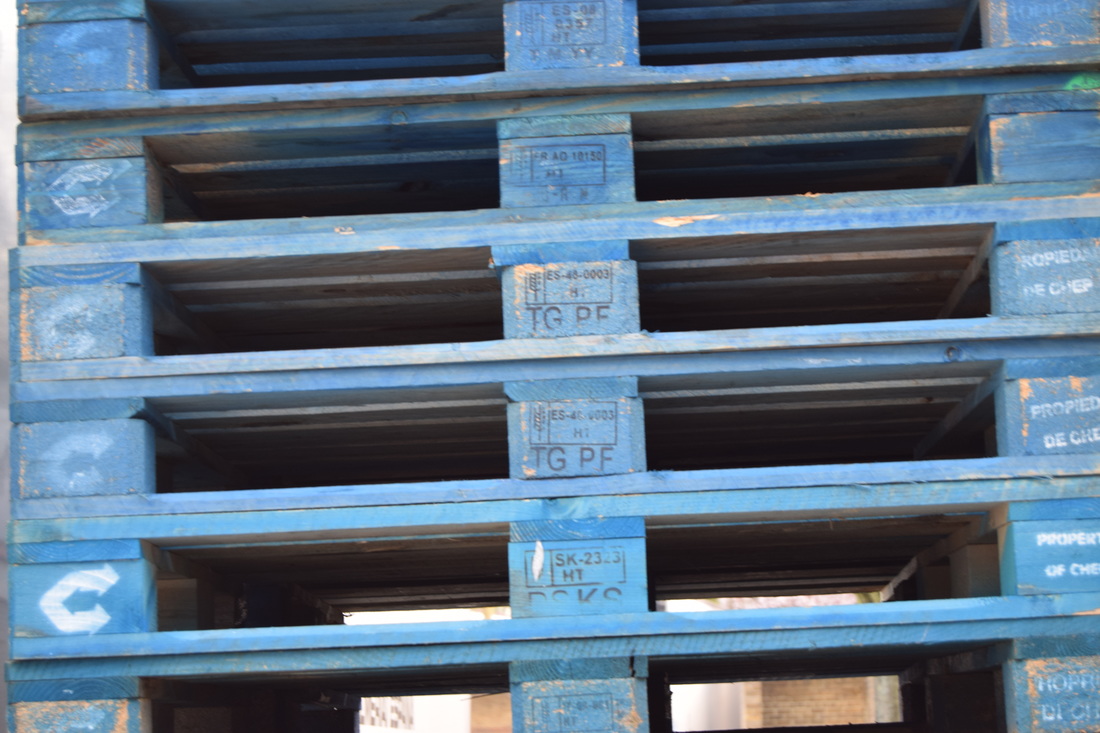
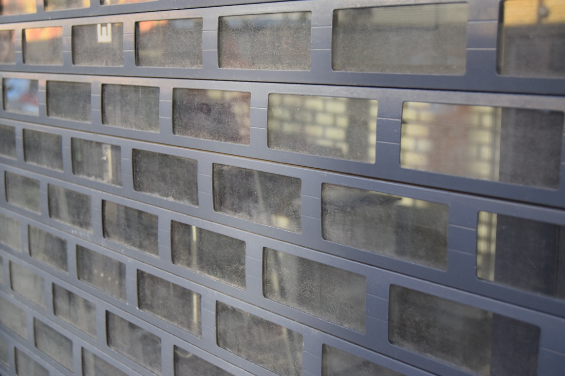
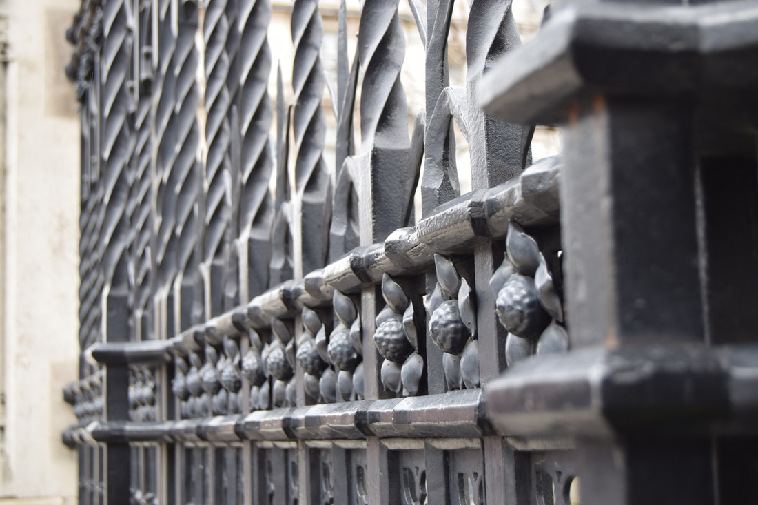
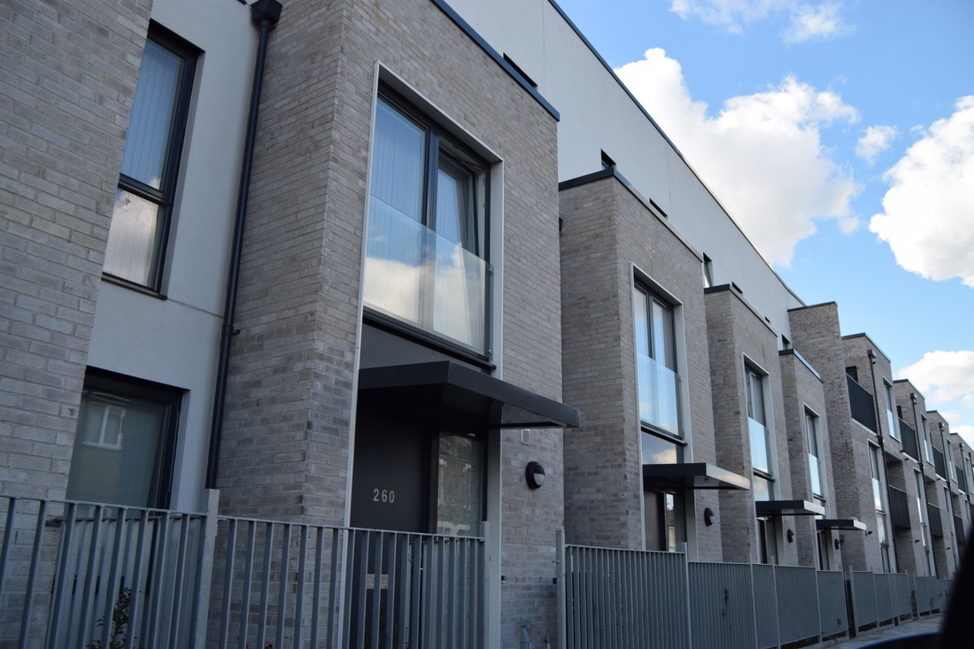
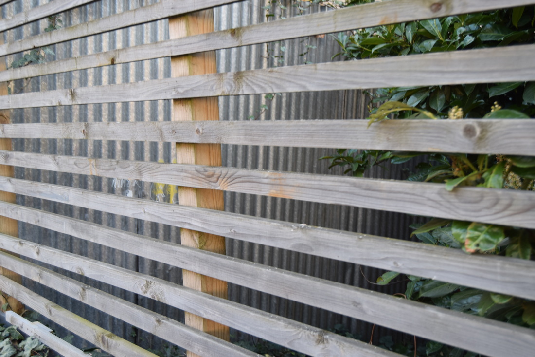
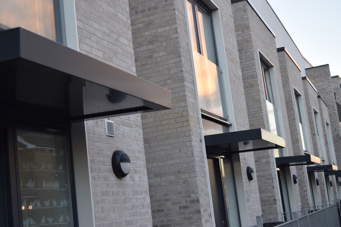
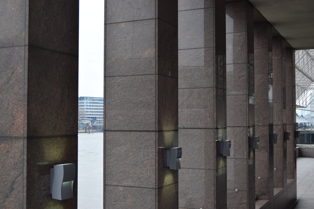
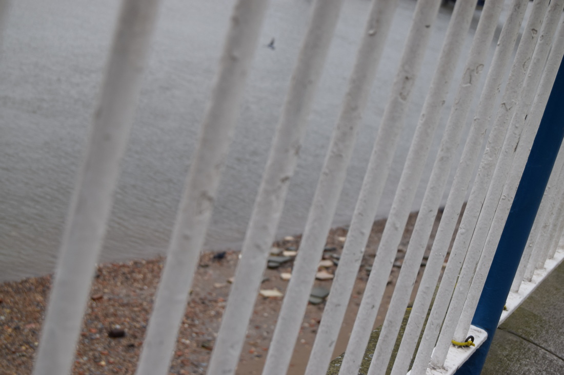
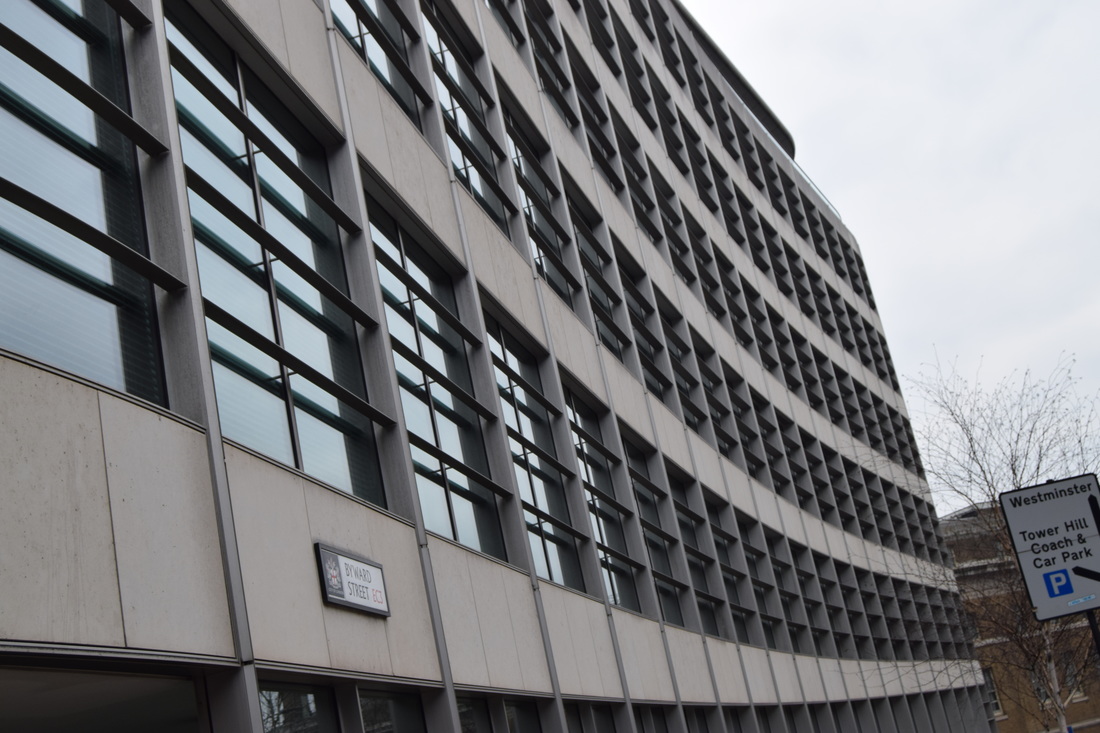
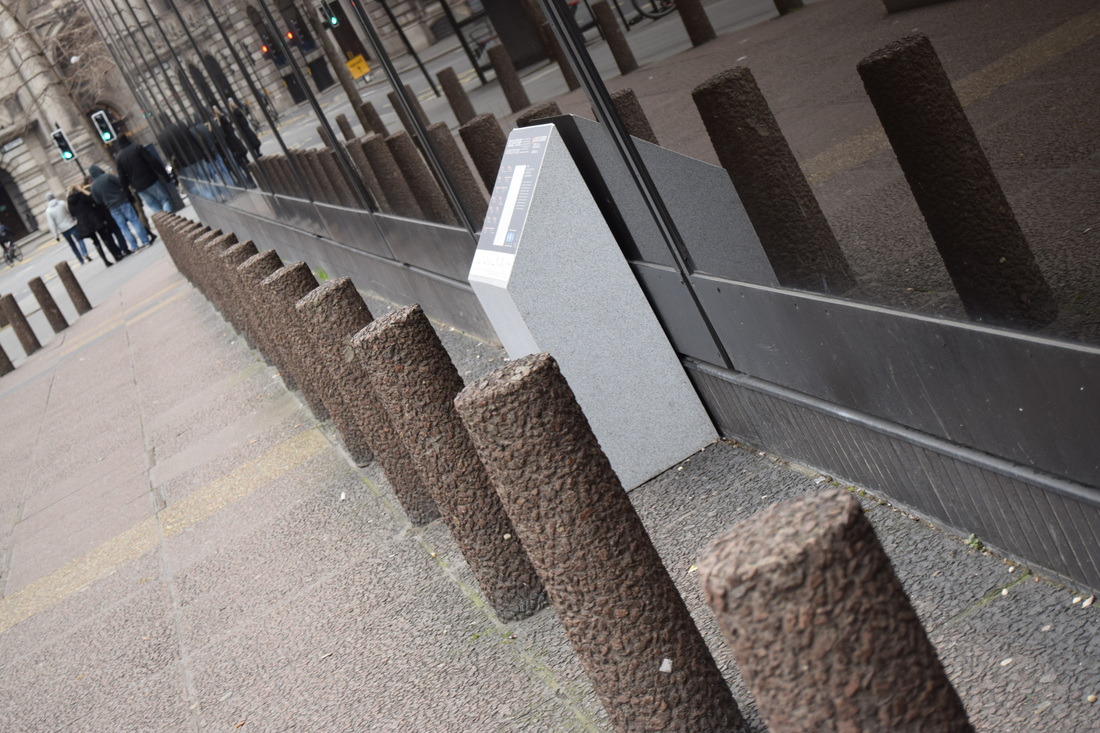
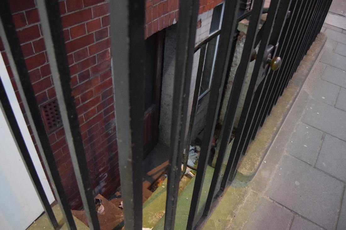
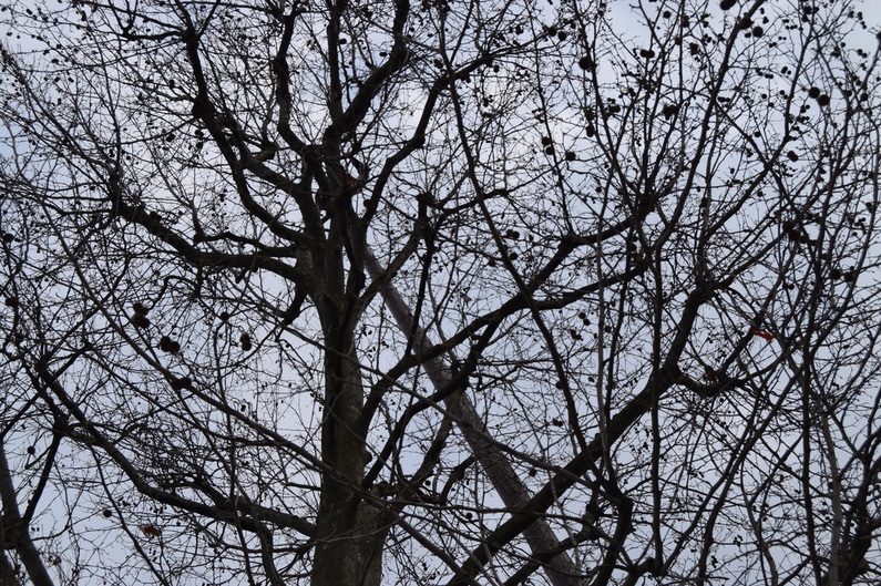
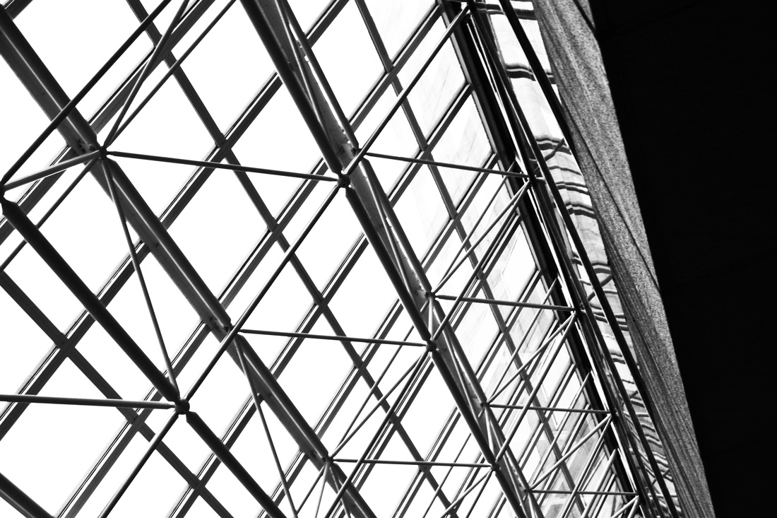
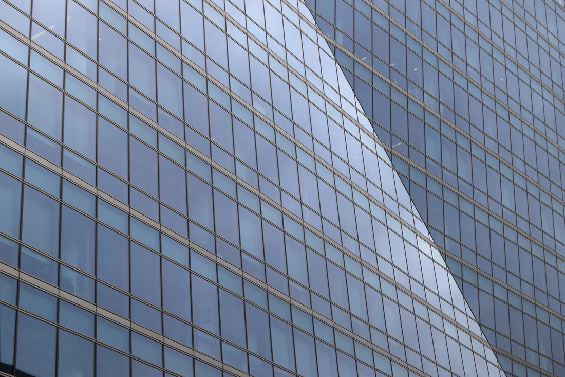
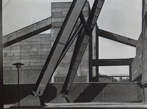
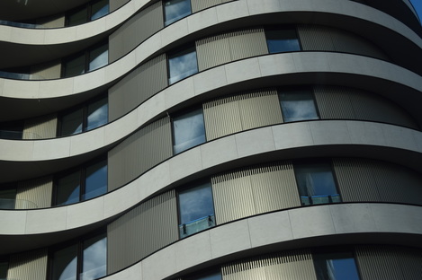
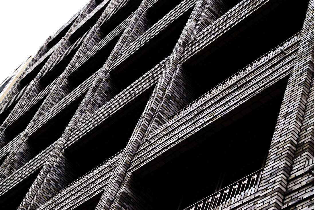
These are some of my photos that I think they are appropriate for this project, as sin repetition. I took many photos to buildings because all the buildings I took photos of, had many patterns and strong lines, and of course all the patterns were repeated in many different ways.
There are more objects that had repetition, but I decided to use buildings and other stuff instead of photographing, flowers, glasses, food, shoes and other stuff.
When I took these photographs, I wasn't really thinking of any photographer, but thinking about repetition and patterns.
I think urban photography is more of my type, rather than small objects and also, you can do a lot out of a building photo.
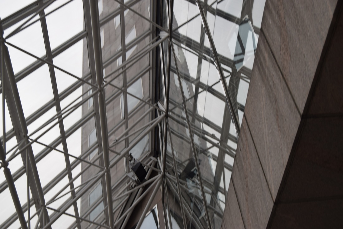
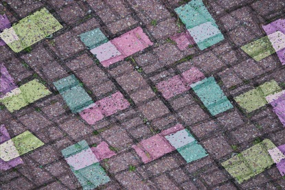
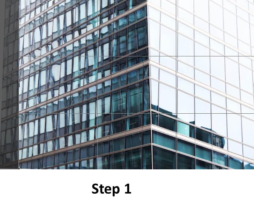
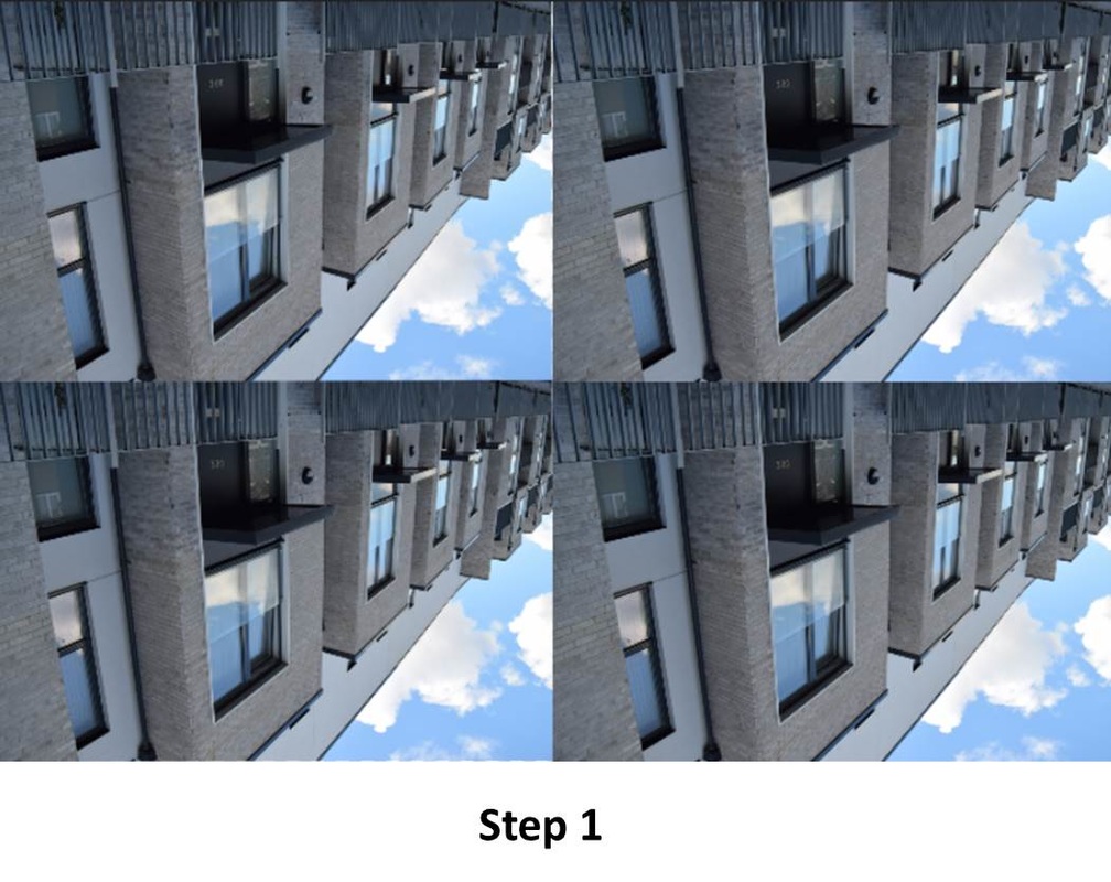
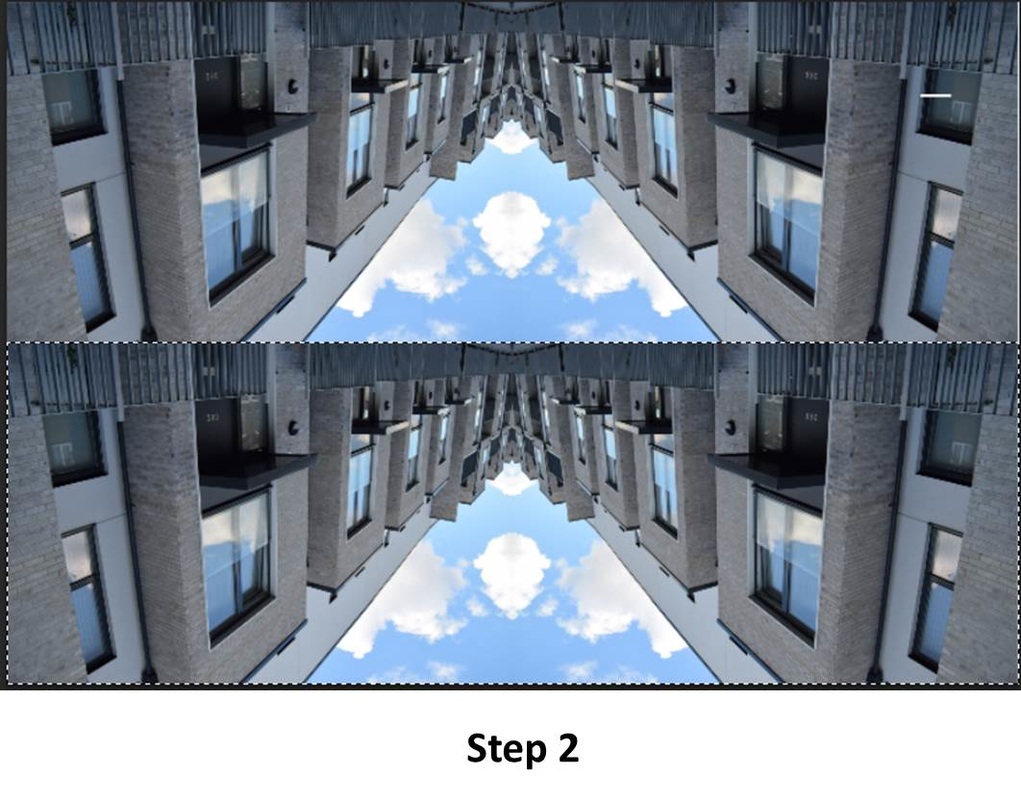
Piece 1
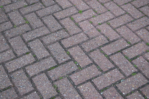
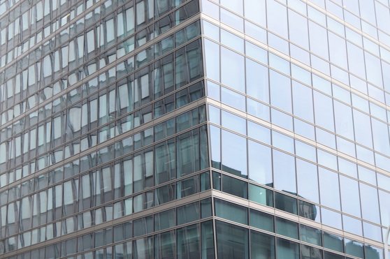
Original photograph.
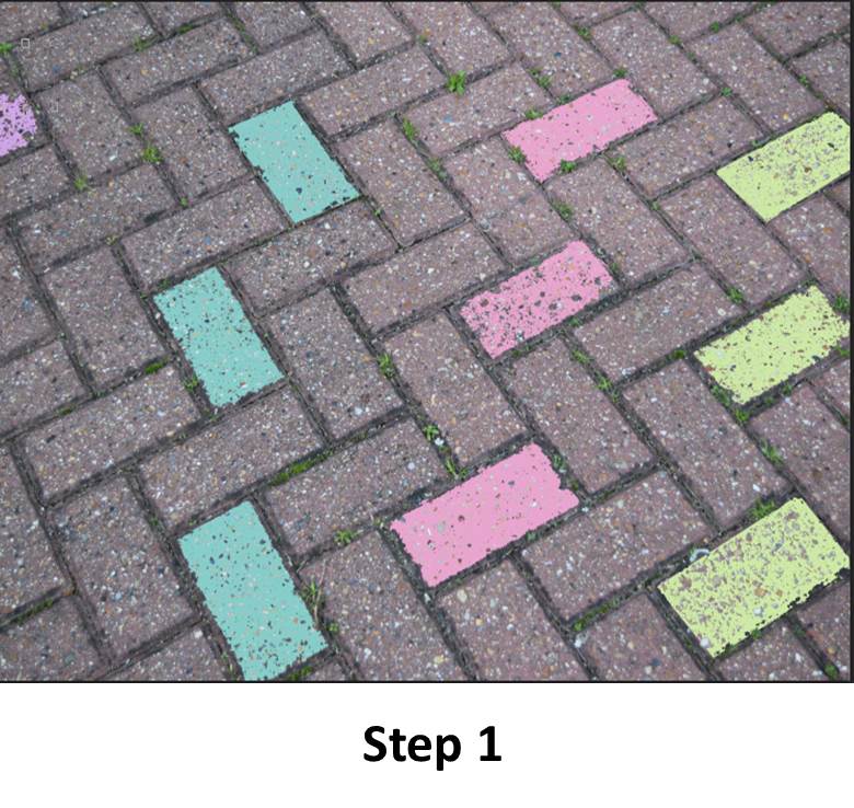
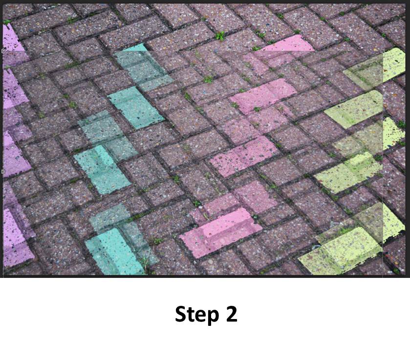
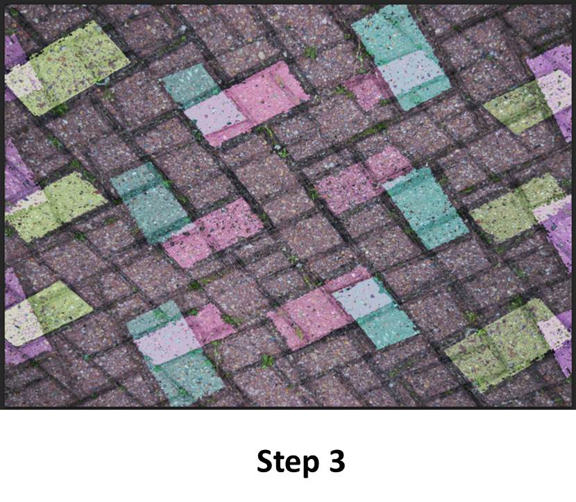
For the first step, I started to colour in some of the rectangles with the polygonal lasso tool and the paint bucket with some pastel colours just like the photographer, Michael Wolf.
I took advantage of the strong lines and the rectangle shapes of this photo to do whatever I wanted, and because of the straight lines in this photo, it was easier for me to select the places I wanted colour in.
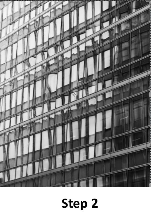
The second step consisted in, duplicating the layer, rotating the layer and changing it's opacity and gave it a higher contrast
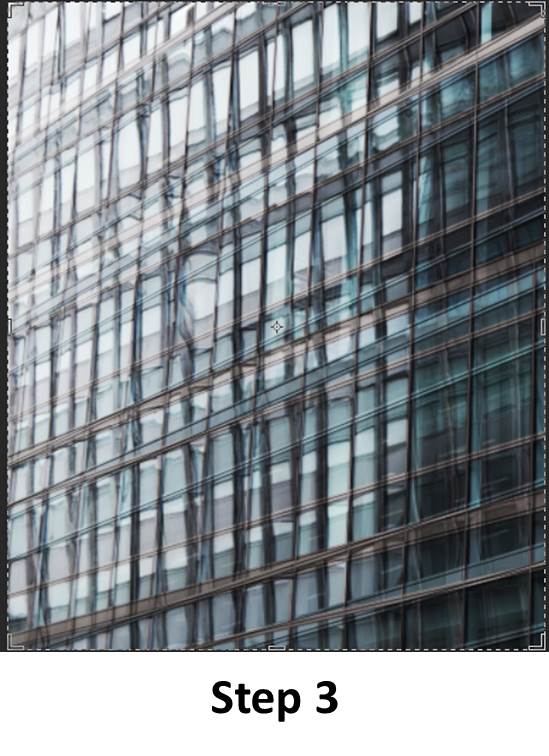
And for the third and last step I moved the layers around and added a bit more of high contrast.
I took advantage of the strong lines and the rectangle shapes of this photo to do whatever I wanted, and because of the straight lines in this photo, it was easier for me to select the places I wanted colour in.
The second step consisted in, duplicating the layer, rotating the layer and changing it's opacity and gave it a higher contrast
And for the third and last step I moved the layers around and added a bit more of high contrast.
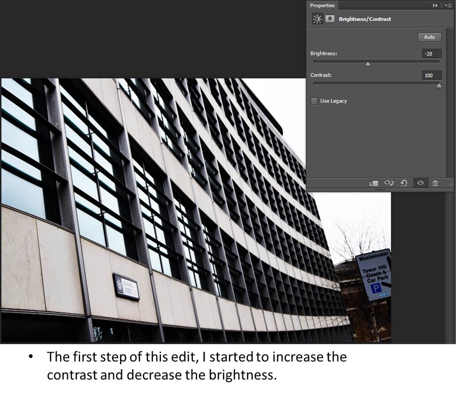
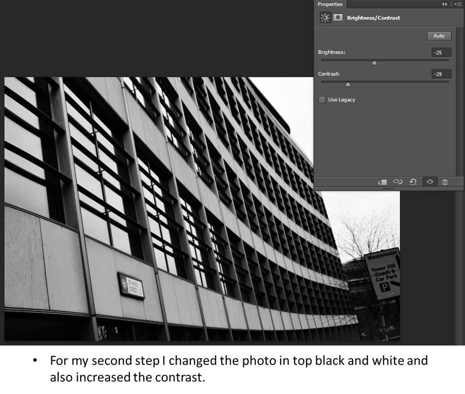
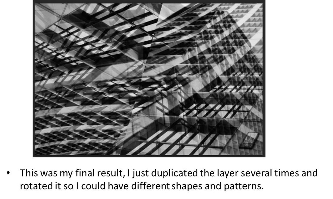
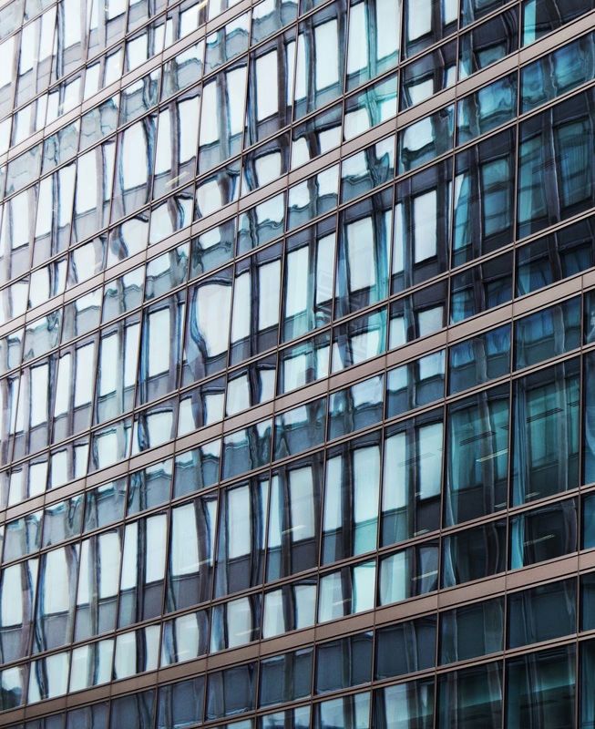
Piece 2
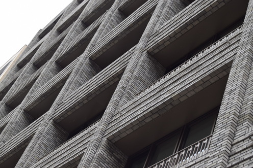
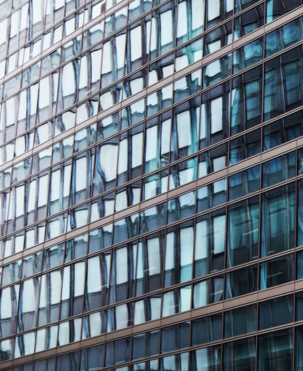
Original photograph.
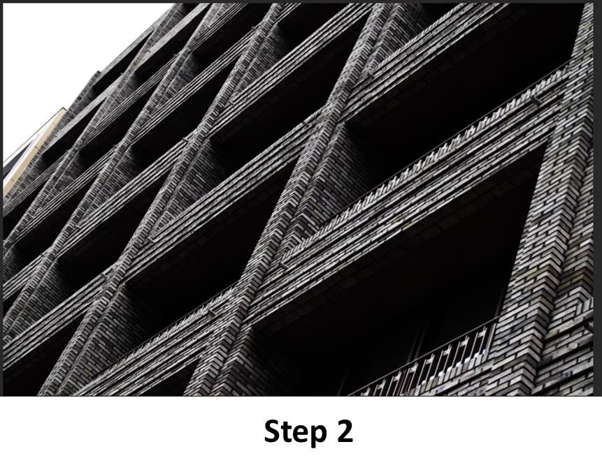
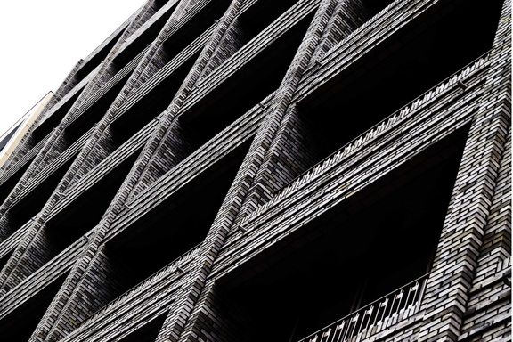
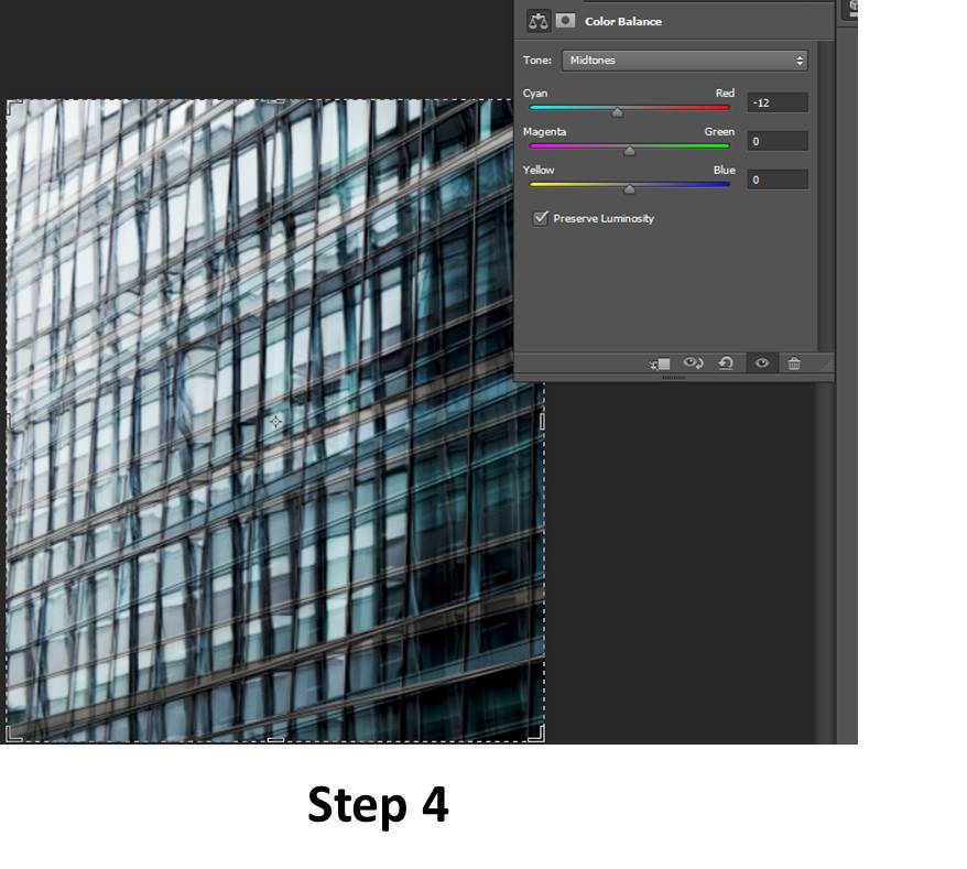
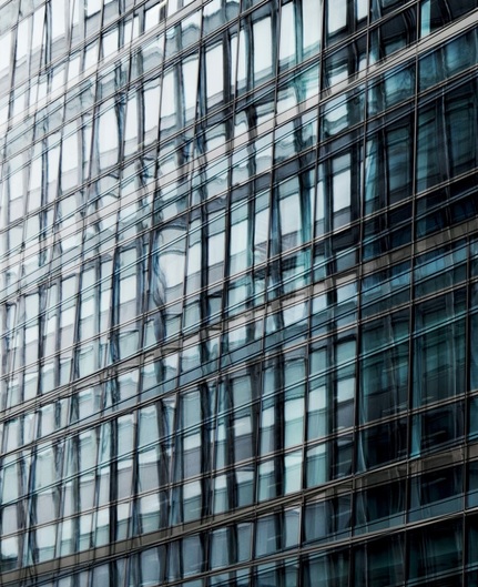
For this edit, I used a picture that was very strong in terms of lines and texture.
First step, I lowered the brightness and to emphasise the lines I had there, increased the contrast to make the image sort of grey scale.
For my second and last step, I also increased my contrast twice and increased the levels too to make the image darker and so the lines could really pop out.
I was inspired to do this edit because of the photographer Albert Renger-Patzsch, because his work is all in grey scale and has very strong lines and because this is my type of photography, I like to play around with the contrast and levels to create even stronger lines.
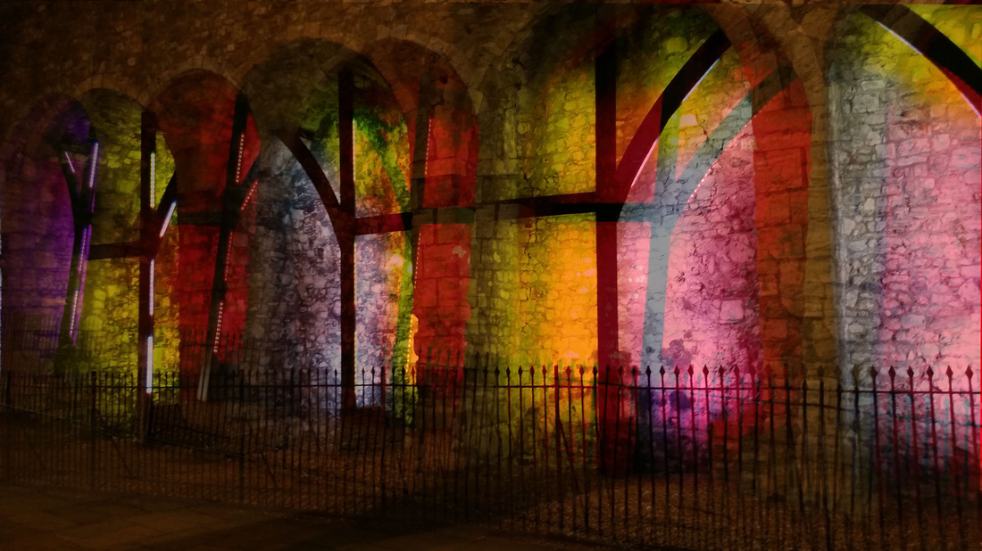
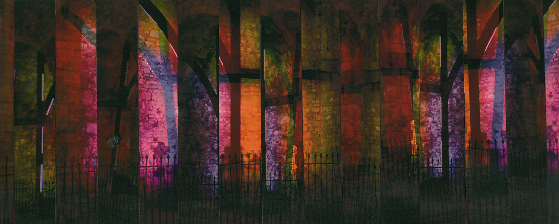
Piece 3
Original photographs.
This is the collage before I cropped it.

For this edit I used as inspiration, Maurizio Galimberti, to chop up pictures and to mix them up, so for this one I printed out one of my black and white edits and chopped them into uneven thin parts.
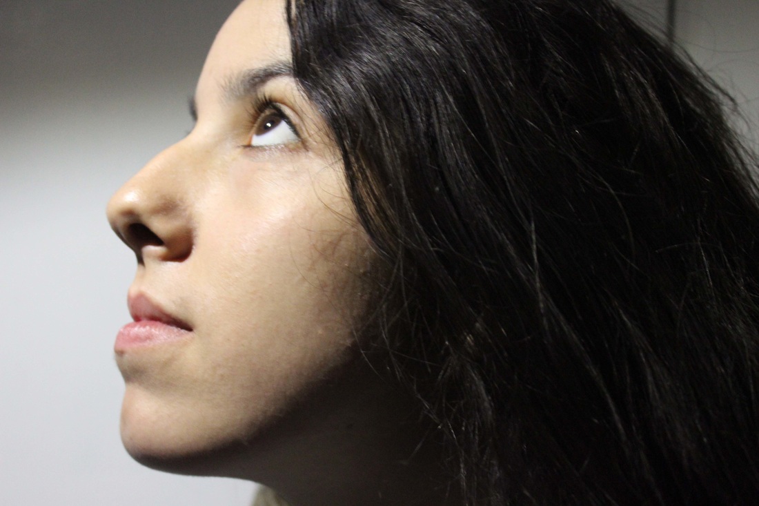
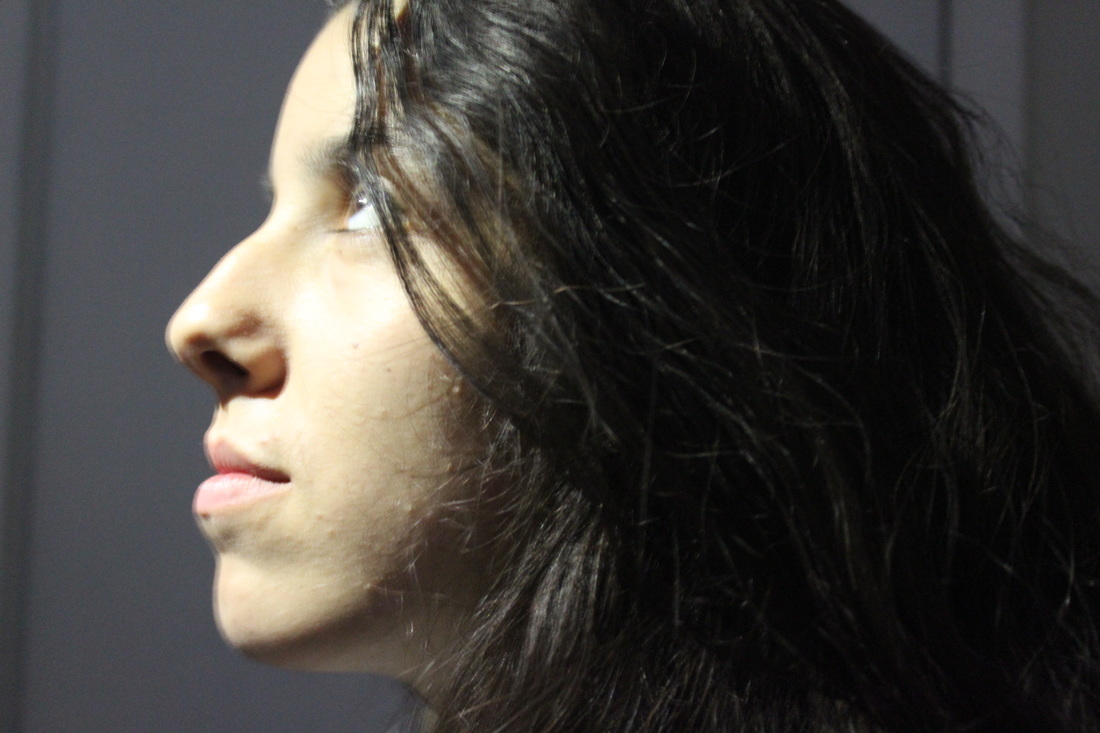
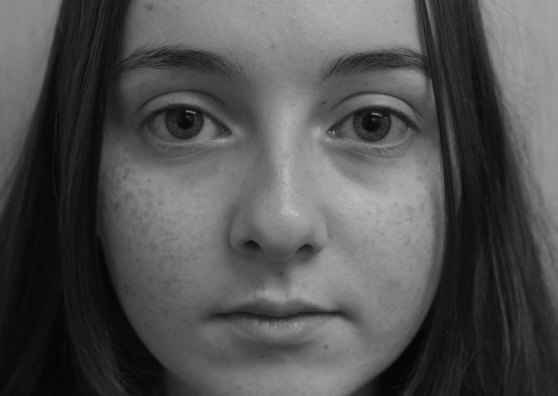
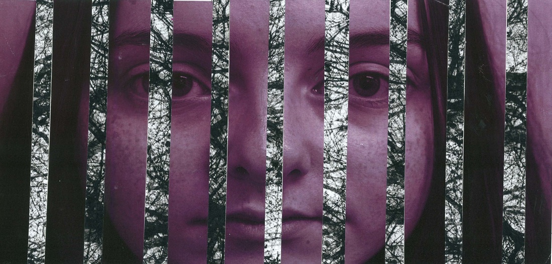
For the second part of this piece I printed out this close up portrait, chopped it into thicker parts so I could see her full face even though I have chopped it.
I concentrated more into the eyes, nose and lip area to maintain them straight after joining all the chopped slices up.
For the second part of this piece I printed out this close up portrait, chopped it into thicker parts so I could see her full face even though I have chopped it.
I concentrated more into the eyes, nose and lip area to maintain them straight after joining all the chopped slices up.
After I had scanned this edit into the computer, I edited it on photoshop. Because she is pale and has a lot of freckles, I increased the contrast to make them pop out a little bit more and has I did that, her cheeks on the lower bit of her face look slightly darker and it looks like it's like a layer of colours getting lighter as we go up her face to her eyes.
The black and white stripes look whiter and the black looks darker because of the increase of contrast.
The black and white stripes look whiter and the black looks darker because of the increase of contrast.
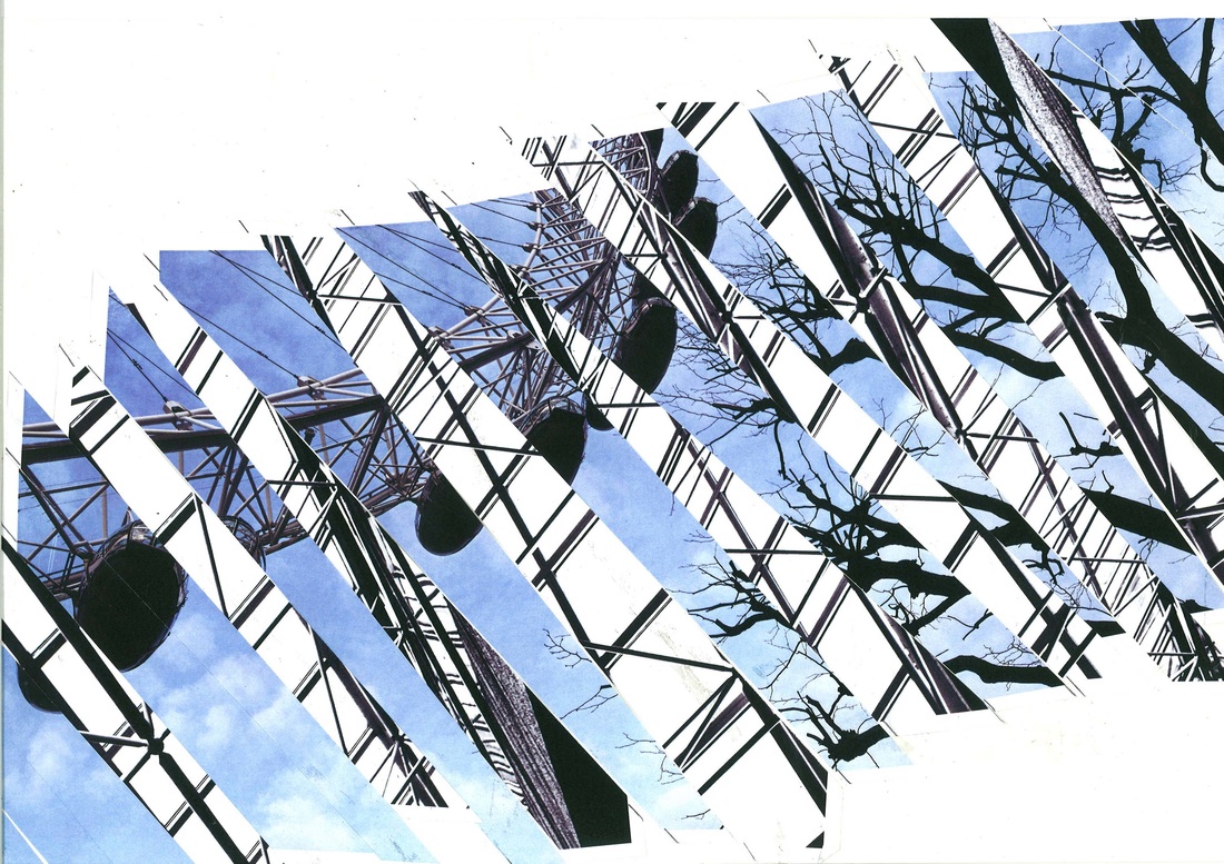
Piece 4


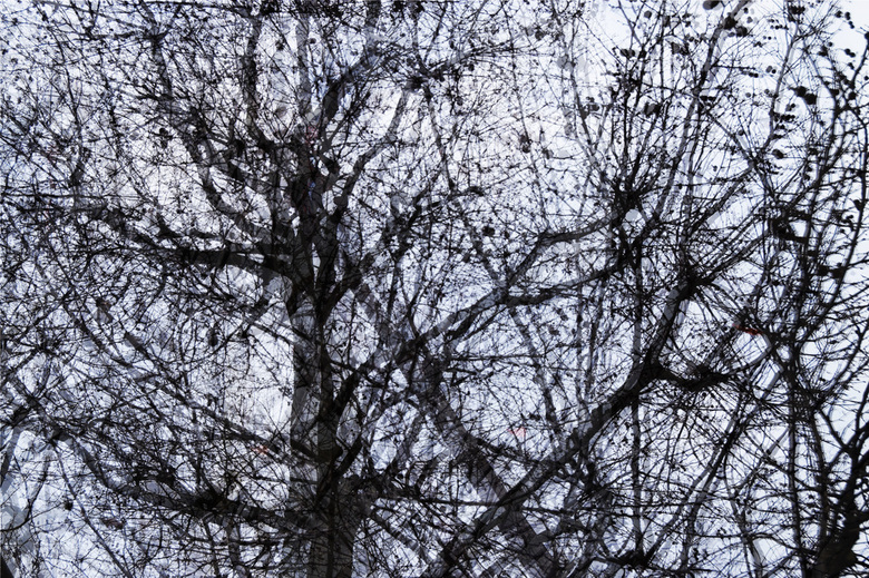
For this edit I only edited the images while on the computer, printed them out and chopped them into diagonal stripes.
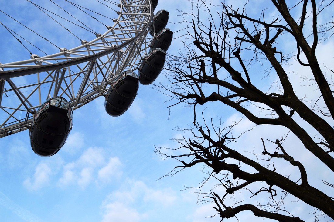
I combined the London's eye photo and a black and white edit I had made before and joined the together, and layered them out in a way the London's eye could still be visible.
The only thing I changed after scanning was the contrast, so the lines can be stronger and highly contrasted.
I decided to leave the collage as it was after scanning, with all the uneven ends and in a diagonal way, so it's a different edit, but still inspired by, the photographer Maurizio Galimberti.
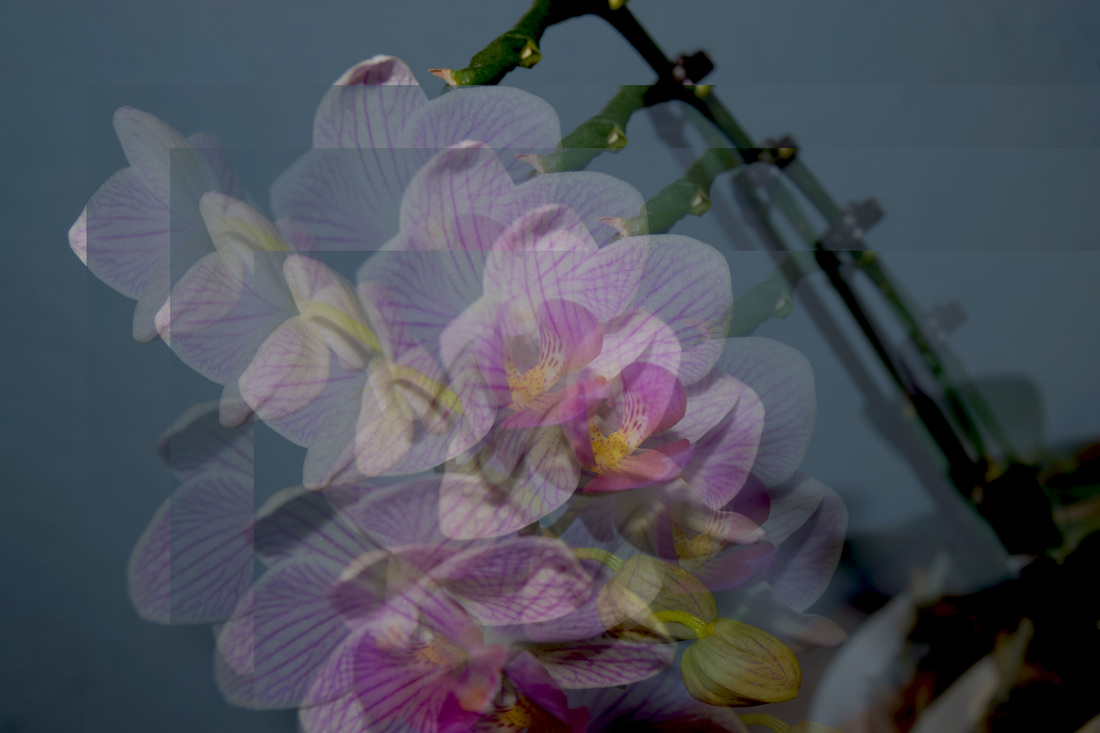
Piece 5
This is my original picture before edited.
First of all, I got my inspiration for this edit from the photographer
This is my first attempt of editing with only one layer and only using high contrast.
|
This is my second attempt of edit, using two layers, one in colour, one in black and white.
|
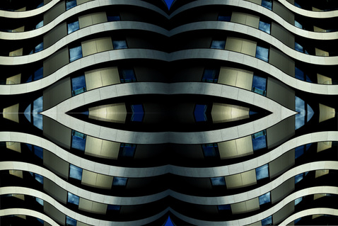
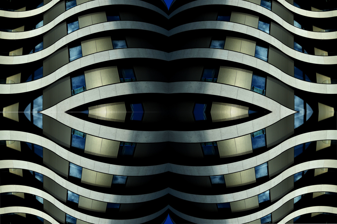
Piece 6
I used the picture above to create this edit in 3 different steps.
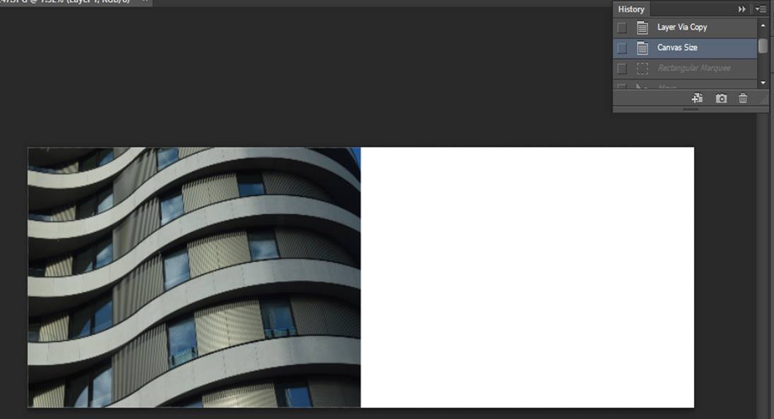
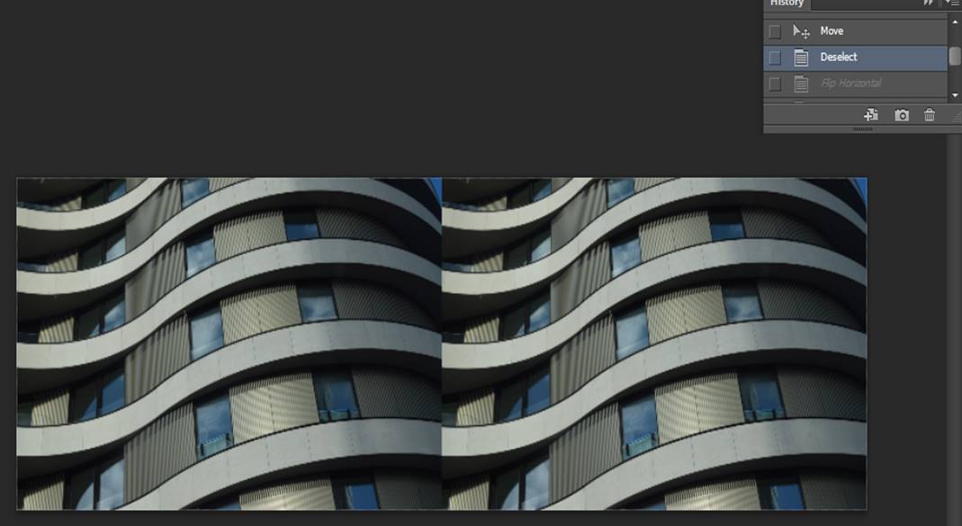
I was inspired to create this edit because of the photographer Albert Renger-Patzsch, even though he doesn't quite often use colours, I felt inspired, in fact, not just because of the lines. In the first step, I doubled the canvas size in double so I could fit a copy of the same picture.
In the second step I placed the copy of the picture where I wanted it to be, and then I flipped it to create a type of pattern by connecting the lines together.
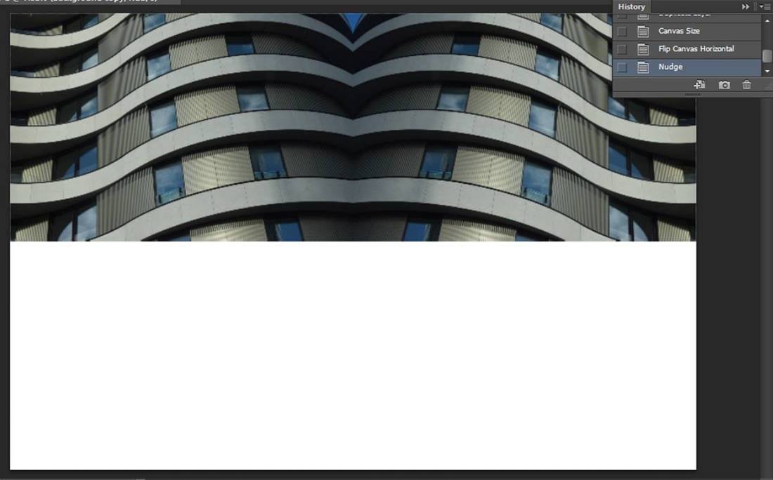
For my last step, I flattened the image and made the increased the canvas size again the downwards this time and then rotated it again and created this type of pattern with lines. To make this edit look even better I increased the contrast levels so in the middle, because it was darker, could have some shadows.
Piece 7
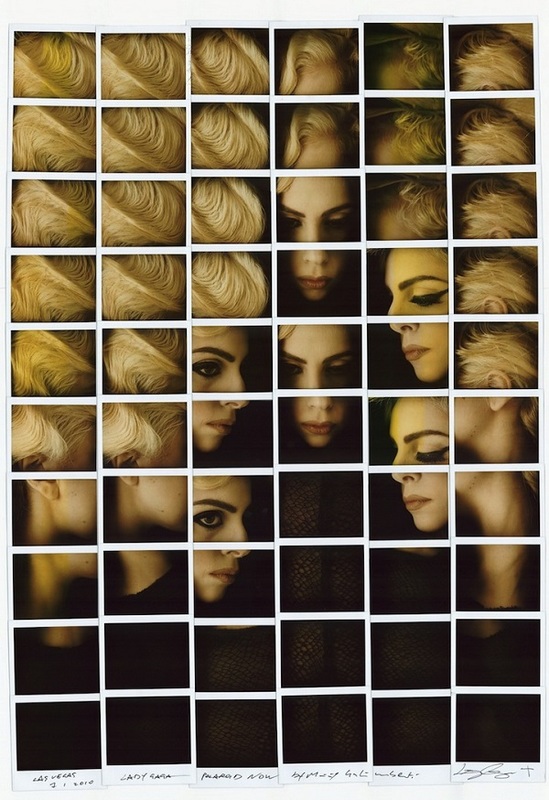
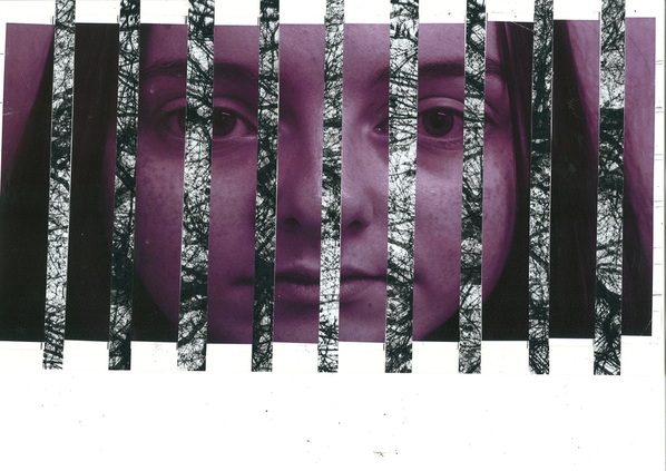
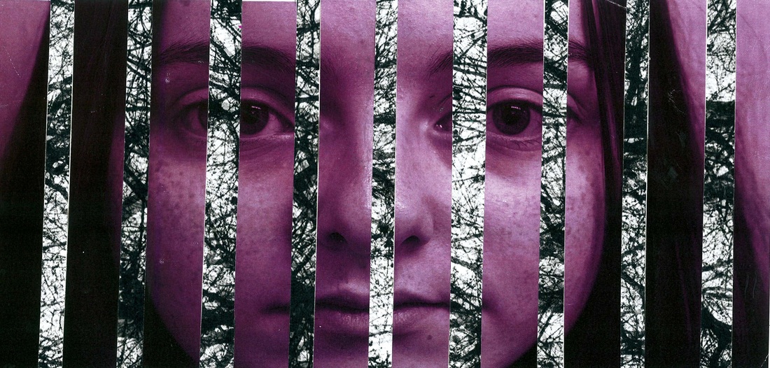
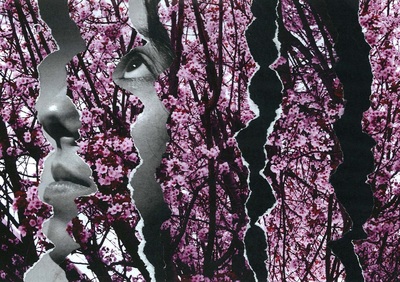
To create this piece I used a tearing technique, related in some way to the photographer Maurizio Galimberti because he always uses the cut and collage techniques and many different pictures, so I changed it a bit, I used only one picture and its a close up and instead of cutting everything into the same size I tore them.
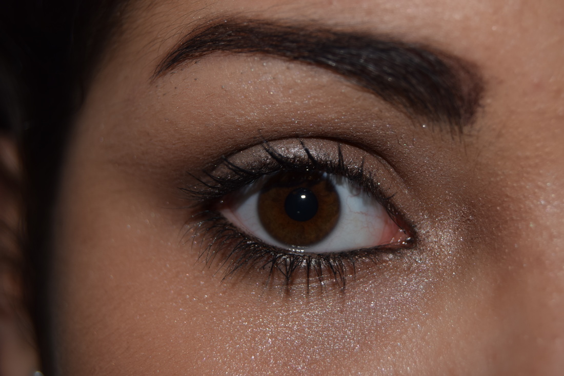
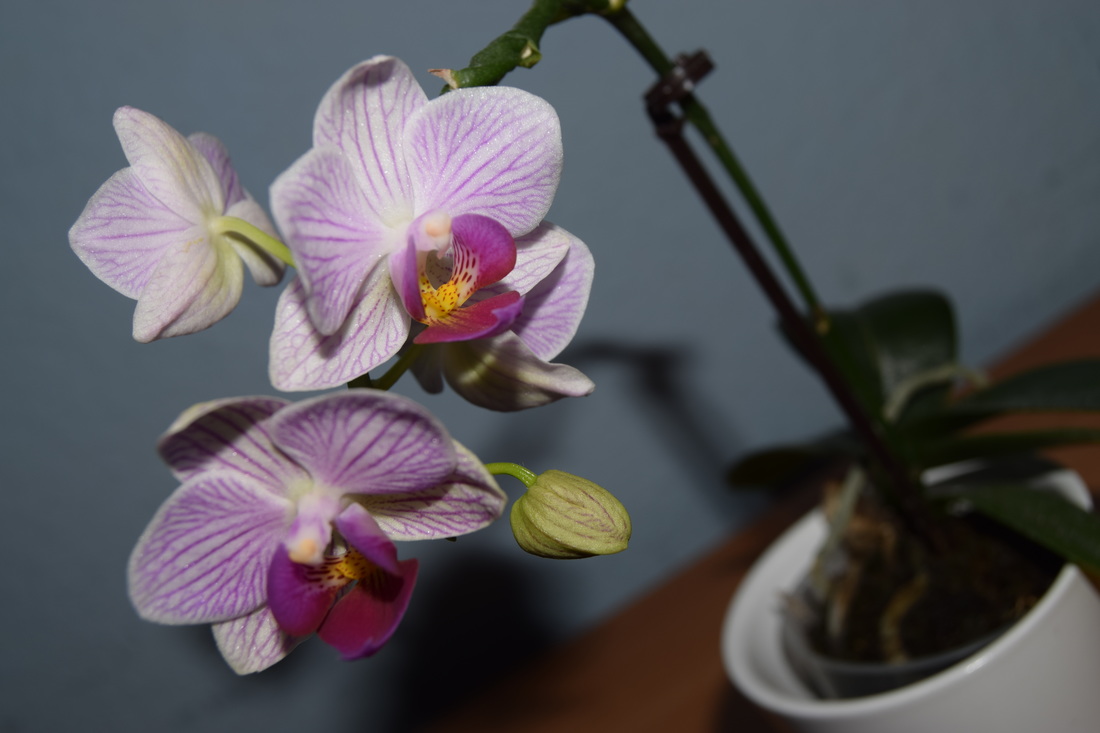
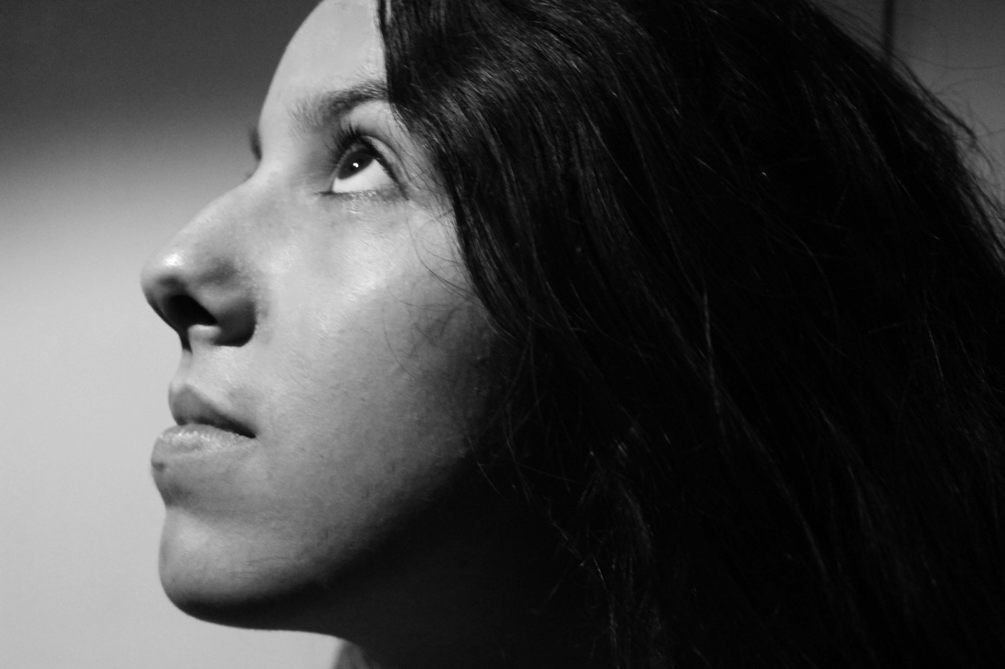
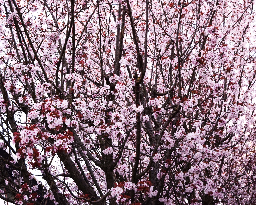
I combined a floral picture and a close up portrait for this edit. In the pictures down below, I have the one I scanned in as it is, and I also have the one I scanned in and gave it a retouch. I created three examples of edits that I liked with this collage.
I combined a floral picture and a close up portrait for this edit. In the pictures down below, I have the one I scanned in as it is, and I also have the one I scanned in and gave it a retouch. I created three examples of edits that I liked with this collage.
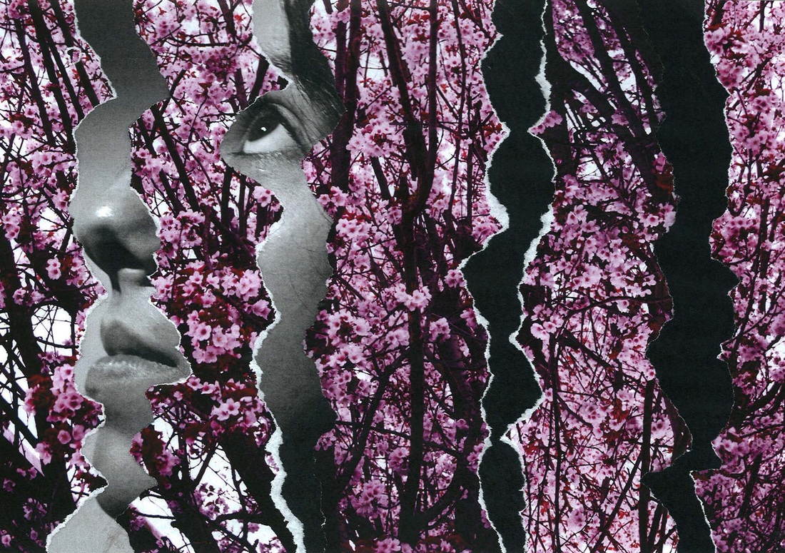
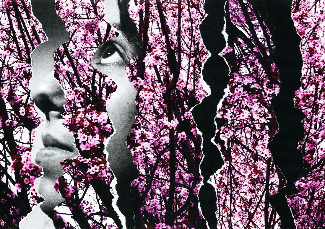

These are all the edits I made with this collage, but the one that I think would be better for this project would be the first one, because the contrast of the flowers and face are quite more balanced than the other two.
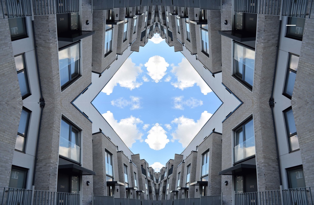
Piece 8
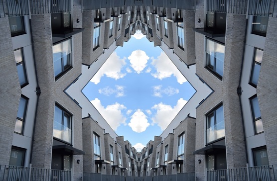
I relate this piece with piece 6 because I used the stronger lines to create a middle point and connect together.
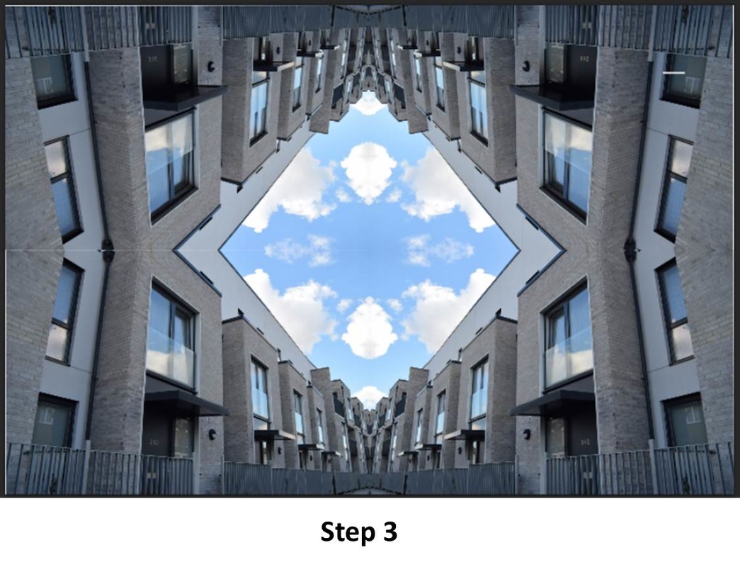
I also relate this piece with piece 6 because I used the flip technique to create the diamond shape in the middle just using one picture and a couple of layers.
For my first step I duplicated the layer four times and made a grid.
Second step was to flip the horizontally and have only two layers.
For my final step I flattened each layer and flipped the bottom one horizontally and gave it some small nudges, so the image could be even on both sides and have no space between them.
My final pieces:

I chose these pictures because I think they are all related to the same photographer, Maurizio Galimberti because of all the cuttings he did
To do these edits and creations, I had to explore and use many tools that I have never heard of, and just because of that I can tell that I have learnt a lot by doing this exam.
Some of these photos are quite similar in some way because I had to relate them with other photographers.
I'm really pleased with my work and with all my responses to the photographers I have chosen.
Evaluation:
I'm very pleased with my final outcomes because they show the effort I used in it and I also discovered that I actually enjoy this theme and I will do it more times even though I have done my GCSE.
In this project I also presented some edits in which I have used my friends to help me.
I'm also quite satisfied with my evolution during this photography course and I would have done better if joined school a bit earlier, but even though, I'm pleased with my final edits and happy about finishing year 11 with all this photography knowledge.
In my opinion I think I developed the theme, repetition, quite well and I used as a main thing to photograph buildings, because they are something simple to edit and a simple thing to use as experimenting.
During this project I have changed my ideas a few times, I couldn't imagine myself doing stuff outside the computer such as in shopping and doing collages.
I'm glad I used the photographer Maurizio Galimberti as a main inspiration for my project because I developed many ideas thanks to him.
I hope that all the people that decide to take a look at my website, understand that even with a simple building photo you can edit it in many ways and do a lot with it, an I also want them to understand that you can use them same photograph to do many things.
If I had more time I would have liked to use Albert Renger-Patzsch as another main inspiration and I would also have done more responses to his work.
I hope you enjoy my project!
